Huge last-minute discounts for FabCon Vienna from September 15-18, 2025
Supplies are limited. Contact info@espc.tech right away to save your spot before the conference sells out.
Get your discount- Power BI forums
- Get Help with Power BI
- Desktop
- Service
- Report Server
- Power Query
- Mobile Apps
- Developer
- DAX Commands and Tips
- Custom Visuals Development Discussion
- Health and Life Sciences
- Power BI Spanish forums
- Translated Spanish Desktop
- Training and Consulting
- Instructor Led Training
- Dashboard in a Day for Women, by Women
- Galleries
- Data Stories Gallery
- Themes Gallery
- Contests Gallery
- Quick Measures Gallery
- Notebook Gallery
- Translytical Task Flow Gallery
- TMDL Gallery
- R Script Showcase
- Webinars and Video Gallery
- Ideas
- Custom Visuals Ideas (read-only)
- Issues
- Issues
- Events
- Upcoming Events
Score big with last-minute savings on the final tickets to FabCon Vienna. Secure your discount
- Power BI forums
- Forums
- Get Help with Power BI
- Desktop
- Re: Displaying different values from the same colu...
- Subscribe to RSS Feed
- Mark Topic as New
- Mark Topic as Read
- Float this Topic for Current User
- Bookmark
- Subscribe
- Printer Friendly Page
- Mark as New
- Bookmark
- Subscribe
- Mute
- Subscribe to RSS Feed
- Permalink
- Report Inappropriate Content
Displaying different values from the same column for one day
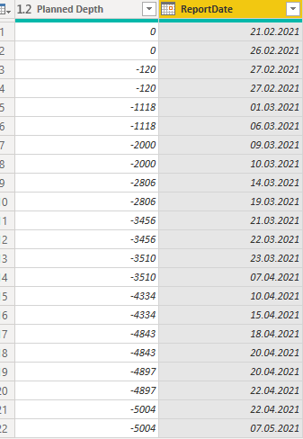
Hi everyone! A stupid question but how does one go about plotting several different values from one column vs a given corresponding date?


What it does now it sums up Planned Depth for the same date (both in case of 20.04.2021 and 22.04.2021). I'd like to avoid it and keep the original data format so I can also plot it using the line chart.
Solved! Go to Solution.
- Mark as New
- Bookmark
- Subscribe
- Mute
- Subscribe to RSS Feed
- Permalink
- Report Inappropriate Content
Hi @Anonymous ,
I am able to achieve this but with a workaround.
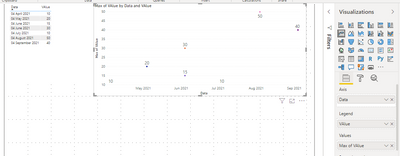
Instead of using the Value column in Value secution of Line chart also use it in the legend and make the summarization of the one in the value column to max.
Then hide the line by making the stroke width to 0.
Switch off the tooltips and enable the data labels.
The Same power bi report is present in the below link. Do check out
https://1drv.ms/u/s!Ahd9tZ6Q55jygSTRO1r4iC-wTsVP?e=VchwKP
The Below is the screenshot of the final output
Mark it as a solution and give it a kudos if this helps!!!
- Mark as New
- Bookmark
- Subscribe
- Mute
- Subscribe to RSS Feed
- Permalink
- Report Inappropriate Content
Hi @Anonymous ,
Create a column as below:
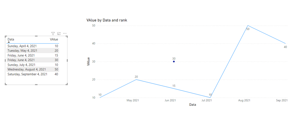
rank = RANKX(FILTER('Table','Table'[Data]=EARLIER('Table'[Data])),'Table'[VAlue],,ASC)Then put the column in the legend of line chart and you will see:
For June 4,2021,it has 2 values,and they are all shown in line chart.
For the related .pbix file,pls see attached.
Best Regards,
Kelly
Did I answer your question? Mark my post as a solution!
- Mark as New
- Bookmark
- Subscribe
- Mute
- Subscribe to RSS Feed
- Permalink
- Report Inappropriate Content
Hi @Anonymous ,
The Column will have a summarize property. Make it as Non-Summarize. This way you ca avoid the data from getting added together which is the default summarize option for a value.
Then check if your line chart is as expected
\
- Mark as New
- Bookmark
- Subscribe
- Mute
- Subscribe to RSS Feed
- Permalink
- Report Inappropriate Content
Hi @Thejeswar, the Summarization is set to "Don't summarize" for the Planned Depth column. However, the line chart always aggregates and gives sum/avg/max/etc. for this column. How to make show only original data from the Planned Depth?
- Mark as New
- Bookmark
- Subscribe
- Mute
- Subscribe to RSS Feed
- Permalink
- Report Inappropriate Content
Hi @Anonymous ,
I am able to achieve this but with a workaround.
Instead of using the Value column in Value secution of Line chart also use it in the legend and make the summarization of the one in the value column to max.
Then hide the line by making the stroke width to 0.
Switch off the tooltips and enable the data labels.
The Same power bi report is present in the below link. Do check out
https://1drv.ms/u/s!Ahd9tZ6Q55jygSTRO1r4iC-wTsVP?e=VchwKP
The Below is the screenshot of the final output
Mark it as a solution and give it a kudos if this helps!!!
- Mark as New
- Bookmark
- Subscribe
- Mute
- Subscribe to RSS Feed
- Permalink
- Report Inappropriate Content
@Anonymous , Add an index column and add that to the visual
https://stackoverflow.com/questions/45715963/creating-an-index-column-for-power-bi
- Mark as New
- Bookmark
- Subscribe
- Mute
- Subscribe to RSS Feed
- Permalink
- Report Inappropriate Content
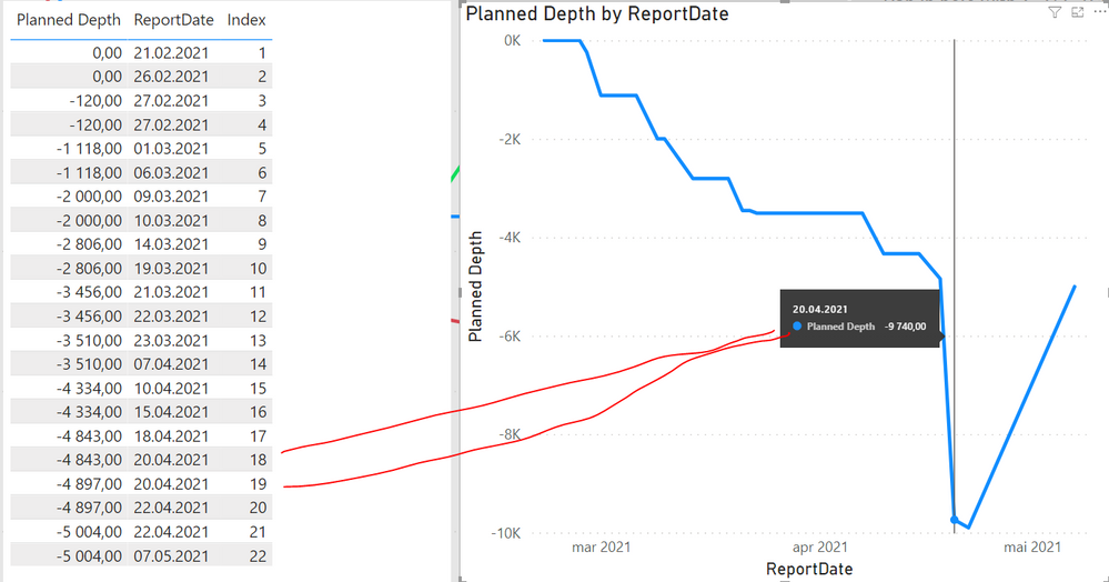
@amitchandak thanks for quick reply! It solves the problem of showing a correct data in the table visual but not in a line chart (it still sums up values for the same day, like on the pic below for 20.04.2021)
:


