FabCon is coming to Atlanta
Join us at FabCon Atlanta from March 16 - 20, 2026, for the ultimate Fabric, Power BI, AI and SQL community-led event. Save $200 with code FABCOMM.
Register now!- Power BI forums
- Get Help with Power BI
- Desktop
- Service
- Report Server
- Power Query
- Mobile Apps
- Developer
- DAX Commands and Tips
- Custom Visuals Development Discussion
- Health and Life Sciences
- Power BI Spanish forums
- Translated Spanish Desktop
- Training and Consulting
- Instructor Led Training
- Dashboard in a Day for Women, by Women
- Galleries
- Data Stories Gallery
- Themes Gallery
- Contests Gallery
- Quick Measures Gallery
- Notebook Gallery
- Translytical Task Flow Gallery
- TMDL Gallery
- R Script Showcase
- Webinars and Video Gallery
- Ideas
- Custom Visuals Ideas (read-only)
- Issues
- Issues
- Events
- Upcoming Events
To celebrate FabCon Vienna, we are offering 50% off select exams. Ends October 3rd. Request your discount now.
- Power BI forums
- Forums
- Get Help with Power BI
- Desktop
- Re: Display values in Tool Tip.
- Subscribe to RSS Feed
- Mark Topic as New
- Mark Topic as Read
- Float this Topic for Current User
- Bookmark
- Subscribe
- Printer Friendly Page
- Mark as New
- Bookmark
- Subscribe
- Mute
- Subscribe to RSS Feed
- Permalink
- Report Inappropriate Content
Display values in Tool Tip.
Hello,
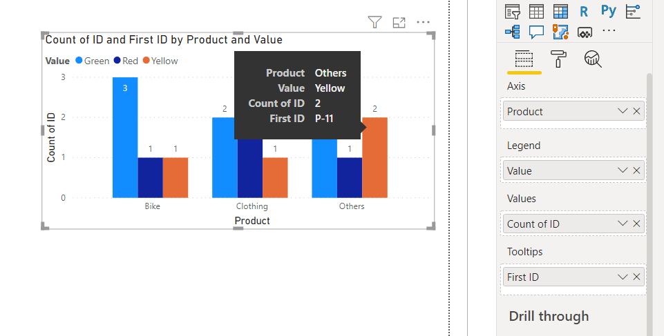
This is my Table and have made chart out of that table.
| ID | Product | Value |
| P-01 | Bike | Green |
| P-02 | Bike | Yellow |
| P-03 | Bike | Green |
| P-04 | Bike | Red |
| P-05 | Bike | Green |
| P-06 | Clothing | Yellow |
| P-07 | Clothing | Green |
| P-08 | Clothing | Red |
| P-09 | Clothing | Red |
| P-10 | Clothing | Green |
| P-11 | Others | Yellow |
| P-12 | Others | Yellow |
| P-13 | Others | Red |
| P-14 | Others | Green |
| P-15 | Others | Green |

Here in tool tip its only showing P-11, how to show all the values that made that bar, in this case both "P-11" and "P-12".
Thanks
Solved! Go to Solution.
- Mark as New
- Bookmark
- Subscribe
- Mute
- Subscribe to RSS Feed
- Permalink
- Report Inappropriate Content
@NithinBN - Create a measure for your tooltip like this:
Measure =
  CONCATENATEX(
    DISTINCT(
      SELECTCOLUMNS('Table',"ID",[ID])
    ),
    [ID],","
  )
Use that for your Tooltip.
Follow on LinkedIn
@ me in replies or I'll lose your thread!!!
Instead of a Kudo, please vote for this idea
Become an expert!: Enterprise DNA
External Tools: MSHGQM
YouTube Channel!: Microsoft Hates Greg
Latest book!: DAX For Humans
DAX is easy, CALCULATE makes DAX hard...
- Mark as New
- Bookmark
- Subscribe
- Mute
- Subscribe to RSS Feed
- Permalink
- Report Inappropriate Content
@NithinBN , In case you take it tooltip, it will show only the first value. You can create a tooltip page and use it.
https://docs.microsoft.com/en-us/power-bi/desktop-tooltips/last
Helpful resources
| User | Count |
|---|---|
| 89 | |
| 70 | |
| 67 | |
| 53 | |
| 27 |


