Fabric Data Days starts November 4th!
Advance your Data & AI career with 50 days of live learning, dataviz contests, hands-on challenges, study groups & certifications and more!
Get registered- Power BI forums
- Get Help with Power BI
- Desktop
- Service
- Report Server
- Power Query
- Mobile Apps
- Developer
- DAX Commands and Tips
- Custom Visuals Development Discussion
- Health and Life Sciences
- Power BI Spanish forums
- Translated Spanish Desktop
- Training and Consulting
- Instructor Led Training
- Dashboard in a Day for Women, by Women
- Galleries
- Data Stories Gallery
- Themes Gallery
- Contests Gallery
- QuickViz Gallery
- Quick Measures Gallery
- Visual Calculations Gallery
- Notebook Gallery
- Translytical Task Flow Gallery
- TMDL Gallery
- R Script Showcase
- Webinars and Video Gallery
- Ideas
- Custom Visuals Ideas (read-only)
- Issues
- Issues
- Events
- Upcoming Events
Get Fabric Certified for FREE during Fabric Data Days. Don't miss your chance! Request now
- Power BI forums
- Forums
- Get Help with Power BI
- Desktop
- Re: Display time in Y-axis using Power BI clustere...
- Subscribe to RSS Feed
- Mark Topic as New
- Mark Topic as Read
- Float this Topic for Current User
- Bookmark
- Subscribe
- Printer Friendly Page
- Mark as New
- Bookmark
- Subscribe
- Mute
- Subscribe to RSS Feed
- Permalink
- Report Inappropriate Content
Display time in Y-axis using Power BI clustered column chart
I have multiple time for the selected date. I need to show average time for the selected date/ month using clustered column chart.
Average time which will come top of the BAR. X axis will be time axis. And average time will be there on top of the BAR and height accordingly. How to acheive this. please advice. Thanks in advance.
Solved! Go to Solution.
- Mark as New
- Bookmark
- Subscribe
- Mute
- Subscribe to RSS Feed
- Permalink
- Report Inappropriate Content
@Sonal28,
Power BI doesn't support time in Y-axis of clustered column chart, there are workarounds for you to create the visual.
1. Use integer to represent the Time and dispaly integer in Y-Axis, there is a similar thread for your reference.
2. Use R visual, please see this similar thread.
Regards,
Lydia
- Mark as New
- Bookmark
- Subscribe
- Mute
- Subscribe to RSS Feed
- Permalink
- Report Inappropriate Content
I recently got stuck with this same issue, and option #1 on @Anonymous's reply got me pretty close by converting the times to integers with a format of HHMMSS. (Ex: 9:24:38 AM would equal 92438).
You can reference that original solution here by @Anonymous on another thread:
Just wanted to share an update that Power BI rolled out a Dynamic formatting for DAX measures feature, which gets us even closer now, by displaying an integer as HH:MM:SS.
Basically, just follow shex's instructions to create a DAX measure that represents your time as an integer (they used MAX, but I needed an AVERAGE) :
DAX Start Time = (HOUR(AVERAGE(data_table[Start Time]))*10000) + (MINUTE(AVERAGE(data_table[Start Time]))*100) + (SECOND(AVERAGE(data_table[Start Time]))*1)
Next, change the format of your measure to "Dynamic", and you'll get a drop-down option to input a format string for your measure. I chose "00:00:00" as my format (you can include negative and zero formats as well separated by a semi-colon, if you want to be thorough. see below)
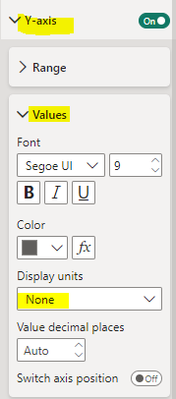
Next, create a Line Graph and use your new DAX measure as the Y-Axis. You'll need to format your Y-Axis in the settings of the chart so that the Display Units don't get auto-formatted to thousands (K). Set that option to "None"
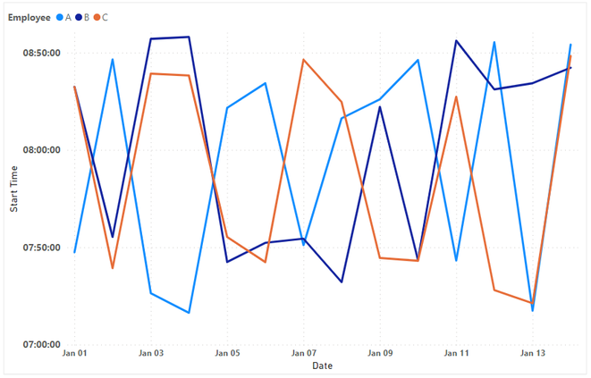
Here is what my final Line Graph looks like in my test file:
The only drawback I have noticed so far is that you won't be able to format your time in 12HH format with an AM/PM indicator. I played around with the formatting by making my AM times negative and PM times positive inside my measure, and including the AM and PM indicators in the positive;negative formatting strings (Ex: "00:00:00 PM; 00:00:00 AM") but still no luck, unless I'm missing something simpler. I don't believe you can use date/time format patterns directly within the Dynamic format feature (i.e. just typing "HH:MM:SS" as your format string didn't work for me).
Perhaps someone smarter than me could hack a mathematical conversion or a clever DAX measure to display a 12HH graph correctly because I'm drawing a blank.
Also, it doesn't look like I can attach a sample pbix file, but if it eventually lets me then I will include what I put together.
Hope this helps!
Paulo
- Mark as New
- Bookmark
- Subscribe
- Mute
- Subscribe to RSS Feed
- Permalink
- Report Inappropriate Content
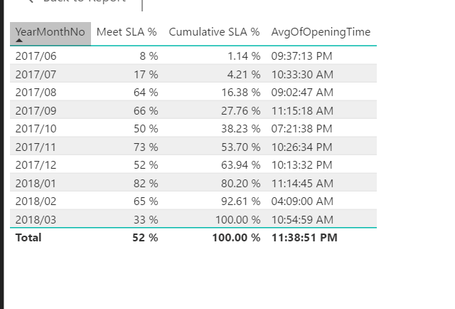
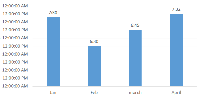
I need to show above data using clustered column chart.
Average time which will come top of the BAR. X axis will be time axis. And average time will be there on top of the BAR and height accordingly. How to acheive this. please advice. Thanks in advance.
- Mark as New
- Bookmark
- Subscribe
- Mute
- Subscribe to RSS Feed
- Permalink
- Report Inappropriate Content
@Sonal28,
Power BI doesn't support time in Y-axis of clustered column chart, there are workarounds for you to create the visual.
1. Use integer to represent the Time and dispaly integer in Y-Axis, there is a similar thread for your reference.
2. Use R visual, please see this similar thread.
Regards,
Lydia
- Mark as New
- Bookmark
- Subscribe
- Mute
- Subscribe to RSS Feed
- Permalink
- Report Inappropriate Content
Hi @Anonymous ,
Does pbi already have this feature of displaying time in the y axis?
Thank you so much,
Pedro
- Mark as New
- Bookmark
- Subscribe
- Mute
- Subscribe to RSS Feed
- Permalink
- Report Inappropriate Content
Please see this post regarding How to Get Your Question Answered Quickly: https://community.powerbi.com/t5/Community-Blog/How-to-Get-Your-Question-Answered-Quickly/ba-p/38490
Follow on LinkedIn
@ me in replies or I'll lose your thread!!!
Instead of a Kudo, please vote for this idea
Become an expert!: Enterprise DNA
External Tools: MSHGQM
YouTube Channel!: Microsoft Hates Greg
Latest book!: DAX For Humans
DAX is easy, CALCULATE makes DAX hard...
Helpful resources

Fabric Data Days
Advance your Data & AI career with 50 days of live learning, contests, hands-on challenges, study groups & certifications and more!

Power BI Monthly Update - October 2025
Check out the October 2025 Power BI update to learn about new features.


