FabCon is coming to Atlanta
Join us at FabCon Atlanta from March 16 - 20, 2026, for the ultimate Fabric, Power BI, AI and SQL community-led event. Save $200 with code FABCOMM.
Register now!- Power BI forums
- Get Help with Power BI
- Desktop
- Service
- Report Server
- Power Query
- Mobile Apps
- Developer
- DAX Commands and Tips
- Custom Visuals Development Discussion
- Health and Life Sciences
- Power BI Spanish forums
- Translated Spanish Desktop
- Training and Consulting
- Instructor Led Training
- Dashboard in a Day for Women, by Women
- Galleries
- Data Stories Gallery
- Themes Gallery
- Contests Gallery
- QuickViz Gallery
- Quick Measures Gallery
- Visual Calculations Gallery
- Notebook Gallery
- Translytical Task Flow Gallery
- TMDL Gallery
- R Script Showcase
- Webinars and Video Gallery
- Ideas
- Custom Visuals Ideas (read-only)
- Issues
- Issues
- Events
- Upcoming Events
The Power BI Data Visualization World Championships is back! Get ahead of the game and start preparing now! Learn more
- Power BI forums
- Forums
- Get Help with Power BI
- Desktop
- Different colours on small multiple line charts?
- Subscribe to RSS Feed
- Mark Topic as New
- Mark Topic as Read
- Float this Topic for Current User
- Bookmark
- Subscribe
- Printer Friendly Page
- Mark as New
- Bookmark
- Subscribe
- Mute
- Subscribe to RSS Feed
- Permalink
- Report Inappropriate Content
Different colours on small multiple line charts?
I have a 2x5 set of line charts as small multiples and need to have a different colour for each line:
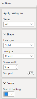
I've seen youtube videos where they do this via conditional formatting but I don't have this option - I don't have a section called "Data colors" at all, just under "Lines" I have the option to choose a colour manually which applies to every chart:
I do have the option to apply conditional formatting to my titles and values so it seems weird that I can't do this to my lines or bars.
Is there any work around for me to do make these lines different colours? Any help appreciated, I'm still very new. I'm using the May 2023 version of desktop.
Solved! Go to Solution.
- Mark as New
- Bookmark
- Subscribe
- Mute
- Subscribe to RSS Feed
- Permalink
- Report Inappropriate Content
Hi @hb380 ,
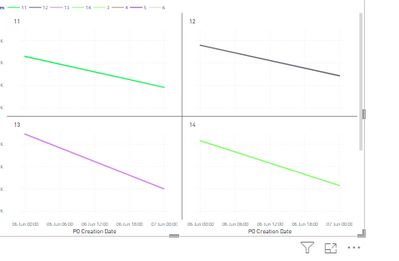
Possibly a work around here. If you would like to use same field which is used in small multiples, in legend, it does not allow. So create a duplicate column of small multiple column and use that in legend. You get different color for each line, as below:
You also get more control to tweak the legends as well.
Hope it helps.
- Mark as New
- Bookmark
- Subscribe
- Mute
- Subscribe to RSS Feed
- Permalink
- Report Inappropriate Content
I used this, thank you! I didn't have the option to add a legend as I had multiple measures on the Y axis (for data labelling), taking them off sorted it.
- Mark as New
- Bookmark
- Subscribe
- Mute
- Subscribe to RSS Feed
- Permalink
- Report Inappropriate Content
@hb380 , Conditional formatting is not supported in line visual. Create a measure on the field of small multiple, and use that in conditional formatting using the field value option. For that first, convert it the bar, do conditional formatting, and then change to line
Brand Color = Switch( true(),
max('Item'[brand]) = "Brand 1" , "red",
max('Item'[brand]) = "Brand 2" , "blue",
max('Item'[brand]) = "Brand 3" , "green",
max('Item'[brand]) = "Brand 4" , "gray",
max('Item'[brand]) = "Brand 5" , "yellow",
max('Item'[brand]) = "Brand 6" , "orange",
max('Item'[brand]) = "Brand 7" , "brown",
max('Item'[brand]) = "Brand 8" , "Cyan",
max('Item'[brand]) = "Brand 9" , "Tan",
max('Item'[brand]) = "Brand 10" , "Violet",
max('Item'[brand]) = "Brand 11" , "Gold",
"silver"
)
How to do conditional formatting by measure and apply it on pie?
https://www.youtube.com/watch?v=RqBb5eBf_I4&list=PLPaNVDMhUXGYo50Ajmr4SgSV9HIQLxc8L
https://community.powerbi.com/t5/Community-Blog/Power-BI-Conditional-formatting-the-Pie-Visual/ba-p/...
https://amitchandak.medium.com/power-bi-where-is-the-conditional-formatting-option-in-new-format-pan...
Helpful resources

Power BI Dataviz World Championships
The Power BI Data Visualization World Championships is back! Get ahead of the game and start preparing now!

| User | Count |
|---|---|
| 39 | |
| 38 | |
| 38 | |
| 28 | |
| 27 |
| User | Count |
|---|---|
| 124 | |
| 88 | |
| 73 | |
| 66 | |
| 65 |


