FabCon is coming to Atlanta
Join us at FabCon Atlanta from March 16 - 20, 2026, for the ultimate Fabric, Power BI, AI and SQL community-led event. Save $200 with code FABCOMM.
Register now!- Power BI forums
- Get Help with Power BI
- Desktop
- Service
- Report Server
- Power Query
- Mobile Apps
- Developer
- DAX Commands and Tips
- Custom Visuals Development Discussion
- Health and Life Sciences
- Power BI Spanish forums
- Translated Spanish Desktop
- Training and Consulting
- Instructor Led Training
- Dashboard in a Day for Women, by Women
- Galleries
- Data Stories Gallery
- Themes Gallery
- Contests Gallery
- QuickViz Gallery
- Quick Measures Gallery
- Visual Calculations Gallery
- Notebook Gallery
- Translytical Task Flow Gallery
- TMDL Gallery
- R Script Showcase
- Webinars and Video Gallery
- Ideas
- Custom Visuals Ideas (read-only)
- Issues
- Issues
- Events
- Upcoming Events
Learn from the best! Meet the four finalists headed to the FINALS of the Power BI Dataviz World Championships! Register now
- Power BI forums
- Forums
- Get Help with Power BI
- Desktop
- Re: Difference between two years
- Subscribe to RSS Feed
- Mark Topic as New
- Mark Topic as Read
- Float this Topic for Current User
- Bookmark
- Subscribe
- Printer Friendly Page
- Mark as New
- Bookmark
- Subscribe
- Mute
- Subscribe to RSS Feed
- Permalink
- Report Inappropriate Content
Difference between two years
Hello,
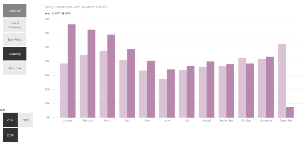
I need to know how much the value changed on monthly basis. For example, if I select "Laundary", I like to view how much annual difference percentage was between 2017 and 2018. The question is how to calculate this "new measure"?
How can I show the monthly difference percent on top of each month on this bar chart?
I need this new measure get updated based on my selection from the slicers as well.
Many Thanks

Solved! Go to Solution.
- Mark as New
- Bookmark
- Subscribe
- Mute
- Subscribe to RSS Feed
- Permalink
- Report Inappropriate Content
Hi @Alirezam ,
For your requirement, we could create the measure below to achieve it.
Measure =
VAR minyear =
    CALCULATE (
        SUM ( Table1[Sales] ),
        FILTER (
            'Table1',
            YEAR ( 'Table1'[Date] ) = YEAR ( MIN ( 'Table1'[Date] ) )
                && MONTH ( 'Table1'[Date] ) = MONTH ( MAX ( 'Table1'[Date] ) )
        )
    )
VAR maxyear =
    CALCULATE (
        SUM ( Table1[Sales] ),
        FILTER (
            'Table1',
            YEAR ( 'Table1'[Date] ) = YEAR ( MAX ( 'Table1'[Date] ) )
                && MONTH ( 'Table1'[Date] ) = MONTH ( MAX ( 'Table1'[Date] ) )
        )
    )
RETURN
    ( maxyear - minyear ) / maxyear
Then we could create a line and clusterd column chart like below.
More details, please refer to my attachment.
Best Regards,
Cherry
If this post helps, then please consider Accept it as the solution to help the other members find it more quickly.
- Mark as New
- Bookmark
- Subscribe
- Mute
- Subscribe to RSS Feed
- Permalink
- Report Inappropriate Content
Hi @Alirezam ,
Have you solved your problem?
If you have solved, please always accept the replies making sense as solution to your question so that people who may have the same question can get the solution directly.
If you still need help, please feel free to ask.
Best Regards,
Cherry
If this post helps, then please consider Accept it as the solution to help the other members find it more quickly.
- Mark as New
- Bookmark
- Subscribe
- Mute
- Subscribe to RSS Feed
- Permalink
- Report Inappropriate Content
Hi @Alirezam ,
For your requirement, we could create the measure below to achieve it.
Measure =
VAR minyear =
    CALCULATE (
        SUM ( Table1[Sales] ),
        FILTER (
            'Table1',
            YEAR ( 'Table1'[Date] ) = YEAR ( MIN ( 'Table1'[Date] ) )
                && MONTH ( 'Table1'[Date] ) = MONTH ( MAX ( 'Table1'[Date] ) )
        )
    )
VAR maxyear =
    CALCULATE (
        SUM ( Table1[Sales] ),
        FILTER (
            'Table1',
            YEAR ( 'Table1'[Date] ) = YEAR ( MAX ( 'Table1'[Date] ) )
                && MONTH ( 'Table1'[Date] ) = MONTH ( MAX ( 'Table1'[Date] ) )
        )
    )
RETURN
    ( maxyear - minyear ) / maxyear
Then we could create a line and clusterd column chart like below.
More details, please refer to my attachment.
Best Regards,
Cherry
If this post helps, then please consider Accept it as the solution to help the other members find it more quickly.
- Mark as New
- Bookmark
- Subscribe
- Mute
- Subscribe to RSS Feed
- Permalink
- Report Inappropriate Content
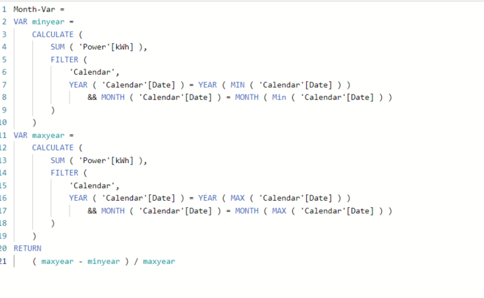
Hi, Thanks for your reply. I did what you said but still the line does not show anyting and sticks to the x-axis. Please note that I get [date] from another table named 'Calendar'
Helpful resources

Join our Fabric User Panel
Share feedback directly with Fabric product managers, participate in targeted research studies and influence the Fabric roadmap.

Power BI Monthly Update - February 2026
Check out the February 2026 Power BI update to learn about new features.

| User | Count |
|---|---|
| 61 | |
| 59 | |
| 42 | |
| 18 | |
| 15 |
| User | Count |
|---|---|
| 109 | |
| 102 | |
| 39 | |
| 29 | |
| 29 |


