A new Data Days event is coming soon!
This time we’re going bigger than ever. Fabric, Power BI, SQL, AI and more. We're covering it all. You won't want to miss it.
Learn more- Power BI forums
- Get Help with Power BI
- Desktop
- Service
- Report Server
- Power Query
- Mobile Apps
- Developer
- DAX Commands and Tips
- Custom Visuals Development Discussion
- Health and Life Sciences
- Power BI Spanish forums
- Translated Spanish Desktop
- Training and Consulting
- Instructor Led Training
- Dashboard in a Day for Women, by Women
- Galleries
- Data Stories Gallery
- Themes Gallery
- Contests Gallery
- QuickViz Gallery
- Quick Measures Gallery
- Visual Calculations Gallery
- Notebook Gallery
- Translytical Task Flow Gallery
- TMDL Gallery
- R Script Showcase
- Webinars and Video Gallery
- Ideas
- Custom Visuals Ideas (read-only)
- Issues
- Issues
- Events
- Upcoming Events
Level up your Power BI skills this month - build one visual each week and tell better stories with data! Get started
- Power BI forums
- Forums
- Get Help with Power BI
- Desktop
- Re: Decimals Conditional Format
- Subscribe to RSS Feed
- Mark Topic as New
- Mark Topic as Read
- Float this Topic for Current User
- Bookmark
- Subscribe
- Printer Friendly Page
- Mark as New
- Bookmark
- Subscribe
- Mute
- Subscribe to RSS Feed
- Permalink
- Report Inappropriate Content
Decimals Conditional Format
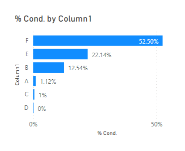
Hello – I have a bar chart where I transformed the # in show as to % of total. However categories which there are less than 1%, I want to show with two decimals, but the others, remain the round value. Is there a way to do it? I tried this way, but no success:
% Cond. = IF(([Total Employees Based on Selection])>0.01,
ROUND([Total Employees Based on Selection],2),
ROUND([Total Employees Based on Selection],0))
Thank you 🙂
Solved! Go to Solution.
- Mark as New
- Bookmark
- Subscribe
- Mute
- Subscribe to RSS Feed
- Permalink
- Report Inappropriate Content
@AnaAlbano
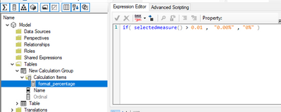
It is actually possible using a Calculation Group. I have attached a sample file below my signature.
You need to create a calculation group and set the format string as follows:
⭕ Subscribe and learn Power BI from these videos
⚪ Website ⚪ LinkedIn ⚪ PBI User Group
- Mark as New
- Bookmark
- Subscribe
- Mute
- Subscribe to RSS Feed
- Permalink
- Report Inappropriate Content
Thank you very much Fowmy! That works, but just for scenarios where there is no option to filter, correct? I added an slicer where the user could select each region, for instance, then I assume I need to create a group for each region, right?
- Mark as New
- Bookmark
- Subscribe
- Mute
- Subscribe to RSS Feed
- Permalink
- Report Inappropriate Content
@AnaAlbano
This will work regardless of any filter applied on the measure as long as you have the same condition that you need to use, in your case it is >0.01 .
⭕ Subscribe and learn Power BI from these videos
⚪ Website ⚪ LinkedIn ⚪ PBI User Group
- Mark as New
- Bookmark
- Subscribe
- Mute
- Subscribe to RSS Feed
- Permalink
- Report Inappropriate Content
Hey @AnaAlbano ,
you can use the round function to change the value, but the display in the bar chart stays the same for all numbers.
You could do that dynamically with the FORMAT function. But that will return a string what won't be possible to display in a bar chart:
Dynamic scaling of a measure in Power BI with DAX - What the fact.bi
You could split it into multiple measures, one for 2 decimals and one for 1 decimal and then add them to the bar chart. But I'm not sure if that's worth the effort.
For the same measure you cannot change the formatting by value for sure.
Helpful resources

Power BI Monthly Update - April 2026
Check out the April 2026 Power BI update to learn about new features.

Data Days 2026 coming soon!
Sign up to receive a private message when registration opens and key events begin.

New to Fabric Survey
If you have recently started exploring Fabric, we'd love to hear how it's going. Your feedback can help with product improvements.

| User | Count |
|---|---|
| 36 | |
| 33 | |
| 26 | |
| 24 | |
| 17 |
| User | Count |
|---|---|
| 67 | |
| 49 | |
| 32 | |
| 27 | |
| 22 |


