FabCon is coming to Atlanta
Join us at FabCon Atlanta from March 16 - 20, 2026, for the ultimate Fabric, Power BI, AI and SQL community-led event. Save $200 with code FABCOMM.
Register now!- Power BI forums
- Get Help with Power BI
- Desktop
- Service
- Report Server
- Power Query
- Mobile Apps
- Developer
- DAX Commands and Tips
- Custom Visuals Development Discussion
- Health and Life Sciences
- Power BI Spanish forums
- Translated Spanish Desktop
- Training and Consulting
- Instructor Led Training
- Dashboard in a Day for Women, by Women
- Galleries
- Data Stories Gallery
- Themes Gallery
- Contests Gallery
- Quick Measures Gallery
- Notebook Gallery
- Translytical Task Flow Gallery
- TMDL Gallery
- R Script Showcase
- Webinars and Video Gallery
- Ideas
- Custom Visuals Ideas (read-only)
- Issues
- Issues
- Events
- Upcoming Events
Calling all Data Engineers! Fabric Data Engineer (Exam DP-700) live sessions are back! Starting October 16th. Sign up.
- Power BI forums
- Forums
- Get Help with Power BI
- Desktop
- Re: Date hierarchy in KPI visual contains year onl...
- Subscribe to RSS Feed
- Mark Topic as New
- Mark Topic as Read
- Float this Topic for Current User
- Bookmark
- Subscribe
- Printer Friendly Page
- Mark as New
- Bookmark
- Subscribe
- Mute
- Subscribe to RSS Feed
- Permalink
- Report Inappropriate Content
Date hierarchy in KPI visual contains year only
Date hierarchy in KPI visual contains year only, why? I filtered the page with year=2016, have several value data on the first three months and I'd like to have the KPI visual showing his status month by month.
Solved! Go to Solution.
- Mark as New
- Bookmark
- Subscribe
- Mute
- Subscribe to RSS Feed
- Permalink
- Report Inappropriate Content
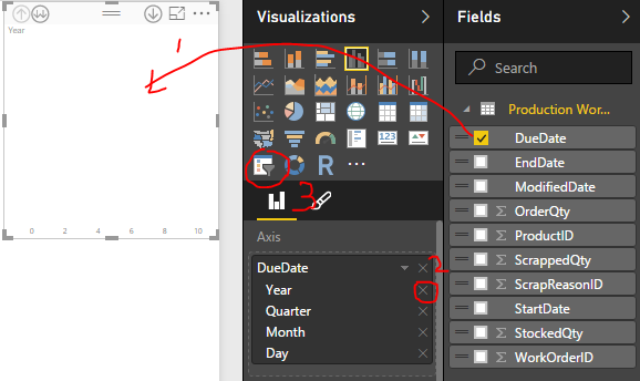
Date Hierarchies aren't supported in KPI and Slicer visuals. So only the top most item is shown (year in your cases). However, if you want to filter by other levels of the hierarchy, say Quarter, you can first drag the field out to create a line chart, and delete the year level in the fields list, then convert that visual into a KPI/slicer.
Meanwhile we are working to bring hierarchy support to these visuals
- Mark as New
- Bookmark
- Subscribe
- Mute
- Subscribe to RSS Feed
- Permalink
- Report Inappropriate Content
I am having this issue as well. I am selecting a date field in a slicer visual and when I select date hierarchy I only show year as an option. Previously I had done the same thing and would show other date parts, such as month, quarter, etc. I am using the latest PBI version. In addition, the date hierarchy comes up as expected when I use a bar chart.. just not for the slicer.
- Mark as New
- Bookmark
- Subscribe
- Mute
- Subscribe to RSS Feed
- Permalink
- Report Inappropriate Content
Follow me on Twitter: https://twitter.com/AdolfoSocorro
- Mark as New
- Bookmark
- Subscribe
- Mute
- Subscribe to RSS Feed
- Permalink
- Report Inappropriate Content
Date Hierarchies aren't supported in KPI and Slicer visuals. So only the top most item is shown (year in your cases). However, if you want to filter by other levels of the hierarchy, say Quarter, you can first drag the field out to create a line chart, and delete the year level in the fields list, then convert that visual into a KPI/slicer.
Meanwhile we are working to bring hierarchy support to these visuals
- Mark as New
- Bookmark
- Subscribe
- Mute
- Subscribe to RSS Feed
- Permalink
- Report Inappropriate Content
This solution doesn't work anymore, probably patched.
It continues to only show the year when you put a date in the slicer.
- Mark as New
- Bookmark
- Subscribe
- Mute
- Subscribe to RSS Feed
- Permalink
- Report Inappropriate Content
Hello @AGo
According to what I've understood, you want to have a KPI showing the status of your KPI with a date dimension.
Try this visual, it may help you.
On the other hand, if you want to see the status and not the tendance on a time line, I'm afraid you'll have to get a KPI visual showing the data, use the page filter for year, and getting a slicer with your month.
Hope it helps
Sébastien


