FabCon is coming to Atlanta
Join us at FabCon Atlanta from March 16 - 20, 2026, for the ultimate Fabric, Power BI, AI and SQL community-led event. Save $200 with code FABCOMM.
Register now!- Power BI forums
- Get Help with Power BI
- Desktop
- Service
- Report Server
- Power Query
- Mobile Apps
- Developer
- DAX Commands and Tips
- Custom Visuals Development Discussion
- Health and Life Sciences
- Power BI Spanish forums
- Translated Spanish Desktop
- Training and Consulting
- Instructor Led Training
- Dashboard in a Day for Women, by Women
- Galleries
- Data Stories Gallery
- Themes Gallery
- Contests Gallery
- QuickViz Gallery
- Quick Measures Gallery
- Visual Calculations Gallery
- Notebook Gallery
- Translytical Task Flow Gallery
- TMDL Gallery
- R Script Showcase
- Webinars and Video Gallery
- Ideas
- Custom Visuals Ideas (read-only)
- Issues
- Issues
- Events
- Upcoming Events
Get Fabric Certified for FREE during Fabric Data Days. Don't miss your chance! Request now
- Power BI forums
- Forums
- Get Help with Power BI
- Desktop
- Date field not accepted in Y axis Clustered Bar Ch...
- Subscribe to RSS Feed
- Mark Topic as New
- Mark Topic as Read
- Float this Topic for Current User
- Bookmark
- Subscribe
- Printer Friendly Page
- Mark as New
- Bookmark
- Subscribe
- Mute
- Subscribe to RSS Feed
- Permalink
- Report Inappropriate Content
Date field not accepted in Y axis Clustered Bar Chart
Hi
I want to show the three days with most transactions in a clustered bar chart.
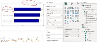
When I put my Date hierarchy on the Y axis it looks like this
I can drill down to the lowest level.
But I want it to show only the date, like 31-01-2022
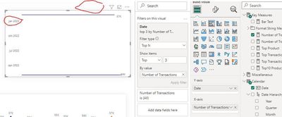
When I delete Year, Month and Quarter form the hierarchy or I put the Date field (the one above the hierarchy) in the Y axis , it becomes like this
Not able to drill down and showing only month and year.
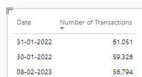
When I change this clustered bar chart in a table, it looks like this
Why can't the bar chart shwo the dates like 31-01-2022??
Regards
Ron
Solved! Go to Solution.
- Mark as New
- Bookmark
- Subscribe
- Mute
- Subscribe to RSS Feed
- Permalink
- Report Inappropriate Content
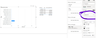
Hi, change to categorical instead of continuous
DID I ANSWER YOUR QUESTION? PLEASE MARK MY POST AS A SOLUTION! APPRECIATE YOUR KUDO/LIKE!
PROUD TO BE A SUPER USER!
Best Stories, Interesting Cases: PowerBI Storytime Newsletter
Linkedin Profile: Linkedin
YouTube Channel: PowerBI Storytime
- Mark as New
- Bookmark
- Subscribe
- Mute
- Subscribe to RSS Feed
- Permalink
- Report Inappropriate Content
- Mark as New
- Bookmark
- Subscribe
- Mute
- Subscribe to RSS Feed
- Permalink
- Report Inappropriate Content
Hi, change to categorical instead of continuous
DID I ANSWER YOUR QUESTION? PLEASE MARK MY POST AS A SOLUTION! APPRECIATE YOUR KUDO/LIKE!
PROUD TO BE A SUPER USER!
Best Stories, Interesting Cases: PowerBI Storytime Newsletter
Linkedin Profile: Linkedin
YouTube Channel: PowerBI Storytime
Helpful resources

Power BI Monthly Update - November 2025
Check out the November 2025 Power BI update to learn about new features.

Fabric Data Days
Advance your Data & AI career with 50 days of live learning, contests, hands-on challenges, study groups & certifications and more!

| User | Count |
|---|---|
| 103 | |
| 79 | |
| 57 | |
| 51 | |
| 46 |


