Fabric Data Days starts November 4th!
Advance your Data & AI career with 50 days of live learning, dataviz contests, hands-on challenges, study groups & certifications and more!
Get registered- Power BI forums
- Get Help with Power BI
- Desktop
- Service
- Report Server
- Power Query
- Mobile Apps
- Developer
- DAX Commands and Tips
- Custom Visuals Development Discussion
- Health and Life Sciences
- Power BI Spanish forums
- Translated Spanish Desktop
- Training and Consulting
- Instructor Led Training
- Dashboard in a Day for Women, by Women
- Galleries
- Data Stories Gallery
- Themes Gallery
- Contests Gallery
- Quick Measures Gallery
- Visual Calculations Gallery
- Notebook Gallery
- Translytical Task Flow Gallery
- TMDL Gallery
- R Script Showcase
- Webinars and Video Gallery
- Ideas
- Custom Visuals Ideas (read-only)
- Issues
- Issues
- Events
- Upcoming Events
Get Fabric Certified for FREE during Fabric Data Days. Don't miss your chance! Learn more
- Power BI forums
- Forums
- Get Help with Power BI
- Desktop
- Date changes in column graph based on slicer selec...
- Subscribe to RSS Feed
- Mark Topic as New
- Mark Topic as Read
- Float this Topic for Current User
- Bookmark
- Subscribe
- Printer Friendly Page
- Mark as New
- Bookmark
- Subscribe
- Mute
- Subscribe to RSS Feed
- Permalink
- Report Inappropriate Content
Date changes in column graph based on slicer selection
Hi, I also need help with a clustered column graph. I want to be able to compare the week that is being selected by the slicer with the previous week so for example if the slicer is week 32 then I want the column graph to display week 32 and week 31 costs. Please help
Solved! Go to Solution.
- Mark as New
- Bookmark
- Subscribe
- Mute
- Subscribe to RSS Feed
- Permalink
- Report Inappropriate Content
Hi@ sdas028
After my research, You can try to follow my steps like below:
Step 1:
Add a measure that contains last week costs
Last week =
VAR currWeek =
    MAX ( StoreSales[Week id] )
RETURN
    CALCULATE (
        SUM(StoreSales[costs]),
        FILTER (
            ALL(  StoreSales ),
            StoreSales[Week id]
                IN GENERATESERIES ( MAX ( currWeek - 1, 1 ), currWeek-1, 1 )
Step 2:
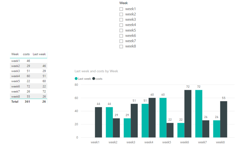
Add filed costs and measure Last week into Value of column chart and week into Axis
Result:
For example
After select week4
Here is DEMO, please try it.
Best Regards,
Lin
If this post helps, then please consider Accept it as the solution to help the other members find it more quickly.
- Mark as New
- Bookmark
- Subscribe
- Mute
- Subscribe to RSS Feed
- Permalink
- Report Inappropriate Content
Hi Lin,
Thanks for that, I figured out how to do it by adding in "This Week" and "Last Week" to the week dimension I had and then applying a filter for those labels and then a slicre for them also.
Thanks,
Sophie
Helpful resources

Fabric Data Days
Advance your Data & AI career with 50 days of live learning, contests, hands-on challenges, study groups & certifications and more!

Power BI Monthly Update - October 2025
Check out the October 2025 Power BI update to learn about new features.

| User | Count |
|---|---|
| 80 | |
| 49 | |
| 35 | |
| 31 | |
| 30 |


