Join us at FabCon Vienna from September 15-18, 2025
The ultimate Fabric, Power BI, SQL, and AI community-led learning event. Save €200 with code FABCOMM.
Get registered- Power BI forums
- Get Help with Power BI
- Desktop
- Service
- Report Server
- Power Query
- Mobile Apps
- Developer
- DAX Commands and Tips
- Custom Visuals Development Discussion
- Health and Life Sciences
- Power BI Spanish forums
- Translated Spanish Desktop
- Training and Consulting
- Instructor Led Training
- Dashboard in a Day for Women, by Women
- Galleries
- Data Stories Gallery
- Themes Gallery
- Contests Gallery
- Quick Measures Gallery
- Notebook Gallery
- Translytical Task Flow Gallery
- TMDL Gallery
- R Script Showcase
- Webinars and Video Gallery
- Ideas
- Custom Visuals Ideas (read-only)
- Issues
- Issues
- Events
- Upcoming Events
Compete to become Power BI Data Viz World Champion! First round ends August 18th. Get started.
- Power BI forums
- Forums
- Get Help with Power BI
- Desktop
- Re: Data flow mapping in power bi
- Subscribe to RSS Feed
- Mark Topic as New
- Mark Topic as Read
- Float this Topic for Current User
- Bookmark
- Subscribe
- Printer Friendly Page
- Mark as New
- Bookmark
- Subscribe
- Mute
- Subscribe to RSS Feed
- Permalink
- Report Inappropriate Content
Data flow mapping in power bi
Hello,
I am trying to visualize in power bi. I have two datasets named - entities and features.
Entity dataset consists of user id, employee business line, employee profile center
Features dataset consist of sender, recipient (which in in the same format as the user id)
For both the dataset the relationship is user id 1--many sender & user id 1--many recipient.
I want to visualize it in such a way where i will be able to see the data flow between business lines along with the sender and recipient names.
for example,
Sender 1 ------->Recepient 1
Sender Business line ------ >Recepient Business line
- Mark as New
- Bookmark
- Subscribe
- Mute
- Subscribe to RSS Feed
- Permalink
- Report Inappropriate Content
A dataflow is a collection of tables that are created and managed in workspaces in the Power BI service. A table is a set of columns that are used to store data, much like a table within a database. You can add and edit tables in your dataflow, as well as manage data refresh schedules, directly from the workspace in which your dataflow was created.
To create a dataflow, launch the Power BI service in a browser then select a workspace (dataflows are not available in my-workspace in the Power BI service) from the nav pane on the left, as shown in the following screen. You can also create a new workspace in which to create your new dataflow.
There are multiple ways to create or build on top of a new dataflow:
Create a dataflow using define new tables
Create a dataflow using linked tables
Create a dataflow using a computed table
Create a dataflow using import/export
This may help you,
Rachel Gomez
- Mark as New
- Bookmark
- Subscribe
- Mute
- Subscribe to RSS Feed
- Permalink
- Report Inappropriate Content
Have you tried duplicating the Entity dataset and name them Sender and Recipient. After setting up the relationships, you should be able to filter by Business Line or Profile Center for either Sender or Recipient (or both) .
Give it a try and let me know.
- Mark as New
- Bookmark
- Subscribe
- Mute
- Subscribe to RSS Feed
- Permalink
- Report Inappropriate Content
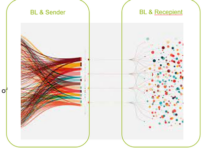
I tried, but i am confused which visual to use. since i want to show it flowing from sender to recepient and i also want to know from which business lines they are.
Something like this:
- Mark as New
- Bookmark
- Subscribe
- Mute
- Subscribe to RSS Feed
- Permalink
- Report Inappropriate Content
Take a look at a visual from MS called Chord that might work for you.
https://1drv.ms/u/s!AnF6rI36HAVkhPE1-cRFLfEqsq32aA?e=7dxy0t
a few more examples...
https://1drv.ms/u/s!AnF6rI36HAVkhPE3lENaOgqiCfkzyg?e=FWrJp6
- Mark as New
- Bookmark
- Subscribe
- Mute
- Subscribe to RSS Feed
- Permalink
- Report Inappropriate Content
Hi Sammy
This visual doesn't really do what you want if I understand your requirements.
I've looked at a few other visuals but nothing else seems close either.
Might be a job for... someone who knows R.


