FabCon is coming to Atlanta
Join us at FabCon Atlanta from March 16 - 20, 2026, for the ultimate Fabric, Power BI, AI and SQL community-led event. Save $200 with code FABCOMM.
Register now!- Power BI forums
- Get Help with Power BI
- Desktop
- Service
- Report Server
- Power Query
- Mobile Apps
- Developer
- DAX Commands and Tips
- Custom Visuals Development Discussion
- Health and Life Sciences
- Power BI Spanish forums
- Translated Spanish Desktop
- Training and Consulting
- Instructor Led Training
- Dashboard in a Day for Women, by Women
- Galleries
- Data Stories Gallery
- Themes Gallery
- Contests Gallery
- Quick Measures Gallery
- Visual Calculations Gallery
- Notebook Gallery
- Translytical Task Flow Gallery
- TMDL Gallery
- R Script Showcase
- Webinars and Video Gallery
- Ideas
- Custom Visuals Ideas (read-only)
- Issues
- Issues
- Events
- Upcoming Events
Calling all Data Engineers! Fabric Data Engineer (Exam DP-700) live sessions are back! Starting October 16th. Sign up.
- Power BI forums
- Forums
- Get Help with Power BI
- Desktop
- Re: Data Manipulation - Scatter Plot
- Subscribe to RSS Feed
- Mark Topic as New
- Mark Topic as Read
- Float this Topic for Current User
- Bookmark
- Subscribe
- Printer Friendly Page
- Mark as New
- Bookmark
- Subscribe
- Mute
- Subscribe to RSS Feed
- Permalink
- Report Inappropriate Content
Data Manipulation - Scatter Plot
I am fairly a newbie in Power BI, I am just trying to figure out how I can create a scatter graph. I have seen the example on tutorials in YouTube via power BI and the tutorial in https://powerbi.microsoft.com/en-us/documentation/powerbi-service-tutorial-scatter/ but I have not been able to get anywhere.
The issue I am having with is the way the data is represented at the moment. I am taking it from a database. The header of each column are as follows, Company ID, Audit ID, Risk, Security, Operations, Manage Changes (as per below).
| Company ID | Audit ID | Risk | Security | Operations | Manage Changes |
| 1 | 2 | 0 | 1 | 2 | 5 |
| 2 | 4 | 4 | 3 | 2 | 4 |
| 3 | 5 | 3 | 2 | 2 | 2 |
- Hence in the Company ID and Audit ID columns the data is unique and incremental.
- From the Risk column to Manage Changes, the data is from 0-5 depending on the result of the audit.
- I want to create a visual (Scatter graph is what I think would best illustrate) that groups all the the findings (ie. 0,1,2,3,4,5) on the X Axis.
- Group by Risk, Security, Operations, Manage Changes in the Y axis.
In a way at the simplest form of the question, I want to create multiple line chart that has the gratings on the y axis and Risk, Security, Operations, Manage Changes on the X axis.
Solved! Go to Solution.
- Mark as New
- Bookmark
- Subscribe
- Mute
- Subscribe to RSS Feed
- Permalink
- Report Inappropriate Content
Hi @magtuto,
According to your description, you want to drag multiple columns to the Scatter visual’s X and Y Axis, right?
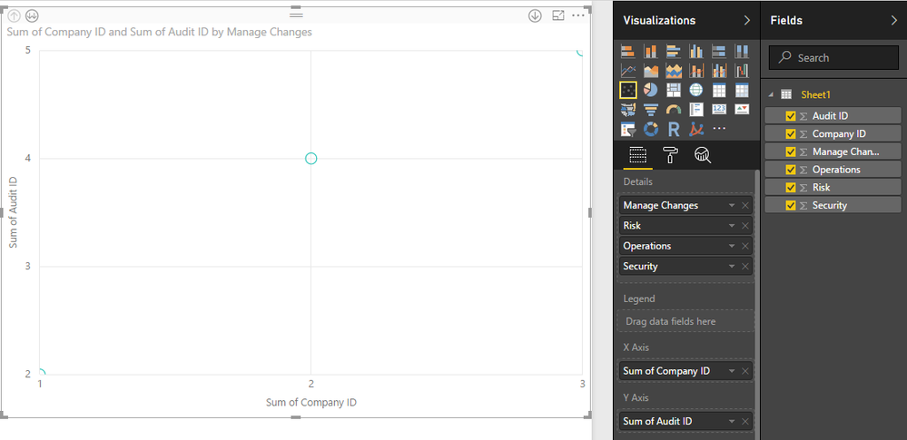
Based on test, it is impossible to drag multiple columns to Scatter visual’s X and Y Axis, it only support one field in X axis and Y axis. You can drag “Risk, Security, Operations, Manage Changes” columns to Details filed and use drip down/up feature to view the detail graph.
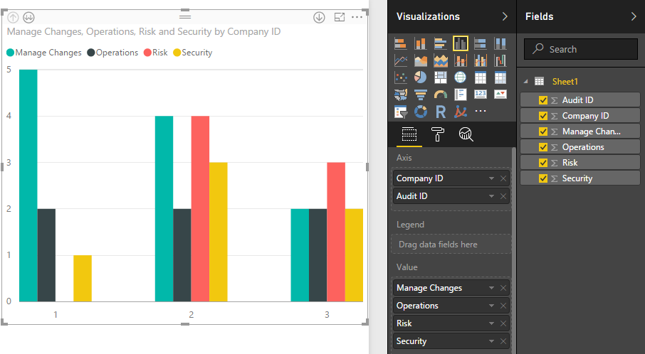
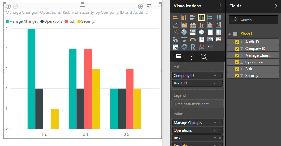
If you want to view these values more clearly, you can use the Clustered column chart, it supports multiple column, screenshots:
Regards,
Xiaoxin Sheng
- Mark as New
- Bookmark
- Subscribe
- Mute
- Subscribe to RSS Feed
- Permalink
- Report Inappropriate Content
Thanks for the reply.
After much procrastination, so that I cant get the desired effect, I broke the data into sections so that I can get a quasi scatter graph.
I agree that because the data is represented in such a way, it was imposible to create the scatter graph I was after.
- Mark as New
- Bookmark
- Subscribe
- Mute
- Subscribe to RSS Feed
- Permalink
- Report Inappropriate Content
Hi @magtuto,
Is there anything about Scatter char you not clear? If you have, please feel free to post.
Regards,
Xiaoxin Sheng
Helpful resources

FabCon Global Hackathon
Join the Fabric FabCon Global Hackathon—running virtually through Nov 3. Open to all skill levels. $10,000 in prizes!

Power BI Monthly Update - October 2025
Check out the October 2025 Power BI update to learn about new features.


