Join us at FabCon Vienna from September 15-18, 2025
The ultimate Fabric, Power BI, SQL, and AI community-led learning event. Save €200 with code FABCOMM.
Get registered- Power BI forums
- Get Help with Power BI
- Desktop
- Service
- Report Server
- Power Query
- Mobile Apps
- Developer
- DAX Commands and Tips
- Custom Visuals Development Discussion
- Health and Life Sciences
- Power BI Spanish forums
- Translated Spanish Desktop
- Training and Consulting
- Instructor Led Training
- Dashboard in a Day for Women, by Women
- Galleries
- Data Stories Gallery
- Themes Gallery
- Contests Gallery
- Quick Measures Gallery
- Notebook Gallery
- Translytical Task Flow Gallery
- TMDL Gallery
- R Script Showcase
- Webinars and Video Gallery
- Ideas
- Custom Visuals Ideas (read-only)
- Issues
- Issues
- Events
- Upcoming Events
Enhance your career with this limited time 50% discount on Fabric and Power BI exams. Ends September 15. Request your voucher.
- Power BI forums
- Forums
- Get Help with Power BI
- Desktop
- Re: Data Manipulation - Scatter Plot
- Subscribe to RSS Feed
- Mark Topic as New
- Mark Topic as Read
- Float this Topic for Current User
- Bookmark
- Subscribe
- Printer Friendly Page
- Mark as New
- Bookmark
- Subscribe
- Mute
- Subscribe to RSS Feed
- Permalink
- Report Inappropriate Content
Data Manipulation - Scatter Plot
I am fairly a newbie in Power BI, I am just trying to figure out how I can create a scatter graph. I have seen the example on tutorials in YouTube via power BI and the tutorial in https://powerbi.microsoft.com/en-us/documentation/powerbi-service-tutorial-scatter/ but I have not been able to get anywhere.
The issue I am having with is the way the data is represented at the moment. I am taking it from a database. The header of each column are as follows, Company ID, Audit ID, Risk, Security, Operations, Manage Changes (as per below).
| Company ID | Audit ID | Risk | Security | Operations | Manage Changes |
| 1 | 2 | 0 | 1 | 2 | 5 |
| 2 | 4 | 4 | 3 | 2 | 4 |
| 3 | 5 | 3 | 2 | 2 | 2 |
- Hence in the Company ID and Audit ID columns the data is unique and incremental.
- From the Risk column to Manage Changes, the data is from 0-5 depending on the result of the audit.
- I want to create a visual (Scatter graph is what I think would best illustrate) that groups all the the findings (ie. 0,1,2,3,4,5) on the X Axis.
- Group by Risk, Security, Operations, Manage Changes in the Y axis.
In a way at the simplest form of the question, I want to create multiple line chart that has the gratings on the y axis and Risk, Security, Operations, Manage Changes on the X axis.
Solved! Go to Solution.
- Mark as New
- Bookmark
- Subscribe
- Mute
- Subscribe to RSS Feed
- Permalink
- Report Inappropriate Content
Hi @magtuto,
According to your description, you want to drag multiple columns to the Scatter visual’s X and Y Axis, right?
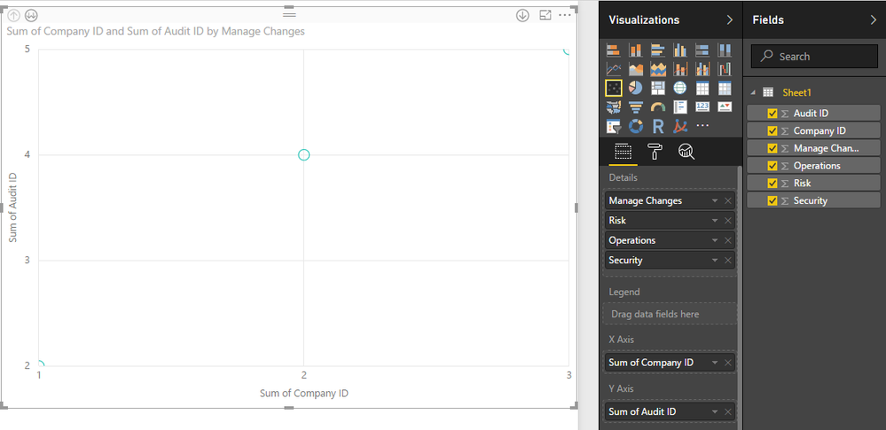
Based on test, it is impossible to drag multiple columns to Scatter visual’s X and Y Axis, it only support one field in X axis and Y axis. You can drag “Risk, Security, Operations, Manage Changes” columns to Details filed and use drip down/up feature to view the detail graph.
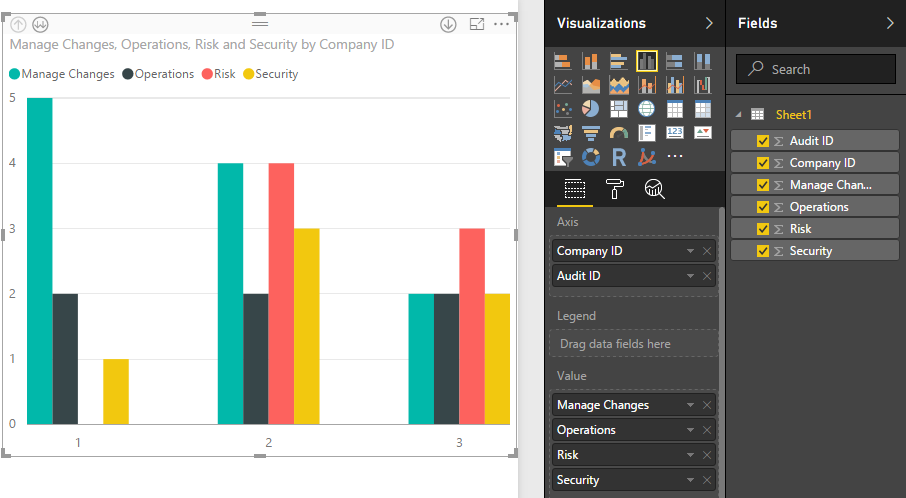
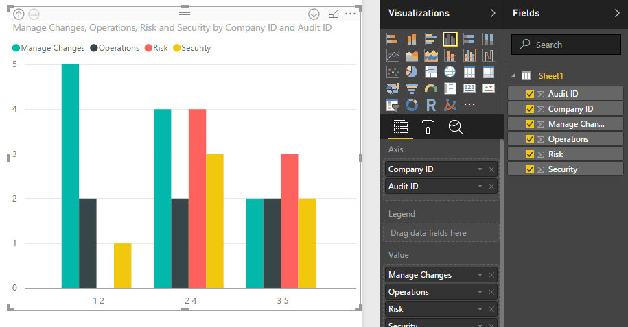
If you want to view these values more clearly, you can use the Clustered column chart, it supports multiple column, screenshots:
Regards,
Xiaoxin Sheng
- Mark as New
- Bookmark
- Subscribe
- Mute
- Subscribe to RSS Feed
- Permalink
- Report Inappropriate Content
Thanks for the reply.
After much procrastination, so that I cant get the desired effect, I broke the data into sections so that I can get a quasi scatter graph.
I agree that because the data is represented in such a way, it was imposible to create the scatter graph I was after.
- Mark as New
- Bookmark
- Subscribe
- Mute
- Subscribe to RSS Feed
- Permalink
- Report Inappropriate Content
Hi @magtuto,
Is there anything about Scatter char you not clear? If you have, please feel free to post.
Regards,
Xiaoxin Sheng
Helpful resources
| User | Count |
|---|---|
| 71 | |
| 64 | |
| 62 | |
| 50 | |
| 28 |
| User | Count |
|---|---|
| 117 | |
| 75 | |
| 62 | |
| 54 | |
| 43 |


