FabCon is coming to Atlanta
Join us at FabCon Atlanta from March 16 - 20, 2026, for the ultimate Fabric, Power BI, AI and SQL community-led event. Save $200 with code FABCOMM.
Register now!- Power BI forums
- Get Help with Power BI
- Desktop
- Service
- Report Server
- Power Query
- Mobile Apps
- Developer
- DAX Commands and Tips
- Custom Visuals Development Discussion
- Health and Life Sciences
- Power BI Spanish forums
- Translated Spanish Desktop
- Training and Consulting
- Instructor Led Training
- Dashboard in a Day for Women, by Women
- Galleries
- Data Stories Gallery
- Themes Gallery
- Contests Gallery
- QuickViz Gallery
- Quick Measures Gallery
- Visual Calculations Gallery
- Notebook Gallery
- Translytical Task Flow Gallery
- TMDL Gallery
- R Script Showcase
- Webinars and Video Gallery
- Ideas
- Custom Visuals Ideas (read-only)
- Issues
- Issues
- Events
- Upcoming Events
The Power BI Data Visualization World Championships is back! Get ahead of the game and start preparing now! Learn more
- Power BI forums
- Forums
- Get Help with Power BI
- Desktop
- Data Labels not always appearing on a Line and Sta...
- Subscribe to RSS Feed
- Mark Topic as New
- Mark Topic as Read
- Float this Topic for Current User
- Bookmark
- Subscribe
- Printer Friendly Page
- Mark as New
- Bookmark
- Subscribe
- Mute
- Subscribe to RSS Feed
- Permalink
- Report Inappropriate Content
Data Labels not always appearing on a Line and Stacked Column Chart
Hi All,
I have a Line and Stacked Column chart that should display the toal of the stacks in each column. I have it set up so that the data labels should show, however for some reason they appear on some bars but not on others - and as far as I can see there is no clear reason why. Has anyone seen this before?
Any help that could be given on this would be much appreciated.
Thanks
Darragh
- Mark as New
- Bookmark
- Subscribe
- Mute
- Subscribe to RSS Feed
- Permalink
- Report Inappropriate Content
Hello Anonimo.
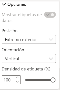
I found a solution, in the Format part, in the Data Label settings, an option called Tag density appears, upload it to 100% and all the details should appear.
I hope this helps you.
Best regards.
- Mark as New
- Bookmark
- Subscribe
- Mute
- Subscribe to RSS Feed
- Permalink
- Report Inappropriate Content
Hi, @Anonymous
Based on my test, It works properly. I created data to reproduce your scenario.
Then I created a measure to calculate the toal of the Score in each column.
Total =
CALCULATE(
    SUM('Table'[Score]),
    ALL('Table')
)
The data label is set as on. It appears correct.
You may try to go to 'Format', click 'Data label'=>'Customize series', modify the 'position' as 'Inside center'. Or you can try to increase the width and height of the visual to see if it helps.
Best Regards
Allan
If this post helps, then please consider Accept it as the solution to help the other members find it more quickly.
- Mark as New
- Bookmark
- Subscribe
- Mute
- Subscribe to RSS Feed
- Permalink
- Report Inappropriate Content
HI @Anonymous ,
Try to increase space between your bars and check for different data label sizes. You need try multiple combinations there under FORMAT section for this visual. Check-out for Minimum category, etc. options there.
Thanks,
Pragati
- Mark as New
- Bookmark
- Subscribe
- Mute
- Subscribe to RSS Feed
- Permalink
- Report Inappropriate Content
Hi @Anonymous ,
Go to formating, x-axis and try to playaround with Minimum category width and maximum size, it might help.
If not try to change the size of your chart, that will help too.
If it helps, please mark it as solution.
Thank you.
- Mark as New
- Bookmark
- Subscribe
- Mute
- Subscribe to RSS Feed
- Permalink
- Report Inappropriate Content
@Anonymous , Not very clear to me , But see if this is what you need
https://radacad.com/showing-the-total-value-in-stacked-column-chart-in-power-bi
- Mark as New
- Bookmark
- Subscribe
- Mute
- Subscribe to RSS Feed
- Permalink
- Report Inappropriate Content
@Anonymous can you share the screenshot what you are referrig too?
Subscribe to the @PowerBIHowTo YT channel for an upcoming video on List and Record functions in Power Query!!
Learn Power BI and Fabric - subscribe to our YT channel - Click here: @PowerBIHowTo
If my solution proved useful, I'd be delighted to receive Kudos. When you put effort into asking a question, it's equally thoughtful to acknowledge and give Kudos to the individual who helped you solve the problem. It's a small gesture that shows appreciation and encouragement! ❤
Did I answer your question? Mark my post as a solution. Proud to be a Super User! Appreciate your Kudos 🙂
Feel free to email me with any of your BI needs.
Helpful resources

Power BI Dataviz World Championships
The Power BI Data Visualization World Championships is back! Get ahead of the game and start preparing now!

| User | Count |
|---|---|
| 59 | |
| 47 | |
| 40 | |
| 40 | |
| 22 |
| User | Count |
|---|---|
| 175 | |
| 138 | |
| 118 | |
| 80 | |
| 54 |


