- Power BI forums
- Get Help with Power BI
- Desktop
- Service
- Report Server
- Power Query
- Mobile Apps
- Developer
- DAX Commands and Tips
- Custom Visuals Development Discussion
- Health and Life Sciences
- Power BI Spanish forums
- Translated Spanish Desktop
- Training and Consulting
- Instructor Led Training
- Dashboard in a Day for Women, by Women
- Galleries
- Data Stories Gallery
- Themes Gallery
- Contests Gallery
- QuickViz Gallery
- Quick Measures Gallery
- Visual Calculations Gallery
- Notebook Gallery
- Translytical Task Flow Gallery
- TMDL Gallery
- R Script Showcase
- Webinars and Video Gallery
- Ideas
- Custom Visuals Ideas (read-only)
- Issues
- Issues
- Events
- Upcoming Events
Learn from the best! Meet the four finalists headed to the FINALS of the Power BI Dataviz World Championships! Register now
- Power BI forums
- Forums
- Get Help with Power BI
- Desktop
- Data Labels Positioning Overlaps
- Subscribe to RSS Feed
- Mark Topic as New
- Mark Topic as Read
- Float this Topic for Current User
- Bookmark
- Subscribe
- Printer Friendly Page
- Mark as New
- Bookmark
- Subscribe
- Mute
- Subscribe to RSS Feed
- Permalink
- Report Inappropriate Content
Data Labels Positioning Overlaps
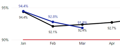
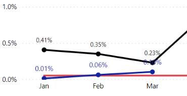
I have a scenario where I'm overlaying data from last year and this year on separate line graphs. The values are inevitably going to be very similar, so there is the potential to overlap. I have set the Data Labels for last year's data to display as black with a smaller font size and this year's data to be blue with a larger font size. Unfortunately, I've got a jumbled mess in certain scenarios. It would be nice to be able to slide things around manually in cases where the aesthetics don't align or even better to have some AI do it for me. I've toyed with adding backgrounds to the labels, but then you overshadow the line. It may not be a big issue for other users looking at this in Power BI itself with the interactivity, but for creating static extracts (i.e., PDFs/JPGs) it poses an issue for display purposes.
Looking for any workaround ideas or suggestions to make things look better. I hate to share this data looking the way it does.
Below are two examples:
- Here I have the current year's data (blue) displaying the Data Labels above the line and last year's data (black) displaying the Data Labels below the line. Worked great for Jan & Feb, but now with Mar data, my 2022 numbers dipped below 2021, so now my 91.8% is above the black line/data marker and the 92.4% is below the blue line/data marker. Not all that bad, but the Data Labels are very close to the opposite line, so aesthetically speaking, it's a little rough.
- Here I have things adjusted slightly different, where the current year's data (blue) is positioned Above the line and last year's data (black) is also positioned above the line. Unfortunately, in Mar I've run into an overlap of the data marker/line and the value from the other line.
- Mark as New
- Bookmark
- Subscribe
- Mute
- Subscribe to RSS Feed
- Permalink
- Report Inappropriate Content
Looks similar to this post Overlapping data labels in line-clustered bar char... - Microsoft Power BI Community
Regards,
Ritesh
Helpful resources

New to Fabric Survey
If you have recently started exploring Fabric, we'd love to hear how it's going. Your feedback can help with product improvements.

Power BI DataViz World Championships - June 2026
A new Power BI DataViz World Championship is coming this June! Don't miss out on submitting your entry.

Join our Fabric User Panel
Share feedback directly with Fabric product managers, participate in targeted research studies and influence the Fabric roadmap.

| User | Count |
|---|---|
| 57 | |
| 38 | |
| 34 | |
| 19 | |
| 16 |
| User | Count |
|---|---|
| 70 | |
| 66 | |
| 42 | |
| 32 | |
| 25 |


