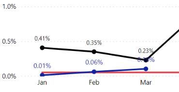
I have a scenario where I'm overlaying data from last year and this year on separate line graphs. The values are inevitably going to be very similar, so there is the potential to overlap. I have set the Data Labels for last year's data to display as black with a smaller font size and this year's data to be blue with a larger font size. Unfortunately, I've got a jumbled mess in certain scenarios. It would be nice to be able to slide things around manually in cases where the aesthetics don't align or even better to have some AI do it for me. I've toyed with adding backgrounds to the labels, but then you overshadow the line. It may not be a big issue for other users looking at this in Power BI itself with the interactivity, but for creating static extracts (i.e., PDFs/JPGs) it poses an issue for display purposes.
Looking for any workaround ideas or suggestions to make things look better. I hate to share this data looking the way it does.
Below are two examples:
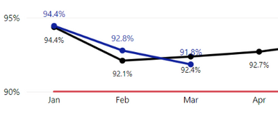
- Here I have the current year's data (blue) displaying the Data Labels above the line and last year's data (black) displaying the Data Labels below the line. Worked great for Jan & Feb, but now with Mar data, my 2022 numbers dipped below 2021, so now my 91.8% is above the black line/data marker and the 92.4% is below the blue line/data marker. Not all that bad, but the Data Labels are very close to the opposite line, so aesthetically speaking, it's a little rough.
- Here I have things adjusted slightly different, where the current year's data (blue) is positioned Above the line and last year's data (black) is also positioned above the line. Unfortunately, in Mar I've run into an overlap of the data marker/line and the value from the other line.