FabCon is coming to Atlanta
Join us at FabCon Atlanta from March 16 - 20, 2026, for the ultimate Fabric, Power BI, AI and SQL community-led event. Save $200 with code FABCOMM.
Register now!- Power BI forums
- Get Help with Power BI
- Desktop
- Service
- Report Server
- Power Query
- Mobile Apps
- Developer
- DAX Commands and Tips
- Custom Visuals Development Discussion
- Health and Life Sciences
- Power BI Spanish forums
- Translated Spanish Desktop
- Training and Consulting
- Instructor Led Training
- Dashboard in a Day for Women, by Women
- Galleries
- Data Stories Gallery
- Themes Gallery
- Contests Gallery
- QuickViz Gallery
- Quick Measures Gallery
- Visual Calculations Gallery
- Notebook Gallery
- Translytical Task Flow Gallery
- TMDL Gallery
- R Script Showcase
- Webinars and Video Gallery
- Ideas
- Custom Visuals Ideas (read-only)
- Issues
- Issues
- Events
- Upcoming Events
The Power BI Data Visualization World Championships is back! Get ahead of the game and start preparing now! Learn more
- Power BI forums
- Forums
- Get Help with Power BI
- Desktop
- Customize Y axis data interval
- Subscribe to RSS Feed
- Mark Topic as New
- Mark Topic as Read
- Float this Topic for Current User
- Bookmark
- Subscribe
- Printer Friendly Page
- Mark as New
- Bookmark
- Subscribe
- Mute
- Subscribe to RSS Feed
- Permalink
- Report Inappropriate Content
Customize Y axis data interval
Hello Gurus
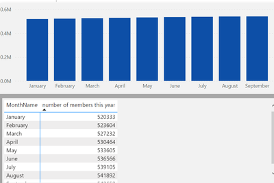
I have a graph where I show number of members per month. As you can see the change in the values is small and in the graph it shows like it has not change. Can I change the data range so that the graph shows the small increase?
Regards
PP
Solved! Go to Solution.
- Mark as New
- Bookmark
- Subscribe
- Mute
- Subscribe to RSS Feed
- Permalink
- Report Inappropriate Content
@PBIDEV_10 , from Aug 2021, release you can use measure in the start and end value of the axis. Create measure and use those
Start Value = minx(values(Table[Month]), [Measure]) -1
end Value = maxx(values(Table[Month]), [Measure]) +1
Use these in fx of start and end
- Mark as New
- Bookmark
- Subscribe
- Mute
- Subscribe to RSS Feed
- Permalink
- Report Inappropriate Content
Hi @PBIDEV_10,
AFAIK, current power bi seems not have a feature to auto-resize the axis ranges to fit your data bars.
For this scenario, I think you can refer to amitchandak 's point of view to changing the start/end range of the axis to help recognize the small difference between these values.
Customize X-axis and Y-axis properties - Power BI | Microsoft Docs
Regards,
Xiaoxin Sheng
- Mark as New
- Bookmark
- Subscribe
- Mute
- Subscribe to RSS Feed
- Permalink
- Report Inappropriate Content
@PBIDEV_10 , from Aug 2021, release you can use measure in the start and end value of the axis. Create measure and use those
Start Value = minx(values(Table[Month]), [Measure]) -1
end Value = maxx(values(Table[Month]), [Measure]) +1
Use these in fx of start and end
Helpful resources

Power BI Dataviz World Championships
The Power BI Data Visualization World Championships is back! Get ahead of the game and start preparing now!

| User | Count |
|---|---|
| 40 | |
| 35 | |
| 34 | |
| 31 | |
| 27 |
| User | Count |
|---|---|
| 135 | |
| 102 | |
| 67 | |
| 65 | |
| 56 |


