Get Fabric certified for FREE!
Don't miss your chance to take the Fabric Data Engineer (DP-600) exam for FREE! Find out how by attending the DP-600 session on April 23rd (pacific time), live or on-demand.
Learn more- Power BI forums
- Get Help with Power BI
- Desktop
- Service
- Report Server
- Power Query
- Mobile Apps
- Developer
- DAX Commands and Tips
- Custom Visuals Development Discussion
- Health and Life Sciences
- Power BI Spanish forums
- Translated Spanish Desktop
- Training and Consulting
- Instructor Led Training
- Dashboard in a Day for Women, by Women
- Galleries
- Data Stories Gallery
- Themes Gallery
- Contests Gallery
- QuickViz Gallery
- Quick Measures Gallery
- Visual Calculations Gallery
- Notebook Gallery
- Translytical Task Flow Gallery
- TMDL Gallery
- R Script Showcase
- Webinars and Video Gallery
- Ideas
- Custom Visuals Ideas (read-only)
- Issues
- Issues
- Events
- Upcoming Events
Next up in the FabCon + SQLCon recap series: The roadmap for Microsoft SQL and Maximizing Developer experiences in Fabric. All sessions are available on-demand after the live show. Register now
- Power BI forums
- Forums
- Get Help with Power BI
- Desktop
- Custom visual
- Subscribe to RSS Feed
- Mark Topic as New
- Mark Topic as Read
- Float this Topic for Current User
- Bookmark
- Subscribe
- Printer Friendly Page
- Mark as New
- Bookmark
- Subscribe
- Mute
- Subscribe to RSS Feed
- Permalink
- Report Inappropriate Content
Custom visual
Hello,
I want to display a particulart chart but I don't know if there is any visualization that can help me:
As you can see, I want to display the different categories of clientes according to the number of clients in each category. For example, category A may have 10 clients, whereas category E can have 50 clients. The sum of A, B, C, D and E does not represent the total number of clients, because one client can be in different categories at the same time.
Any idea if there is any visualization to represent this chart?
Many thanks!
Solved! Go to Solution.
- Mark as New
- Bookmark
- Subscribe
- Mute
- Subscribe to RSS Feed
- Permalink
- Report Inappropriate Content
Hi @afp141991,
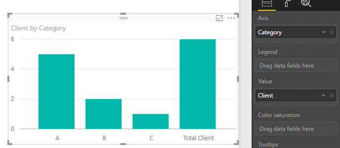
In Power BI, there is no such a visualization can represent data like above chart. To work around this, please try to create a calculate table. Table1 is the original table containing two columns [Category] and [Client].
Table2 =
UNION (
    SUMMARIZE (
        Table1,
        Table1[Category],
        "Client", DISTINCTCOUNT ( Table1[Client] )
    ),
    SUMMARIZE (
        SELECTCOLUMNS (
            Table1,
            "Category", "Total Client",
            "Client", DISTINCTCOUNT ( Table1[Client] )
        ),
        [Category],
        [Client]
    )
)
Then, create a column bar chart like below, add fields from Table2.
Best regards,
Yuliana Gu
If this post helps, then please consider Accept it as the solution to help the other members find it more quickly.
- Mark as New
- Bookmark
- Subscribe
- Mute
- Subscribe to RSS Feed
- Permalink
- Report Inappropriate Content
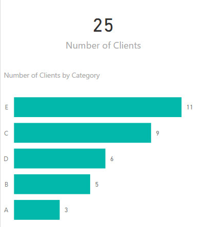
I would split the visual into two; have one visual (card) for the unique total of clients and then a stacked bar chart, sorted in descending order of number of clients with category on the axis.
The way you have it you can't easily compare the number of clients in each category....
Helpful resources

New to Fabric Survey
If you have recently started exploring Fabric, we'd love to hear how it's going. Your feedback can help with product improvements.

Power BI DataViz World Championships - June 2026
A new Power BI DataViz World Championship is coming this June! Don't miss out on submitting your entry.

Join our Fabric User Panel
Share feedback directly with Fabric product managers, participate in targeted research studies and influence the Fabric roadmap.

| User | Count |
|---|---|
| 48 | |
| 45 | |
| 41 | |
| 20 | |
| 17 |
| User | Count |
|---|---|
| 69 | |
| 64 | |
| 32 | |
| 31 | |
| 27 |


