Become a Certified Power BI Data Analyst!
Join us for an expert-led overview of the tools and concepts you'll need to pass exam PL-300. The first session starts on June 11th. See you there!
Get registered- Power BI forums
- Get Help with Power BI
- Desktop
- Service
- Report Server
- Power Query
- Mobile Apps
- Developer
- DAX Commands and Tips
- Custom Visuals Development Discussion
- Health and Life Sciences
- Power BI Spanish forums
- Translated Spanish Desktop
- Training and Consulting
- Instructor Led Training
- Dashboard in a Day for Women, by Women
- Galleries
- Webinars and Video Gallery
- Data Stories Gallery
- Themes Gallery
- Contests Gallery
- Quick Measures Gallery
- Notebook Gallery
- Translytical Task Flow Gallery
- R Script Showcase
- Ideas
- Custom Visuals Ideas (read-only)
- Issues
- Issues
- Events
- Upcoming Events
Power BI is turning 10! Let’s celebrate together with dataviz contests, interactive sessions, and giveaways. Register now.
- Power BI forums
- Forums
- Get Help with Power BI
- Desktop
- Re: Custom name legend
- Subscribe to RSS Feed
- Mark Topic as New
- Mark Topic as Read
- Float this Topic for Current User
- Bookmark
- Subscribe
- Printer Friendly Page
- Mark as New
- Bookmark
- Subscribe
- Mute
- Subscribe to RSS Feed
- Permalink
- Report Inappropriate Content
Custom name legend
I have data with following columns:
Product1.FaultA, Product1.FaultB, Product2.FaultA, Product2.FaultB etc.
I want to draw two pie charts (one for product 1 and one for 2) that tell how many faults of each type occures.
What I need help with is naming the legends for these charts. By default they say Product1.FaultA and so on. But this is long and confusing because there are only data from single product in this chart. I would like to rename legends without renaiming columns in data.
Solved! Go to Solution.
- Mark as New
- Bookmark
- Subscribe
- Mute
- Subscribe to RSS Feed
- Permalink
- Report Inappropriate Content
Your scenario is still confusing me. Maybe you're looking for something as below?
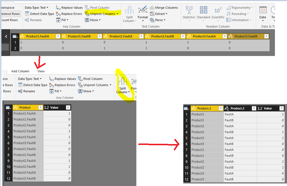
- Unpivot the table.
- Split the Product column by dot.
- Rename the column properly.
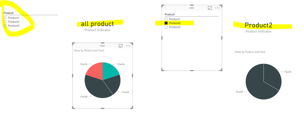
In report window, to avoid confusion, instead of individual pie charts, use one chart with slicer. Create a measure Product Indicator and show it in a Card visual.
Product Indicator = IF(ISFILTERED('Table'[Product]),LASTNONBLANK('Table'[Product],""),"all product")
Check more details in a
- Mark as New
- Bookmark
- Subscribe
- Mute
- Subscribe to RSS Feed
- Permalink
- Report Inappropriate Content
Hi all, I came across this video, which showed me how to make the measure names change dinamically and solved the issue.
- Mark as New
- Bookmark
- Subscribe
- Mute
- Subscribe to RSS Feed
- Permalink
- Report Inappropriate Content
I too have a similar requirement for customizing the Legend labels. I am using a filter on a measure in a clustered bar chart and I cannot afford to change the column name because it is being used in other charts. This is an important UI requirement. Please provide fix for this.
- Mark as New
- Bookmark
- Subscribe
- Mute
- Subscribe to RSS Feed
- Permalink
- Report Inappropriate Content
I too have same issue, we need to change the legend name based on the data loads. It should bind it to column data.
- Mark as New
- Bookmark
- Subscribe
- Mute
- Subscribe to RSS Feed
- Permalink
- Report Inappropriate Content
- Mark as New
- Bookmark
- Subscribe
- Mute
- Subscribe to RSS Feed
- Permalink
- Report Inappropriate Content
I too have a similar requirement for customizing the Legend labels. I am using a filter on a measure in a clustered bar chart and I cannot afford to change the column name because it is being used in other charts. This is an important UI requirement. Please provide fix for this.
- Mark as New
- Bookmark
- Subscribe
- Mute
- Subscribe to RSS Feed
- Permalink
- Report Inappropriate Content
Power BI seems to have a simple way of implementing this.
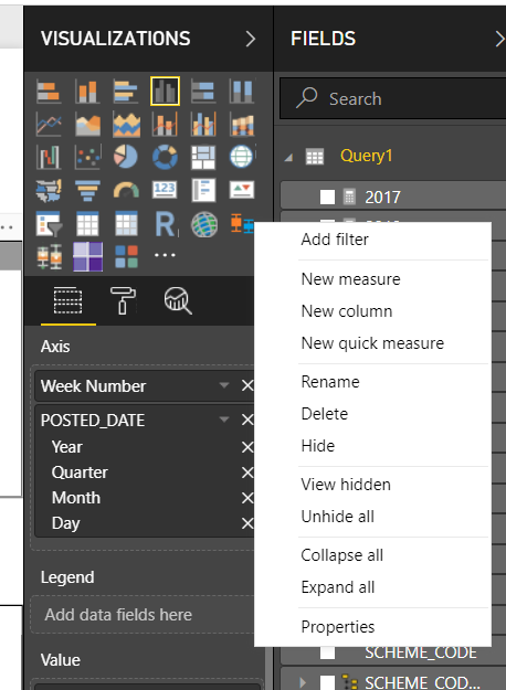
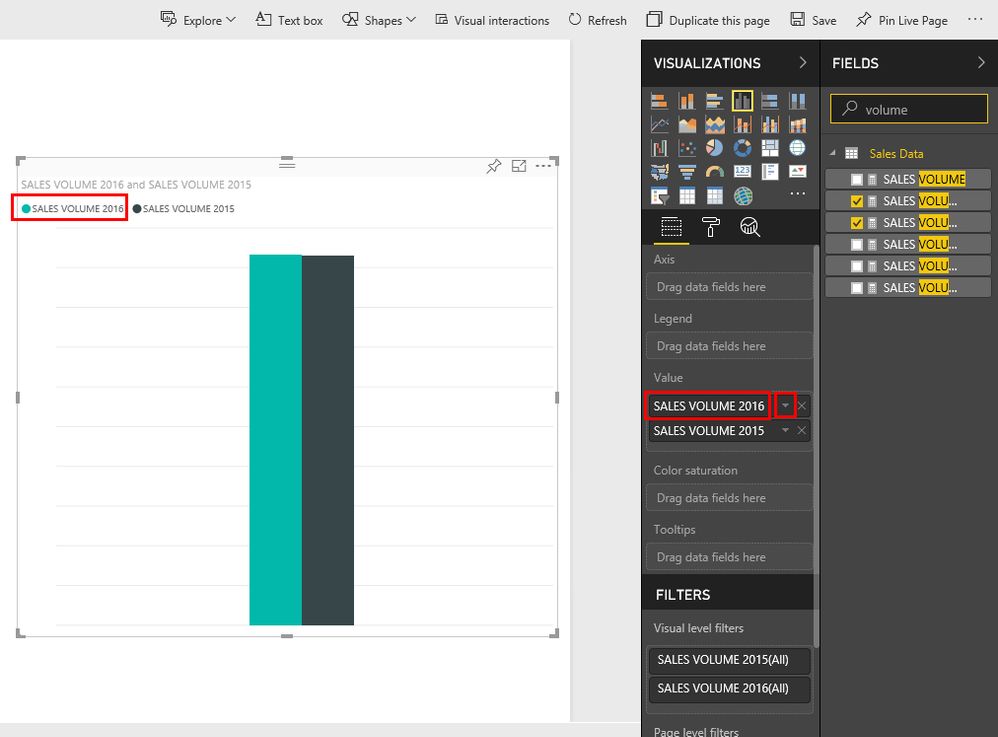
The first chart below shows the original labels that are populated based on the name of the measures. Follow the steps listed below to change the labels on your chart.
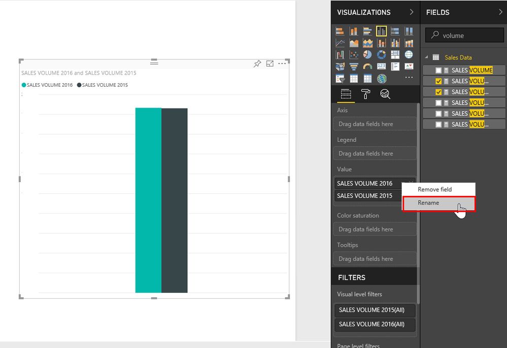
- Click your chart, and click the small triange next to the measure name on fields tab.
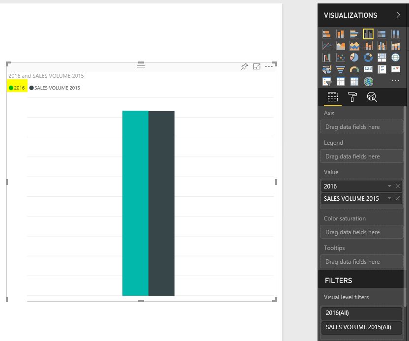
- Click the rename button and type the new Label that you want to show on the chart.
- Legend label is automatically updated with the new label value.
I hope this helps!!
Best Regards,
Satbir Minhas
- Mark as New
- Bookmark
- Subscribe
- Mute
- Subscribe to RSS Feed
- Permalink
- Report Inappropriate Content
Thank you! I wanted to know how to rename the legend and you covered it for me
- Mark as New
- Bookmark
- Subscribe
- Mute
- Subscribe to RSS Feed
- Permalink
- Report Inappropriate Content
Thank you! Your answer was simple and to the point. 🙂
- Mark as New
- Bookmark
- Subscribe
- Mute
- Subscribe to RSS Feed
- Permalink
- Report Inappropriate Content
- Mark as New
- Bookmark
- Subscribe
- Mute
- Subscribe to RSS Feed
- Permalink
- Report Inappropriate Content
Hi Satbir, thanks for your reply.
What you suggest is well when the meaures are year specific.
In my case my measures are relative.
that is i have a measure for last yaer, twoyears ago etc.
so each time data is refreshed its calculated based on current time.
when i open my report in 2017, i want last year lable to be named 2016.
at 2018 however the label for the same meaure should be 2017, automatically.
Any way to implement that?
Thank you.
- Mark as New
- Bookmark
- Subscribe
- Mute
- Subscribe to RSS Feed
- Permalink
- Report Inappropriate Content
Hi,
I am looking for maybe, a similar solution.....
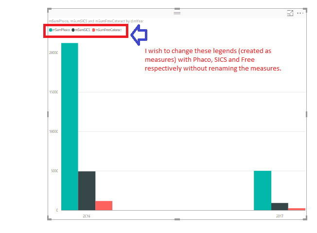
I have created certain measures like mSumPhaco, mSumSICS and mSumFreeCataract and have plotted it on clustered column chart. Obviously, name of the measures are appearing as legends. I wish to change the legends as per the image below. One way of doing so is ofcourse renaming the measures, but I do not want to do so.
Can that be achieved?
Thanks.
- Mark as New
- Bookmark
- Subscribe
- Mute
- Subscribe to RSS Feed
- Permalink
- Report Inappropriate Content
Hi Did you solved this problem,because i am also stuck in the same promblem,want to update the legend name of pie chart.
- Mark as New
- Bookmark
- Subscribe
- Mute
- Subscribe to RSS Feed
- Permalink
- Report Inappropriate Content
Hi - You can rename the legends from the fields menu
- Mark as New
- Bookmark
- Subscribe
- Mute
- Subscribe to RSS Feed
- Permalink
- Report Inappropriate Content
@AdamBuckley Thank you. This was introduced in one of the updates. Thank you anyways.
- Mark as New
- Bookmark
- Subscribe
- Mute
- Subscribe to RSS Feed
- Permalink
- Report Inappropriate Content
Hello deepvibha,
We discussed your question during the "Forum Aid" event of our user group.
You can try adding a custom column with the following if Text.Contains([ColumnName], "A") then "A" else "B"
Best regards,
Global & Virtual Power BI User Group
- Mark as New
- Bookmark
- Subscribe
- Mute
- Subscribe to RSS Feed
- Permalink
- Report Inappropriate Content
Thanks @edejes2,
I think I was not very clear in my question... here it is again - in a screenshot format:
Being "Measures", there are no columns to be renamed with an "If" statement.
If I have got you wrong... pl. let me know in details how to achieve it with your solution.
Thanks
- Mark as New
- Bookmark
- Subscribe
- Mute
- Subscribe to RSS Feed
- Permalink
- Report Inappropriate Content
If you right click the measure you can re-name the measure, that will reflect in your legend. Likewise, you can add a custom legend accessing the setting of the visualization.
I am not clear when you said that " Without remaining the measures" you don't want the measure that you apply?.
Best regards,
Global & Virtual Power BI User Group
- Mark as New
- Bookmark
- Subscribe
- Mute
- Subscribe to RSS Feed
- Permalink
- Report Inappropriate Content
I'm not sure why there is so much confusion around this question. I too am trying to accomplish what a few others are in this thread.
Simply, when you display a legend in a bar chart for example, the legend uses the name of the measures or columns. We wish to change the display name of the measures/columns in the Legend on the chart without renaming the actual measure/column. Power BI provides an option to give the Legend a title, but can you add a function so that we can change the display name for the measure/column?
- Mark as New
- Bookmark
- Subscribe
- Mute
- Subscribe to RSS Feed
- Permalink
- Report Inappropriate Content
Hi, I am new to using Power BI.
I was trying to solve exactly the same issue, but couldn't find the solution here.
What I did was - create a table containing two columns:
Col1: the legend types/names that you are trying to change on your report visual - use this column as an ID to create relationship with the current table.
Col2: The names/titles you would like to be displayed on your visual
Put your 2 original tables in the Axis, and add the new table we just created in the Axis as well - you now have 3 tables in the Axis.
Put the new table we just created into Legend. Hope it works for you too!
- Mark as New
- Bookmark
- Subscribe
- Mute
- Subscribe to RSS Feed
- Permalink
- Report Inappropriate Content
Thanks Iyasolis. I will give it a try and respond.
Helpful resources
| User | Count |
|---|---|
| 81 | |
| 75 | |
| 71 | |
| 42 | |
| 36 |
| User | Count |
|---|---|
| 114 | |
| 56 | |
| 51 | |
| 42 | |
| 42 |
