- Power BI forums
- Get Help with Power BI
- Desktop
- Service
- Report Server
- Power Query
- Mobile Apps
- Developer
- DAX Commands and Tips
- Custom Visuals Development Discussion
- Health and Life Sciences
- Power BI Spanish forums
- Translated Spanish Desktop
- Training and Consulting
- Instructor Led Training
- Dashboard in a Day for Women, by Women
- Galleries
- Data Stories Gallery
- Themes Gallery
- Contests Gallery
- QuickViz Gallery
- Quick Measures Gallery
- Visual Calculations Gallery
- Notebook Gallery
- Translytical Task Flow Gallery
- TMDL Gallery
- R Script Showcase
- Webinars and Video Gallery
- Ideas
- Custom Visuals Ideas (read-only)
- Issues
- Issues
- Events
- Upcoming Events
Learn from the best! Meet the four finalists headed to the FINALS of the Power BI Dataviz World Championships! Register now
- Power BI forums
- Forums
- Get Help with Power BI
- Desktop
- Custom Visualization Power KPI Matrix: Prepping da...
- Subscribe to RSS Feed
- Mark Topic as New
- Mark Topic as Read
- Float this Topic for Current User
- Bookmark
- Subscribe
- Printer Friendly Page
- Mark as New
- Bookmark
- Subscribe
- Mute
- Subscribe to RSS Feed
- Permalink
- Report Inappropriate Content
Custom Visualization Power KPI Matrix: Prepping data!
Hi!
I'm trying to use the KPI Matrix (imported from marketplace) and looked through this tutorial . Example of visualization:
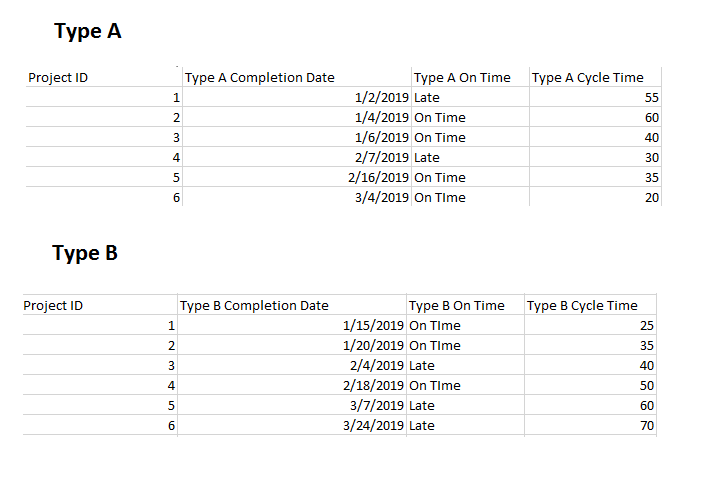
My data looks like this (ish). Type A and Type B are from different databases and different types of projects that our company does.
The metrics I want to display:
1. Number of completions for current month (and yearly trendline)
2. On Time percentage of projects for current month (and yearly trendline)
3. Average Cycle Time for that month (and yearly trendline)
Questions:
1. How do I have the current value reflect an average for the month, while the trendline shows for the year?
2. What the best way to create targets? For example, our cycle time target is 50 days. What's the best way to set arbitrary targets and implement into the KPI Matrix?
3. I'm not quite sure I understand the KPI Indicator Index and Value. It looks like you have to create a sort of variance? How should I do this?
4. The trendlines are currently connected to the completion dates, how do I change it where the trendlines show a monthly or weekly trend (not singular date data points)?
All of the tutorials I've seen seem to already have data in the right format -- can't seem to figure out how to get the data into that format -- any help is so appreciated!!!
- Mark as New
- Bookmark
- Subscribe
- Mute
- Subscribe to RSS Feed
- Permalink
- Report Inappropriate Content
hi, @Anonymous
For it is a custom visual, I would suggest you post it here, there will be many experts help you.
Best Regards,
Lin
If this post helps, then please consider Accept it as the solution to help the other members find it more quickly.
Helpful resources

Power BI DataViz World Championships - June 2026
A new Power BI DataViz World Championship is coming this June! Don't miss out on submitting your entry.

Join our Fabric User Panel
Share feedback directly with Fabric product managers, participate in targeted research studies and influence the Fabric roadmap.

| User | Count |
|---|---|
| 56 | |
| 33 | |
| 33 | |
| 18 | |
| 16 |
| User | Count |
|---|---|
| 68 | |
| 67 | |
| 45 | |
| 30 | |
| 26 |


