Get certified for free when you join Fabric Data Days 2026 and dive into Fabric, Power BI, SQL, AI, and other essential data skills.
Join nowJuly 7 - July 17 | Round 2 of the Power BI Dataviz World Championships. Don't miss your chance! Learn more
Hi,
I want to check if it is possible to customise the colors for a box and whisker plot custom visual. I see the data colors don't match with other plots and when I try to do it manually it doesn't work.
Hi, @Anonymous
Could you please show us some screenshots to point out the settings you have done and where the issue occurs. Do mask sensitive data before uploading. Thanks.
Best Regards
Allan
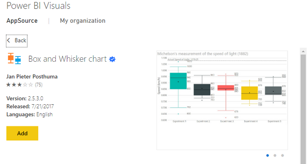
If you are using this one:
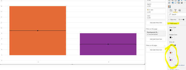
for me it just works as expected :
@Anonymous
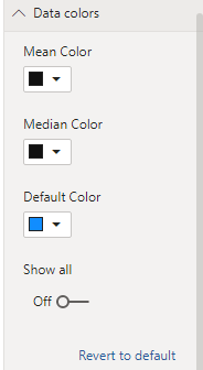
Yes I'm using the same one.. but mine doesn't match with other plots
and the default color is blue aswell? or yellow?
Join us in Barcelona for FabCon and SQLCon, the Fabric, Power BI, SQL, and AI community event. Save €200 with code FABCMTY200.
Join Data Days 2026: 60 days of free live/on-demand sessions, challenges, study groups, and certification opportunities.
| User | Count |
|---|---|
| 29 | |
| 23 | |
| 18 | |
| 18 | |
| 15 |
| User | Count |
|---|---|
| 51 | |
| 44 | |
| 43 | |
| 39 | |
| 32 |