- Power BI forums
- Get Help with Power BI
- Desktop
- Service
- Report Server
- Power Query
- Mobile Apps
- Developer
- DAX Commands and Tips
- Custom Visuals Development Discussion
- Health and Life Sciences
- Power BI Spanish forums
- Translated Spanish Desktop
- Training and Consulting
- Instructor Led Training
- Dashboard in a Day for Women, by Women
- Galleries
- Data Stories Gallery
- Themes Gallery
- Contests Gallery
- QuickViz Gallery
- Quick Measures Gallery
- Visual Calculations Gallery
- Notebook Gallery
- Translytical Task Flow Gallery
- TMDL Gallery
- R Script Showcase
- Webinars and Video Gallery
- Ideas
- Custom Visuals Ideas (read-only)
- Issues
- Issues
- Events
- Upcoming Events
Learn from the best! Meet the four finalists headed to the FINALS of the Power BI Dataviz World Championships! Register now
- Power BI forums
- Forums
- Get Help with Power BI
- Desktop
- Re: Cumulative rates yearly with a goal of 10% dec...
- Subscribe to RSS Feed
- Mark Topic as New
- Mark Topic as Read
- Float this Topic for Current User
- Bookmark
- Subscribe
- Printer Friendly Page
- Mark as New
- Bookmark
- Subscribe
- Mute
- Subscribe to RSS Feed
- Permalink
- Report Inappropriate Content
Cumulative rates yearly with a goal of 10% decrease
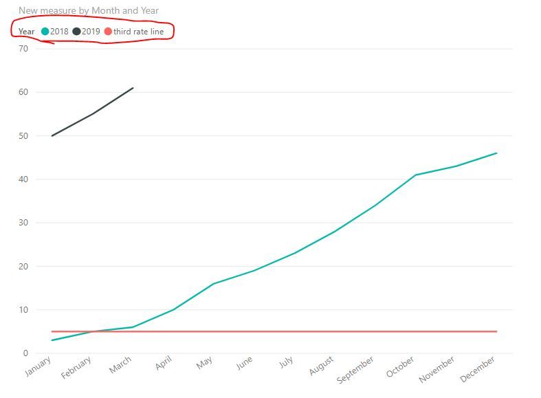
I have been working on this for 2 days now and I can not for the life of me figgure out how to show 2 cumulative rate lines one for 2018 and one for 2019 YTD allong with a third rate line that would be a 10% from 2018. This is what I have for the 2018 and 2019 YTD rates compared, but I can't figure out how to put that goal line.
Solved! Go to Solution.
- Mark as New
- Bookmark
- Subscribe
- Mute
- Subscribe to RSS Feed
- Permalink
- Report Inappropriate Content
HI, @Johnrobbinsjr
Based on my research, you could try this way:
Step1:
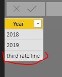
Add a dim year legend table
For example:
Then create the relationship with 'Calendar Work Hours'[Year]
Step2:
Create a new measure like this:
New measure = IF(SELECTEDVALUE('Dim year legend'[Year])="third rate line",[your 10% from 2018 measure] , [Cumulative Rate Yearly] )
Step3:
Drag the new measure into value and year field from dim year legend table into line chart visual.
Result:
simple example:
Best Regards,
Lin
If this post helps, then please consider Accept it as the solution to help the other members find it more quickly.
Helpful resources
| User | Count |
|---|---|
| 57 | |
| 43 | |
| 29 | |
| 17 | |
| 16 |
| User | Count |
|---|---|
| 73 | |
| 63 | |
| 44 | |
| 23 | |
| 22 |


