FabCon is coming to Atlanta
Join us at FabCon Atlanta from March 16 - 20, 2026, for the ultimate Fabric, Power BI, AI and SQL community-led event. Save $200 with code FABCOMM.
Register now!- Power BI forums
- Get Help with Power BI
- Desktop
- Service
- Report Server
- Power Query
- Mobile Apps
- Developer
- DAX Commands and Tips
- Custom Visuals Development Discussion
- Health and Life Sciences
- Power BI Spanish forums
- Translated Spanish Desktop
- Training and Consulting
- Instructor Led Training
- Dashboard in a Day for Women, by Women
- Galleries
- Data Stories Gallery
- Themes Gallery
- Contests Gallery
- QuickViz Gallery
- Quick Measures Gallery
- Visual Calculations Gallery
- Notebook Gallery
- Translytical Task Flow Gallery
- TMDL Gallery
- R Script Showcase
- Webinars and Video Gallery
- Ideas
- Custom Visuals Ideas (read-only)
- Issues
- Issues
- Events
- Upcoming Events
The Power BI Data Visualization World Championships is back! Get ahead of the game and start preparing now! Learn more
- Power BI forums
- Forums
- Get Help with Power BI
- Desktop
- Creating a survey visual
- Subscribe to RSS Feed
- Mark Topic as New
- Mark Topic as Read
- Float this Topic for Current User
- Bookmark
- Subscribe
- Printer Friendly Page
- Mark as New
- Bookmark
- Subscribe
- Mute
- Subscribe to RSS Feed
- Permalink
- Report Inappropriate Content
Creating a survey visual
Hello!
I'm very new to PowerBi, I'm running throught the tutorial videos but I couldn't see anything to help me with the below.
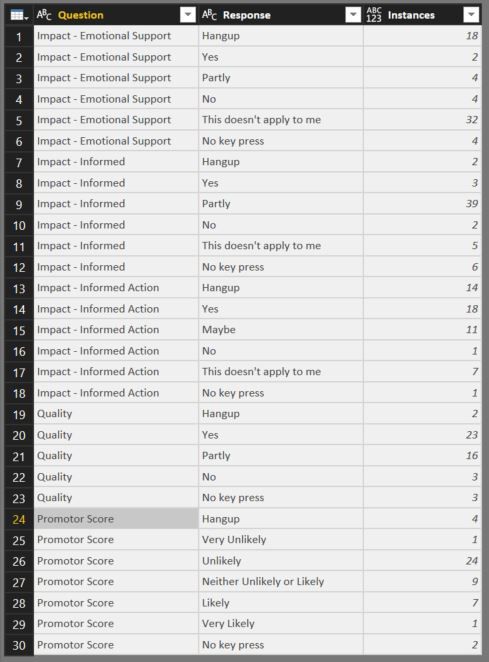
I'm trying to represent some survey feedback as a visual:
- There are 5 questions in the survey
- Each question has a different number of possible responses
- Instances is the number of times a person selected a response to a specific question.
How do I represent this information as a nice visual - possilby a stacked column chart
The data is below:
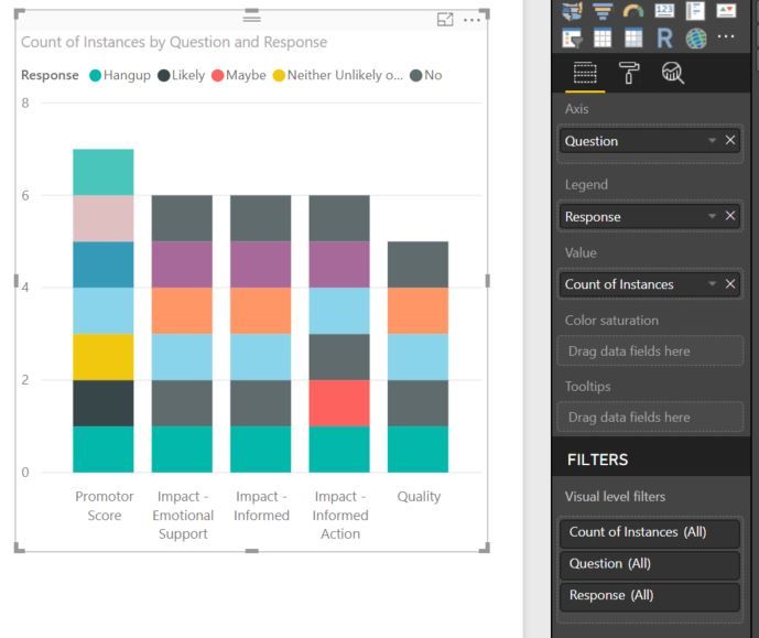
I've tried to create a stacked column chart, as below, but it's not working correctly. I had planned:
- Questions on the x axis
- Instances on the y axis
- Colour of the column segments denotes response.
- Size of the coloured column segments shows number of instances for that response.
How would I create this?
My failed attempt below 😞
Thanks for your help! 🙂
Solved! Go to Solution.
- Mark as New
- Bookmark
- Subscribe
- Mute
- Subscribe to RSS Feed
- Permalink
- Report Inappropriate Content
Hi @JWorthy,
Based on the image and the data you show you need to place:
Axis - Question
Value - Instances
Legend - Response
Should work as you want.
Regards,
MFelix
Regards
Miguel Félix
Did I answer your question? Mark my post as a solution!
Proud to be a Super User!
Check out my blog: Power BI em Português- Mark as New
- Bookmark
- Subscribe
- Mute
- Subscribe to RSS Feed
- Permalink
- Report Inappropriate Content
I've realised what the problem was.
The data type was ABC 123. When I changed it to just number it stoped making the values a 'Count'
Thanks for your help.
- Mark as New
- Bookmark
- Subscribe
- Mute
- Subscribe to RSS Feed
- Permalink
- Report Inappropriate Content
Hi @JWorthy,
Based on the image and the data you show you need to place:
Axis - Question
Value - Instances
Legend - Response
Should work as you want.
Regards,
MFelix
Regards
Miguel Félix
Did I answer your question? Mark my post as a solution!
Proud to be a Super User!
Check out my blog: Power BI em Português- Mark as New
- Bookmark
- Subscribe
- Mute
- Subscribe to RSS Feed
- Permalink
- Report Inappropriate Content
Hi @MFelix,
Thanks for your help.
When i set the axis, legend and values as you suggest I get each of the coloured segments as 1 unit large each, why is this happening? Is it something to do with 'Instances' being 'count of instances' when I place it under values? If so, how do I change this?
This is what happened:
- Mark as New
- Bookmark
- Subscribe
- Mute
- Subscribe to RSS Feed
- Permalink
- Report Inappropriate Content
I've realised what the problem was.
The data type was ABC 123. When I changed it to just number it stoped making the values a 'Count'
Thanks for your help.
Helpful resources

Power BI Dataviz World Championships
The Power BI Data Visualization World Championships is back! Get ahead of the game and start preparing now!

| User | Count |
|---|---|
| 40 | |
| 35 | |
| 34 | |
| 31 | |
| 28 |
| User | Count |
|---|---|
| 136 | |
| 102 | |
| 68 | |
| 66 | |
| 58 |


