cancel
Showing results for 
Search instead for 
Did you mean: 

A new Data Days event is coming soon! This time we’re going bigger than ever. Fabric, Power BI, SQL, AI and more. Don't miss out.

Reply
JWorthy
Advocate I
Advocate I

Creating a survey visual

Hello!


I'm very new to PowerBi, I'm running throught the tutorial videos but I couldn't see anything to help me with the below.


I'm trying to represent some survey feedback as a visual:

- There are 5 questions in the survey

- Each question has a different number of possible responses

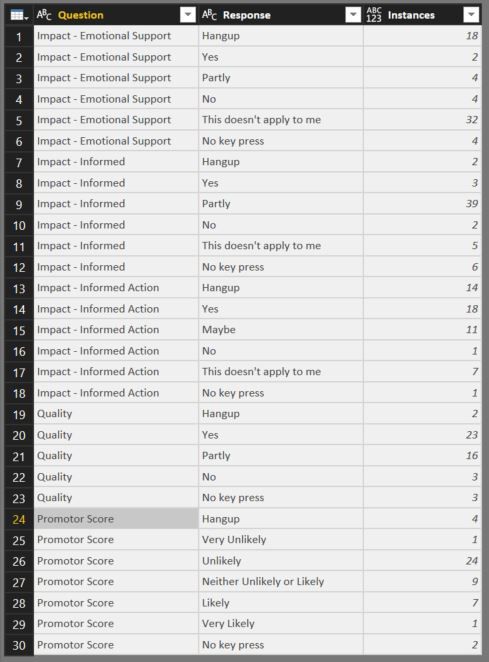
- Instances is the number of times a person selected a response to a specific question.


How do I represent this information as a nice visual - possilby a stacked column chart


The data is below:

Helpline survey Data.JPG


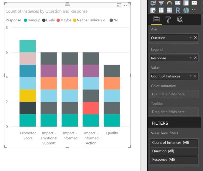
I've tried to create a stacked column chart, as below, but it's not working correctly. I had planned:

- Questions on the x axis

- Instances on the y axis

- Colour of the column segments denotes response.

- Size of the coloured column segments shows number of instances for that response.


How would I create this?


My failed attempt below 😞


Helpline survey sort of what I want.JPG


Thanks for your help! 🙂

2 ACCEPTED SOLUTIONS
MFelix
Super User
Super User

Hi @JWorthy,


Based on the image and the data you show you need to place:


Axis - Question

Value - Instances

Legend - Response


Should work as you want.


Regards,

MFelix


Regards

Miguel Félix


Did I answer your question? Mark my post as a solution!

Proud to be a Super User!

Check out my blog: Power BI em Português


View solution in original post

I've realised what the problem was.


The data type was ABC 123. When I changed it to just number it stoped making the values a 'Count'


Thanks for your help.

View solution in original post

3 REPLIES 3
MFelix
Super User
Super User

Hi @JWorthy,


Based on the image and the data you show you need to place:


Axis - Question

Value - Instances

Legend - Response


Should work as you want.


Regards,

MFelix


Regards

Miguel Félix


Did I answer your question? Mark my post as a solution!

Proud to be a Super User!

Check out my blog: Power BI em Português


Hi @MFelix,


Thanks for your help.


When i set the axis, legend and values as you suggest I get each of the coloured segments as 1 unit large each, why is this happening? Is it something to do with 'Instances' being 'count of instances' when I place it under values? If so, how do I change this?


This is what happened:

Helpline survey problem 2.JPG

I've realised what the problem was.


The data type was ABC 123. When I changed it to just number it stoped making the values a 'Count'


Thanks for your help.

Helpful resources

Announcements
May Power BI Update Carousel

Power BI Monthly Update - May 2026

Check out the May 2026 Power BI update to learn about new features.

Fabric SQL PBI Data Days

Data Days 2026 coming soon!

Sign up to receive a private message when registration opens and key events begin.

New to Fabric survey Carousel

New to Fabric Survey

If you have recently started exploring Fabric, we'd love to hear how it's going. Your feedback can help with product improvements.

Power BI DataViz World Championships carousel

Power BI DataViz World Championships - June 2026

A new Power BI DataViz World Championship is coming this June! Don't miss out on submitting your entry.