Join us at FabCon Vienna from September 15-18, 2025
The ultimate Fabric, Power BI, SQL, and AI community-led learning event. Save €200 with code FABCOMM.
Get registered- Power BI forums
- Get Help with Power BI
- Desktop
- Service
- Report Server
- Power Query
- Mobile Apps
- Developer
- DAX Commands and Tips
- Custom Visuals Development Discussion
- Health and Life Sciences
- Power BI Spanish forums
- Translated Spanish Desktop
- Training and Consulting
- Instructor Led Training
- Dashboard in a Day for Women, by Women
- Galleries
- Data Stories Gallery
- Themes Gallery
- Contests Gallery
- Quick Measures Gallery
- Notebook Gallery
- Translytical Task Flow Gallery
- TMDL Gallery
- R Script Showcase
- Webinars and Video Gallery
- Ideas
- Custom Visuals Ideas (read-only)
- Issues
- Issues
- Events
- Upcoming Events
Enhance your career with this limited time 50% discount on Fabric and Power BI exams. Ends August 31st. Request your voucher.
- Power BI forums
- Forums
- Get Help with Power BI
- Desktop
- Creating a constant line for each bar in a bar cha...
- Subscribe to RSS Feed
- Mark Topic as New
- Mark Topic as Read
- Float this Topic for Current User
- Bookmark
- Subscribe
- Printer Friendly Page
- Mark as New
- Bookmark
- Subscribe
- Mute
- Subscribe to RSS Feed
- Permalink
- Report Inappropriate Content
Creating a constant line for each bar in a bar chart
Hey everyone,
I have a short question of what the best way would be to eachieve something like this.
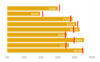
In my report I have a Bar chart, with 10 different bars. I'm looking to create a target line for each individual bar (illustrated below with red lines)
So for the first bar, they have achieved 59,8%, when their target was 61%.
For the second bar, they have achieved 38,9%, when their target was 41%, Etc.
As far as I'm aware, this is not possible with the default bar chart in Powerbi. So maybe I need to create 10 individual bullet charts?
Any suggestions? 😄
thanks.
Solved! Go to Solution.
- Mark as New
- Bookmark
- Subscribe
- Mute
- Subscribe to RSS Feed
- Permalink
- Report Inappropriate Content
Hi @Anonymous
Try the custom visual bullet chart.
https://appsource.microsoft.com/en-us/product/power-bi-visuals/WA104380755?tab=Overview
Regards
Miguel Félix
Did I answer your question? Mark my post as a solution!
Proud to be a Super User!
Check out my blog: Power BI em Português- Mark as New
- Bookmark
- Subscribe
- Mute
- Subscribe to RSS Feed
- Permalink
- Report Inappropriate Content
Ah I see. I checked out another bulletchart and that supported the features that I needed.
Thanks.
- Mark as New
- Bookmark
- Subscribe
- Mute
- Subscribe to RSS Feed
- Permalink
- Report Inappropriate Content
To my knowledge it is not possible to have multiple constant lines in the way that the image is displaying. What you could do instead is create another measure that calculates the difference between target and actual.
The only concern about this is that you will no longer see the target line once it's passed.
Br,
J
Connect on LinkedIn


