- Power BI forums
- Get Help with Power BI
- Desktop
- Service
- Report Server
- Power Query
- Mobile Apps
- Developer
- DAX Commands and Tips
- Custom Visuals Development Discussion
- Health and Life Sciences
- Power BI Spanish forums
- Translated Spanish Desktop
- Training and Consulting
- Instructor Led Training
- Dashboard in a Day for Women, by Women
- Galleries
- Data Stories Gallery
- Themes Gallery
- Contests Gallery
- QuickViz Gallery
- Quick Measures Gallery
- Visual Calculations Gallery
- Notebook Gallery
- Translytical Task Flow Gallery
- TMDL Gallery
- R Script Showcase
- Webinars and Video Gallery
- Ideas
- Custom Visuals Ideas (read-only)
- Issues
- Issues
- Events
- Upcoming Events
Learn from the best! Meet the four finalists headed to the FINALS of the Power BI Dataviz World Championships! Register now
- Power BI forums
- Forums
- Get Help with Power BI
- Desktop
- Create a Timeline visual from Multiple program dat...
- Subscribe to RSS Feed
- Mark Topic as New
- Mark Topic as Read
- Float this Topic for Current User
- Bookmark
- Subscribe
- Printer Friendly Page
- Mark as New
- Bookmark
- Subscribe
- Mute
- Subscribe to RSS Feed
- Permalink
- Report Inappropriate Content
Create a Timeline visual from Multiple program dates
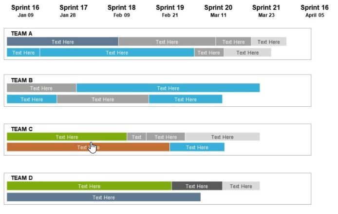
Is there way to create a timeline visual from the data below?
| Program | Date 1 | Date 2 | Date3 | Date4 | Date5 | Date6 | Date7 | Date8 | Date9 | Date10 | Date11 | Date12 | Date13 | Date14 | Date15 |
| Test 1 | 10/26/2020 | 1/1/2021 | 3/9/2021 | 5/15/2021 | 7/21/2021 | 9/26/2021 | 12/2/2021 | 2/7/2022 | 4/15/2022 | 6/21/2022 | 8/27/2022 | 11/2/2022 | 1/8/2023 | 3/16/2023 | 5/22/2023 |
| Test 2 | 9/9/2020 | 10/9/2020 | 11/9/2020 | 12/9/2020 | 1/9/2021 | 2/9/2021 | 3/9/2021 | 4/9/2021 | 5/9/2021 | 6/9/2021 | 7/9/2021 | 8/9/2021 | 9/9/2021 | 10/9/2021 | 11/9/2021 |
| Test 3 | 10/26/2020 | 3/1/2021 | 7/5/2021 | 11/8/2021 | 3/14/2022 | 7/18/2022 | 11/21/2022 | 3/27/2023 | 7/31/2023 | 12/4/2023 | 4/8/2024 | 8/12/2024 | 12/16/2024 | 4/21/2025 | 8/25/2025 |
Would be nice to have something like this? or anything visual other than table would be good?
- Mark as New
- Bookmark
- Subscribe
- Mute
- Subscribe to RSS Feed
- Permalink
- Report Inappropriate Content
@lotus22 , You have Gantt Chart visual. But this data format need some chnages
https://appsource.microsoft.com/en/product/power-bi-visuals/WA104380765?tab=Overview
https://www.mpug.com/articles/how-to-create-an-amazing-gantt-chart-in-power-bi/
another way is color matrix background.
Helpful resources

Power BI DataViz World Championships - June 2026
A new Power BI DataViz World Championship is coming this June! Don't miss out on submitting your entry.

Join our Fabric User Panel
Share feedback directly with Fabric product managers, participate in targeted research studies and influence the Fabric roadmap.

| User | Count |
|---|---|
| 46 | |
| 31 | |
| 29 | |
| 15 | |
| 15 |
| User | Count |
|---|---|
| 58 | |
| 56 | |
| 38 | |
| 21 | |
| 21 |

