Fabric Data Days starts November 4th!
Advance your Data & AI career with 50 days of live learning, dataviz contests, hands-on challenges, study groups & certifications and more!
Get registered- Power BI forums
- Get Help with Power BI
- Desktop
- Service
- Report Server
- Power Query
- Mobile Apps
- Developer
- DAX Commands and Tips
- Custom Visuals Development Discussion
- Health and Life Sciences
- Power BI Spanish forums
- Translated Spanish Desktop
- Training and Consulting
- Instructor Led Training
- Dashboard in a Day for Women, by Women
- Galleries
- Data Stories Gallery
- Themes Gallery
- Contests Gallery
- Quick Measures Gallery
- Visual Calculations Gallery
- Notebook Gallery
- Translytical Task Flow Gallery
- TMDL Gallery
- R Script Showcase
- Webinars and Video Gallery
- Ideas
- Custom Visuals Ideas (read-only)
- Issues
- Issues
- Events
- Upcoming Events
Get Fabric Certified for FREE during Fabric Data Days. Don't miss your chance! Learn more
- Power BI forums
- Forums
- Get Help with Power BI
- Desktop
- Re: Create Line Chart with multiple columns on axi...
- Subscribe to RSS Feed
- Mark Topic as New
- Mark Topic as Read
- Float this Topic for Current User
- Bookmark
- Subscribe
- Printer Friendly Page
- Mark as New
- Bookmark
- Subscribe
- Mute
- Subscribe to RSS Feed
- Permalink
- Report Inappropriate Content
Create Line Chart with multiple columns on axis
Hello PowerBi Community,
Im working on a project to monitor our Facebook campaign results. Among campaigns that don't use video's there are some campaigns that do use videos.
I work with a export file from Facebook with the following columns and values (example):
Source:
| Campaign_Name | Videoviews 25% | Videoviews 50% | Videoviews 75% | Videoviews 100% |
| A | 600 | 400 | 100 | 50 |
| B | 400 | 200 | 20 | 10 |
| C | null | null | null | null |
As you can see the export file puts the number of users that watched a video to a certain percentage in a column that describes that percentage.
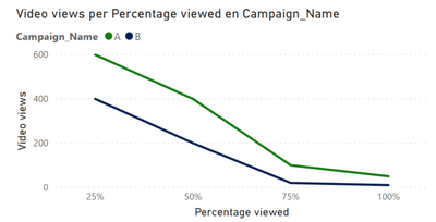
I want to plot the course on videoviews per campaign in a line chart like this:
I do not know if this is the desired way to do it but I came up with the though that the data should be transformed like this:
Transformed table:
| Campaign_Name | Percentage viewed | Video views |
| A | 25% | 600 |
| A | 50% | 400 |
| A | 75% | 100 |
| A | 100% | 50 |
| B | 25% | 400 |
| B | 50% | 200 |
| B | 75% | 20 |
| B | 100% | 10 |
Can you help me create this table within PowerBI / Power Query?
Thanks in advance!
Best Regards,
Isa
Solved! Go to Solution.
- Mark as New
- Bookmark
- Subscribe
- Mute
- Subscribe to RSS Feed
- Permalink
- Report Inappropriate Content
In Power Query, select columns you want to transform, then select Unpivot button on Transform tab.
Eugene
- Mark as New
- Bookmark
- Subscribe
- Mute
- Subscribe to RSS Feed
- Permalink
- Report Inappropriate Content
In Power Query, select columns you want to transform, then select Unpivot button on Transform tab.
Eugene
Helpful resources

Fabric Data Days
Advance your Data & AI career with 50 days of live learning, contests, hands-on challenges, study groups & certifications and more!

Power BI Monthly Update - October 2025
Check out the October 2025 Power BI update to learn about new features.

| User | Count |
|---|---|
| 80 | |
| 49 | |
| 35 | |
| 31 | |
| 30 |

