cancel
Showing results for 
Search instead for 
Did you mean: 

July 7 - July 17 | Round 2 of the Power BI Dataviz World Championships. Don't miss your chance! Learn more

Reply
BillyT_350
Helper V
Helper V

Crate Bar Chart using R Visual

Hello, I am having some trouble using the R visual to create a bar chart. Yes, I know I could do it with the vanilla tool, but because of certain end user requests, I can't use it because it lacks certain aesthetics. So, I thought I would try using the R visualization.


I have a table with lots of transactional data, 'Monthly'. 7 of the columns in this table record the volumes made on a day-of-week basis; MON_VOL, TUE_VOl, .... FRI_VOL, SAT_VOL. I want the sums of each of these DOW volumes to be its own vertical bar, with a label pertaining to the DOW; "Mon", "Tue", ...


I also want the sums to be responsive to a date slicer. Will this be the case by default, since in theory only the data filtered by the data slicer should go to the R visual, or will I have to code that as well?


I know very little about R, so I would apprecite any help you can provide.


I did some googling when I thought of the idea, and this is what I have so far:

1) It looks like I'll have to tell R that each of those columns is a column (they're objects?).

            The main obstacle I'm having to getting started is that I keep getting the error: "object not found"

2) Then I'll have to have it sum each column.

3) Then I can actually create the barplot:


barplot(dataset, main="Day of Week Volume", 
   xlab="Day of Week")


The greyed out section of the code was provided by Power BI. These are some notes I had from a discussion with a friend who dabbles in R.
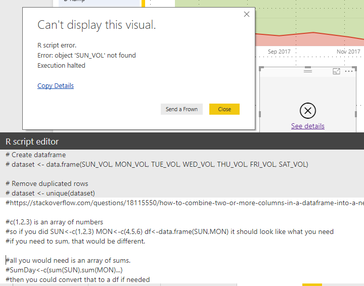
rbarplot.PNG


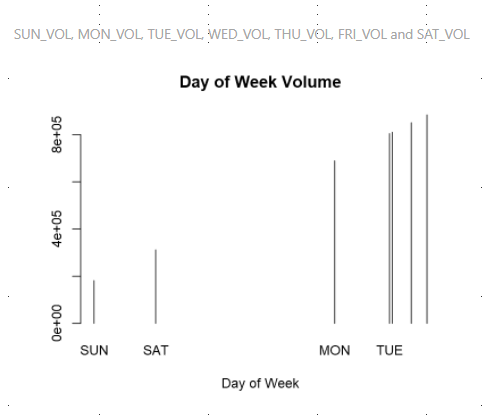
Addition: Getting a little closer now. Still not sure what's going on:

rbarplot2.PNG

4 REPLIES 4
v-jiascu-msft
Microsoft Employee
Microsoft Employee

Hi @BillyT_350,


Try the demo in the attachment, please. The names aren't the legend in your expected result.

bar_names <- c("MON", "TUE", "WED", "THU", "FRI", "SAT", "SUN")
bar_height <- unlist(dataset[1, ])
barplot(dataset, main = "Day of Week Volumn", xlab = "Day of Week", height = bar_height, width = 3000, col = 'red', beside = FALSE, names.arg = bar_names)

create_bar_chart


Best Regards,

Dale

Community Support Team _ Dale
If this post helps, then please consider Accept it as the solution to help the other members find it more quickly.

@v-jiascu-msft Dale,


Thank you for the suggestion. However, using that code, I get the following result, which was very similar to one of the ones that I posted in the OP. Also, I notice that the data seems to be in ascending order, rather than by the order in which they were coded into the visual, or the labels. Is there a way to change this?

Capture.PNG

Hi @BillyT_350,


Can you share your data? A dummy one is enough? It would also be great if you can share the expected result?


Best Regards,

Dale

Community Support Team _ Dale
If this post helps, then please consider Accept it as the solution to help the other members find it more quickly.

@v-jiascu-msft No, a dummy chart will not work. The chart needs to update depending on the selections of the user.

Let me see what I can put together for you as far as dummy data.

Helpful resources

Announcements
FabCon and SQLCon Barcelona 2026

FabCon & SQLCon – Barcelona 2026

Join us in Barcelona for FabCon and SQLCon, the Fabric, Power BI, SQL, and AI community event. Save €200 with code FABCMTY200.

60 days of Data Days Carousel

Data Days 2026

Join Data Days 2026: 60 days of free live/on-demand sessions, challenges, study groups, and certification opportunities.

Power BI DataViz World Championships carousel

Power BI DataViz World Championships - June 2026

A new Power BI DataViz World Championship is coming this June! Don't miss out on submitting your entry.

Top Solution Authors