FabCon is coming to Atlanta
Join us at FabCon Atlanta from March 16 - 20, 2026, for the ultimate Fabric, Power BI, AI and SQL community-led event. Save $200 with code FABCOMM.
Register now!- Power BI forums
- Get Help with Power BI
- Desktop
- Service
- Report Server
- Power Query
- Mobile Apps
- Developer
- DAX Commands and Tips
- Custom Visuals Development Discussion
- Health and Life Sciences
- Power BI Spanish forums
- Translated Spanish Desktop
- Training and Consulting
- Instructor Led Training
- Dashboard in a Day for Women, by Women
- Galleries
- Data Stories Gallery
- Themes Gallery
- Contests Gallery
- QuickViz Gallery
- Quick Measures Gallery
- Visual Calculations Gallery
- Notebook Gallery
- Translytical Task Flow Gallery
- TMDL Gallery
- R Script Showcase
- Webinars and Video Gallery
- Ideas
- Custom Visuals Ideas (read-only)
- Issues
- Issues
- Events
- Upcoming Events
Get Fabric Certified for FREE during Fabric Data Days. Don't miss your chance! Request now
- Power BI forums
- Forums
- Get Help with Power BI
- Desktop
- Count and Display Repeated Date Values
- Subscribe to RSS Feed
- Mark Topic as New
- Mark Topic as Read
- Float this Topic for Current User
- Bookmark
- Subscribe
- Printer Friendly Page
- Mark as New
- Bookmark
- Subscribe
- Mute
- Subscribe to RSS Feed
- Permalink
- Report Inappropriate Content
Count and Display Repeated Date Values
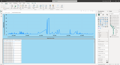
Hi! I am trying to figure out how to display a longitudinal graph that displays a count (how many people registered per day) over time. I can do it with "import"ed data by dragging the same dataset into the X and Y axes, where the Y axis is defined as "Count of Column 1" - as shown here:
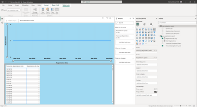
That's easy enough, but the problem is that I have to use DirectQuery because it is being fed via SQL from the reporting service (Reporting 2.0 in the Cornerstone Learning Management System). Converting or transforming the data in any way I can think of keeps giving me the old "you have to convert the data to import" dialog. At this point, what I'm getting is simply returning a "1" - which kind of makes sense, but is not what I need - as shown here:
Is there a column, measure, DAX expression or something else I can use to make this data correlation? Any help is appreciated, I am a newbie who knows just enough to be dangerous.
Solved! Go to Solution.
- Mark as New
- Bookmark
- Subscribe
- Mute
- Subscribe to RSS Feed
- Permalink
- Report Inappropriate Content
Hey @csalinas ,
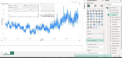
for now, I have no idea of what's going on your site, as I can create a line chart that puts a column of type date/time (date works the same) into the X-axis bucket and the same column to the Y-axis bucket (using count as the aggregation function). As you can see from the image below, I'm getting data from a data source connected in direct query mode (a SQL Server):
Nevertheless, the DAX below creates a measure that counts the days, it returns the no of occurrences and returns the same line chart:
count of occurences =
COUNT(
    'FactOnlineSales'[DateKey]
)
And the picture:
Hopefully, this provides an idea of how to tackle your challenge.
Regards,
Tom
Did I answer your question? Mark my post as a solution, this will help others!
Proud to be a Super User!
I accept Kudos 😉
Hamburg, Germany
- Mark as New
- Bookmark
- Subscribe
- Mute
- Subscribe to RSS Feed
- Permalink
- Report Inappropriate Content
Hi, I wanted to follow up on the resulution here, which was a little different than expected. I was able to convince the database cat in our organization to let me use Import data instead of DirectQuery. After doing that, it worked you decsribed. I guess sometimes a different angle can be the way to go. Thanks again!
- Mark as New
- Bookmark
- Subscribe
- Mute
- Subscribe to RSS Feed
- Permalink
- Report Inappropriate Content
Hi Tom. Thank you for responding. I believe at least part of my problem is that the "count" option is not avalable in the drop down menu on either the X or Y axis. That's what seems to make the data work on the document with the data Import (as opposed to the DirectQuery). Creating a new measure with the count function you shared is giving me a grand total of everything. And the documentation for the COUNT Dax function is saying, "a
This function is not supported for use in DirectQuery mode when used in calculated columns or row-level security (RLS) rules."
The problem maybe lies somewhere in one of those things, I'm just not sure which. Thank you so much, I really appreciate the insight, it's helping me think through the problem!
Helpful resources

Power BI Monthly Update - November 2025
Check out the November 2025 Power BI update to learn about new features.

Fabric Data Days
Advance your Data & AI career with 50 days of live learning, contests, hands-on challenges, study groups & certifications and more!


