- Power BI forums
- Updates
- News & Announcements
- Get Help with Power BI
- Desktop
- Service
- Report Server
- Power Query
- Mobile Apps
- Developer
- DAX Commands and Tips
- Custom Visuals Development Discussion
- Health and Life Sciences
- Power BI Spanish forums
- Translated Spanish Desktop
- Power Platform Integration - Better Together!
- Power Platform Integrations (Read-only)
- Power Platform and Dynamics 365 Integrations (Read-only)
- Training and Consulting
- Instructor Led Training
- Dashboard in a Day for Women, by Women
- Galleries
- Community Connections & How-To Videos
- COVID-19 Data Stories Gallery
- Themes Gallery
- Data Stories Gallery
- R Script Showcase
- Webinars and Video Gallery
- Quick Measures Gallery
- 2021 MSBizAppsSummit Gallery
- 2020 MSBizAppsSummit Gallery
- 2019 MSBizAppsSummit Gallery
- Events
- Ideas
- Custom Visuals Ideas
- Issues
- Issues
- Events
- Upcoming Events
- Community Blog
- Power BI Community Blog
- Custom Visuals Community Blog
- Community Support
- Community Accounts & Registration
- Using the Community
- Community Feedback
Register now to learn Fabric in free live sessions led by the best Microsoft experts. From Apr 16 to May 9, in English and Spanish.
- Power BI forums
- Forums
- Get Help with Power BI
- Desktop
- Re: Convert matrix table to clustered column chart
- Subscribe to RSS Feed
- Mark Topic as New
- Mark Topic as Read
- Float this Topic for Current User
- Bookmark
- Subscribe
- Printer Friendly Page
- Mark as New
- Bookmark
- Subscribe
- Mute
- Subscribe to RSS Feed
- Permalink
- Report Inappropriate Content
Convert matrix table to clustered column chart
Hello,
I'd like to set up a clustered column chart to show the changes in target duration from this current fiscal year compared to the previous fiscal year.
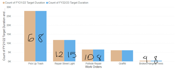
There are 5 work order categories with different target duration times. I'd like to display this in a column chart with the Work orders desccription on the X axis and the columns representing target durations for FY21/22 vs FY22/23. However, my target duration values are aggregating and showing the count for each target duration category. Is there a way to mimic the values shown on my matrix to a clustered column chart.
Something like the below (without aggregating values)
My two target duration columns are set to Text format and are not summarized.
Thank you
Solved! Go to Solution.
- Mark as New
- Bookmark
- Subscribe
- Mute
- Subscribe to RSS Feed
- Permalink
- Report Inappropriate Content
You can either:
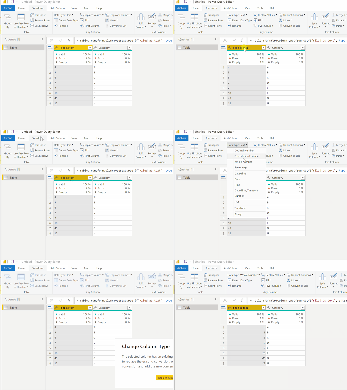
a) Change the field type in Power Query or table view to whole number
b) if you need the values as text for other purposes, you can convert the text field to a number using a measure:
Text as number measure =
VALUE(MAX('Table'[Filed as text]))
Did I answer your question? Mark my post as a solution!
In doing so, you are also helping me. Thank you!
Proud to be a Super User!
Paul on Linkedin.
- Mark as New
- Bookmark
- Subscribe
- Mute
- Subscribe to RSS Feed
- Permalink
- Report Inappropriate Content
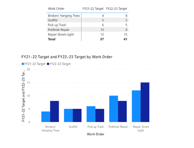
Hi @Anonymous , How is your data structured? I tried to replicate based on the information provided and was able to get the below result just by turning the matrix into a clustered column chart.
Is this your desired end result?
- Mark as New
- Bookmark
- Subscribe
- Mute
- Subscribe to RSS Feed
- Permalink
- Report Inappropriate Content
Hi @johncolley , yes that is exactly the result I'm trying to acheive! When I try to convert my matrix to a clustered column chart, the target values move to the tooltips section. When I try to move them to the "values" section, that is when it aggregates to show the count of the values.
I have two seperate columns for these target values and currently set up as "text" data type.
- Mark as New
- Bookmark
- Subscribe
- Mute
- Subscribe to RSS Feed
- Permalink
- Report Inappropriate Content
You can either:
a) Change the field type in Power Query or table view to whole number
b) if you need the values as text for other purposes, you can convert the text field to a number using a measure:
Text as number measure =
VALUE(MAX('Table'[Filed as text]))
Did I answer your question? Mark my post as a solution!
In doing so, you are also helping me. Thank you!
Proud to be a Super User!
Paul on Linkedin.
- Mark as New
- Bookmark
- Subscribe
- Mute
- Subscribe to RSS Feed
- Permalink
- Report Inappropriate Content
Thank you! That worked perfectly. I had tried to change the data type to a whole number previously in my data table, but I guess I had to change it directly from power query.
Helpful resources

Microsoft Fabric Learn Together
Covering the world! 9:00-10:30 AM Sydney, 4:00-5:30 PM CET (Paris/Berlin), 7:00-8:30 PM Mexico City

Power BI Monthly Update - April 2024
Check out the April 2024 Power BI update to learn about new features.

| User | Count |
|---|---|
| 96 | |
| 94 | |
| 82 | |
| 70 | |
| 64 |
| User | Count |
|---|---|
| 116 | |
| 106 | |
| 94 | |
| 79 | |
| 72 |


