Fabric Data Days starts November 4th!
Advance your Data & AI career with 50 days of live learning, dataviz contests, hands-on challenges, study groups & certifications and more!
Get registered- Power BI forums
- Get Help with Power BI
- Desktop
- Service
- Report Server
- Power Query
- Mobile Apps
- Developer
- DAX Commands and Tips
- Custom Visuals Development Discussion
- Health and Life Sciences
- Power BI Spanish forums
- Translated Spanish Desktop
- Training and Consulting
- Instructor Led Training
- Dashboard in a Day for Women, by Women
- Galleries
- Data Stories Gallery
- Themes Gallery
- Contests Gallery
- QuickViz Gallery
- Quick Measures Gallery
- Visual Calculations Gallery
- Notebook Gallery
- Translytical Task Flow Gallery
- TMDL Gallery
- R Script Showcase
- Webinars and Video Gallery
- Ideas
- Custom Visuals Ideas (read-only)
- Issues
- Issues
- Events
- Upcoming Events
Get Fabric Certified for FREE during Fabric Data Days. Don't miss your chance! Request now
- Power BI forums
- Forums
- Get Help with Power BI
- Desktop
- Re: Constant y-axis value based on field value?
- Subscribe to RSS Feed
- Mark Topic as New
- Mark Topic as Read
- Float this Topic for Current User
- Bookmark
- Subscribe
- Printer Friendly Page
- Mark as New
- Bookmark
- Subscribe
- Mute
- Subscribe to RSS Feed
- Permalink
- Report Inappropriate Content
Constant y-axis value based on field value?
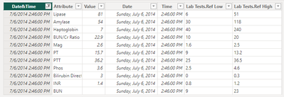
I would like to show the high and low reference values as a line on a line chart along with the actual test value, but I struggling with how to approach the problem. The data table looks like this:
Thanks for any suggestions.
Solved! Go to Solution.
- Mark as New
- Bookmark
- Subscribe
- Mute
- Subscribe to RSS Feed
- Permalink
- Report Inappropriate Content
Hi @MojoGene
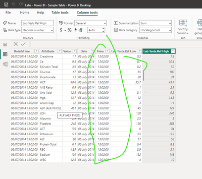
There is no option to work with your sample data file because all data is about the same point in time + the values are not equal to the values on the pictures....
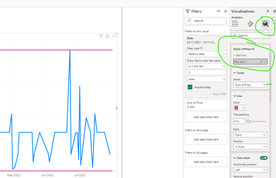
in general, you can add constant lines in this way :
After creating a line graph :
and then format it.
Maximum line in the same way.
These lines are dynamic:
Pbix is attached.
More guides about working with constant lines :
https://www.easytweaks.com/add-horizontal-line-power-bi-chart-visual/
https://blogs.perficient.com/2023/05/03/analytics-pane-in-power-bi-part1/
If this post helps, then please consider Accepting it as the solution to help the other members find it more quickly
Rita Fainshtein | Microsoft MVP
https://www.linkedin.com/in/rita-fainshtein/
Blog : https://www.madeiradata.com/profile/ritaf/profile
- Mark as New
- Bookmark
- Subscribe
- Mute
- Subscribe to RSS Feed
- Permalink
- Report Inappropriate Content
Hi @MojoGene
Now your sample has just one test ....if I understand correctly the table that you attached.
So I used again my file.
You can create customized constants.
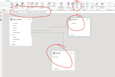
Ob the first step you need to create dimensions for date and lab tests with unique values.
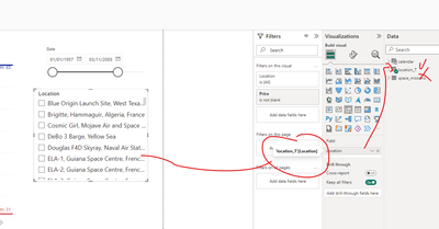
These dimensions should be used as slicers and categories on the graph
Then you can create measures for constants :
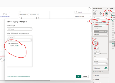
Result :
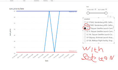
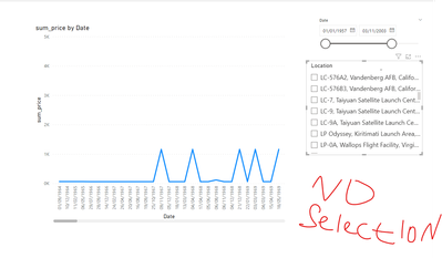
PBIX is attached
More information about dimension tables :
If this post helps, then please consider Accepting it as the solution to help the other members find it more quickly
Rita Fainshtein | Microsoft MVP
https://www.linkedin.com/in/rita-fainshtein/
Blog : https://www.madeiradata.com/profile/ritaf/profile
- Mark as New
- Bookmark
- Subscribe
- Mute
- Subscribe to RSS Feed
- Permalink
- Report Inappropriate Content
Hi @MojoGene
You can work with every time granularity that you want, just create a time dimension table.
https://www.youtube.com/watch?v=-q7v56p192M&t=15s
If this post helps, then please consider Accepting it as the solution to help the other members find it more quickly
Rita Fainshtein | Microsoft MVP
https://www.linkedin.com/in/rita-fainshtein/
Blog : https://www.madeiradata.com/profile/ritaf/profile
- Mark as New
- Bookmark
- Subscribe
- Mute
- Subscribe to RSS Feed
- Permalink
- Report Inappropriate Content
@MojoGene
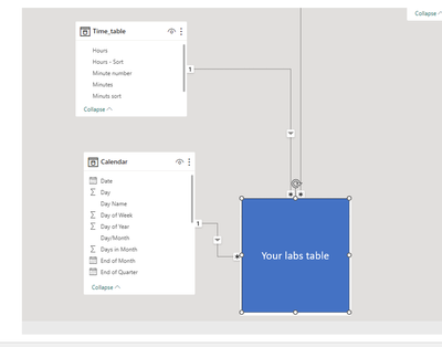
You need to work with both date and time dimensions hierarchically:
If this post helps, then please consider Accepting it as the solution to help the other members find it more quickly
Rita Fainshtein | Microsoft MVP
https://www.linkedin.com/in/rita-fainshtein/
Blog : https://www.madeiradata.com/profile/ritaf/profile
- Mark as New
- Bookmark
- Subscribe
- Mute
- Subscribe to RSS Feed
- Permalink
- Report Inappropriate Content
Hi @MojoGene
Glad to help.
According to the problems with the granularity, please post it as a new question, and attach a pbix with the model that you created with enough data (not one day, one lab, etc...) and expected results.
Rita Fainshtein | Microsoft MVP
https://www.linkedin.com/in/rita-fainshtein/
Blog : https://www.madeiradata.com/profile/ritaf/profile
- Mark as New
- Bookmark
- Subscribe
- Mute
- Subscribe to RSS Feed
- Permalink
- Report Inappropriate Content
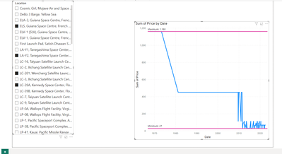
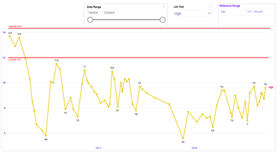
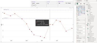
The intent is to show the lab value on a line chart with the high/low range of normal values like this:
- Mark as New
- Bookmark
- Subscribe
- Mute
- Subscribe to RSS Feed
- Permalink
- Report Inappropriate Content
- Mark as New
- Bookmark
- Subscribe
- Mute
- Subscribe to RSS Feed
- Permalink
- Report Inappropriate Content
Hi @MojoGene
This is a data table, I still don't understand what you are trying to achieve....can you show an example?
Rita Fainshtein | Microsoft MVP
https://www.linkedin.com/in/rita-fainshtein/
Blog : https://www.madeiradata.com/profile/ritaf/profile
- Mark as New
- Bookmark
- Subscribe
- Mute
- Subscribe to RSS Feed
- Permalink
- Report Inappropriate Content
Hi and thanks for jumping in. The chart effect I am trying to achieve is shown on the image as mentioned above. The significance of any lab value must be assessed in relation to what is "normal," i.e., the range of expected values. I was thinking that this might be accomplished with dynamic constant lines that change with the lab test.
- Mark as New
- Bookmark
- Subscribe
- Mute
- Subscribe to RSS Feed
- Permalink
- Report Inappropriate Content
Hi @MojoGene
There is no option to work with your sample data file because all data is about the same point in time + the values are not equal to the values on the pictures....
in general, you can add constant lines in this way :
After creating a line graph :
and then format it.
Maximum line in the same way.
These lines are dynamic:
Pbix is attached.
More guides about working with constant lines :
https://www.easytweaks.com/add-horizontal-line-power-bi-chart-visual/
https://blogs.perficient.com/2023/05/03/analytics-pane-in-power-bi-part1/
If this post helps, then please consider Accepting it as the solution to help the other members find it more quickly
Rita Fainshtein | Microsoft MVP
https://www.linkedin.com/in/rita-fainshtein/
Blog : https://www.madeiradata.com/profile/ritaf/profile
- Mark as New
- Bookmark
- Subscribe
- Mute
- Subscribe to RSS Feed
- Permalink
- Report Inappropriate Content
Thanks again for the reply. It occurred to me (duh!) as I was reading your reply that I uploaded data filtered for multiple tests at only one date/time. I should have filtered the data for a single test over multiple date/times as shown in the image. The constant lines I have in mind would only work with one lab test selected. With two or more selected the reference lines would clutter and confuse the chart.
So, I would need to display the high/low reference values with a measure that showed the lines when only one test was selected.
- Mark as New
- Bookmark
- Subscribe
- Mute
- Subscribe to RSS Feed
- Permalink
- Report Inappropriate Content
Hi @MojoGene
Now your sample has just one test ....if I understand correctly the table that you attached.
So I used again my file.
You can create customized constants.
Ob the first step you need to create dimensions for date and lab tests with unique values.
These dimensions should be used as slicers and categories on the graph
Then you can create measures for constants :

Result :


PBIX is attached
More information about dimension tables :
If this post helps, then please consider Accepting it as the solution to help the other members find it more quickly
Rita Fainshtein | Microsoft MVP
https://www.linkedin.com/in/rita-fainshtein/
Blog : https://www.madeiradata.com/profile/ritaf/profile
- Mark as New
- Bookmark
- Subscribe
- Mute
- Subscribe to RSS Feed
- Permalink
- Report Inappropriate Content
Thanks again for your extraordinary effort. I can follow your explanation very well, but this will not work for my needs because the time dimension on the calendar (days) forces the lab results to be summarized for each day. The test results are most meaningful when shown as individual, non-aggregated values. The test results might provide some useful information if aggregated as AVE, MIN or MAX, but a SUM is meaningless for this context.
Would I be able to get HOURS on the x-axis?
- Mark as New
- Bookmark
- Subscribe
- Mute
- Subscribe to RSS Feed
- Permalink
- Report Inappropriate Content
Hi @MojoGene
You can work with every time granularity that you want, just create a time dimension table.
https://www.youtube.com/watch?v=-q7v56p192M&t=15s
If this post helps, then please consider Accepting it as the solution to help the other members find it more quickly
Rita Fainshtein | Microsoft MVP
https://www.linkedin.com/in/rita-fainshtein/
Blog : https://www.madeiradata.com/profile/ritaf/profile
- Mark as New
- Bookmark
- Subscribe
- Mute
- Subscribe to RSS Feed
- Permalink
- Report Inappropriate Content
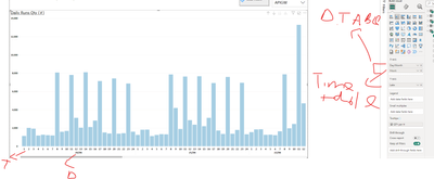
I feel like I am very close here, but I can't seem to get Hours granularity on the Date hierarchy.
- Mark as New
- Bookmark
- Subscribe
- Mute
- Subscribe to RSS Feed
- Permalink
- Report Inappropriate Content
@MojoGene
You need to work with both date and time dimensions hierarchically:
If this post helps, then please consider Accepting it as the solution to help the other members find it more quickly
Rita Fainshtein | Microsoft MVP
https://www.linkedin.com/in/rita-fainshtein/
Blog : https://www.madeiradata.com/profile/ritaf/profile
- Mark as New
- Bookmark
- Subscribe
- Mute
- Subscribe to RSS Feed
- Permalink
- Report Inappropriate Content
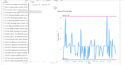
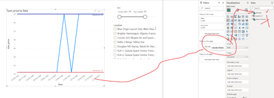
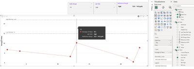
Thanks again, .@Ritaf1983 I have been able to get the hour dimension as you directed, although the results displayed at the hour granularity are not as expected. This is the display of average hourly value, which shows only 7 data points over the 20-day period of data. (Similar results for SUM, MAX, MIN.)
If a date with no data point is selected the graph is blank.
Based on your advice above, I did achieve the result I was looking for, but I achieved this using only the Date-Time field from the lab data table:
I am going to mark this as an accepted solution and once again extend my thanks for your extraordinary efforts. Above an beyond the call of duty.
- Mark as New
- Bookmark
- Subscribe
- Mute
- Subscribe to RSS Feed
- Permalink
- Report Inappropriate Content
Hi @MojoGene
Glad to help.
According to the problems with the granularity, please post it as a new question, and attach a pbix with the model that you created with enough data (not one day, one lab, etc...) and expected results.
Rita Fainshtein | Microsoft MVP
https://www.linkedin.com/in/rita-fainshtein/
Blog : https://www.madeiradata.com/profile/ritaf/profile
- Mark as New
- Bookmark
- Subscribe
- Mute
- Subscribe to RSS Feed
- Permalink
- Report Inappropriate Content
Hi @MojoGene
Please provide sample data that covers your issue or question completely, in a usable format (not as a screenshot).
https://community.powerbi.com/t5/Community-Blog/How-to-provide-sample-data-in-the-Power-BI-Forum/ba-...
Please show the expected outcome based on the sample data you provided.
https://community.powerbi.com/t5/Desktop/How-to-Get-Your-Question-Answered-Quickly/m-p/1447523
Rita Fainshtein | Microsoft MVP
https://www.linkedin.com/in/rita-fainshtein/
Blog : https://www.madeiradata.com/profile/ritaf/profile
Helpful resources

Fabric Data Days
Advance your Data & AI career with 50 days of live learning, contests, hands-on challenges, study groups & certifications and more!

Power BI Monthly Update - October 2025
Check out the October 2025 Power BI update to learn about new features.

