Get certified for free when you join Fabric Data Days 2026 and dive into Fabric, Power BI, SQL, AI, and other essential data skills.
Join nowJuly 7 - July 17 | Round 2 of the Power BI Dataviz World Championships. Don't miss your chance! Learn more
New here and trying to learn, appreciate the patience.
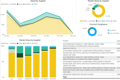
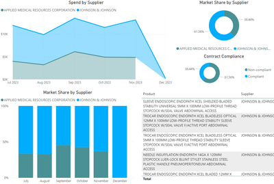
Built my first template and am replicating it for multiple categories. The theme is consistent, but each page has different colors. I do not need a common color for each supplier across all pages, but would like all visualization to have the same colors. Ideally every page would match the color palette of the first example.
Thanks in advance.
@Hospital_BI , While it will not possible to do it on all the visuals. You can create a measure that returns color based on supplier and you can use that in Conditional formatting "Field Value" option
Color = Switch( Max(Table[Supplier]) ,
"Supplier 1", "Red",
"Supplier 2", "Blue",
// Add others
"Green"//Default
)
How to do conditional formatting by measure and apply it on pie?
https://www.youtube.com/watch?v=RqBb5eBf_I4&list=PLPaNVDMhUXGYo50Ajmr4SgSV9HIQLxc8L
https://community.powerbi.com/t5/Community-Blog/Power-BI-Conditional-formatting-the-Pie-Visual/ba-p/...
https://amitchandak.medium.com/power-bi-where-is-the-conditional-formatting-option-in-new-format-pan...
Join us in Barcelona for FabCon and SQLCon, the Fabric, Power BI, SQL, and AI community event. Save €200 with code FABCMTY200.
Join Data Days 2026: 60 days of free live/on-demand sessions, challenges, study groups, and certification opportunities.
| User | Count |
|---|---|
| 28 | |
| 23 | |
| 19 | |
| 18 | |
| 15 |
| User | Count |
|---|---|
| 47 | |
| 44 | |
| 43 | |
| 35 | |
| 30 |