Party with Power BI’s own Guy in a Cube
Power BI is turning 10! Tune in for a special live episode on July 24 with behind-the-scenes stories, product evolution highlights, and a sneak peek at what’s in store for the future.
Save the date- Power BI forums
- Get Help with Power BI
- Desktop
- Service
- Report Server
- Power Query
- Mobile Apps
- Developer
- DAX Commands and Tips
- Custom Visuals Development Discussion
- Health and Life Sciences
- Power BI Spanish forums
- Translated Spanish Desktop
- Training and Consulting
- Instructor Led Training
- Dashboard in a Day for Women, by Women
- Galleries
- Data Stories Gallery
- Themes Gallery
- Contests Gallery
- Quick Measures Gallery
- Notebook Gallery
- Translytical Task Flow Gallery
- TMDL Gallery
- R Script Showcase
- Webinars and Video Gallery
- Ideas
- Custom Visuals Ideas (read-only)
- Issues
- Issues
- Events
- Upcoming Events
Enhance your career with this limited time 50% discount on Fabric and Power BI exams. Ends August 31st. Request your voucher.
- Power BI forums
- Forums
- Get Help with Power BI
- Desktop
- Re: Conditional formatting continued on second vis...
- Subscribe to RSS Feed
- Mark Topic as New
- Mark Topic as Read
- Float this Topic for Current User
- Bookmark
- Subscribe
- Printer Friendly Page
- Mark as New
- Bookmark
- Subscribe
- Mute
- Subscribe to RSS Feed
- Permalink
- Report Inappropriate Content
Conditional formatting continued on second visual
Hey all,
I have a Top and a Bottom 5 table for branches and their social review ratings.
I am using a DAX formula to have conditional formatting per matrix column (which does not work perfectly for Facebook ratings as you can see, but that's an issue for another time), and I would like the tables to have continuous conditional formatting.
What I currently have:
This makes it look like the 3.9 average rating on the bottom 5 is a good rating, but in fact, it is much lower than the 4.50 which shows red on the Top 5 visual.
I am expecting to see the Top 5 mostly shades of green, and the bottom 5 mostly shades of orange/red.
The DAX I am currently using:
Formatting Review Score Branch =
RANKX(
ALLSELECTED(' filters'[Branch]),
[Review Rating],
[Review Rating],
ASC
)
There is a bit more to this though, as I have filtered out branches with less than 5 reviews using the following filter (because I am using Top N on the visual for selecting the most recent business period):
Solved! Go to Solution.
- Mark as New
- Bookmark
- Subscribe
- Mute
- Subscribe to RSS Feed
- Permalink
- Report Inappropriate Content
Hi @Sjoerd_g
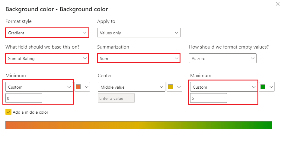
You should format the background color based on the exact Rating values rather than dynamic ranking values. Specify a pair of fixed minimum and maximum values (e.g. 0 and 5) for conditional formatting instead of using the default Highest and Lowest values.
This should work.
Best Regards,
Community Support Team _ Jing
If this post helps, please Accept it as Solution to help other members find it.
- Mark as New
- Bookmark
- Subscribe
- Mute
- Subscribe to RSS Feed
- Permalink
- Report Inappropriate Content
Please provide sanitized sample data that fully covers your issue. If you paste the data into a table in your post or use one of the file services it will be easier to assist you. I cannot use screenshots of your source data.
Please show the expected outcome based on the sample data you provided. Screenshots of the expected outcome are ok.
https://community.powerbi.com/t5/Desktop/How-to-Get-Your-Question-Answered-Quickly/m-p/1447523
Helpful resources
| User | Count |
|---|---|
| 75 | |
| 75 | |
| 45 | |
| 31 | |
| 27 |
| User | Count |
|---|---|
| 99 | |
| 89 | |
| 52 | |
| 48 | |
| 46 |


