FabCon is coming to Atlanta
Join us at FabCon Atlanta from March 16 - 20, 2026, for the ultimate Fabric, Power BI, AI and SQL community-led event. Save $200 with code FABCOMM.
Register now!- Power BI forums
- Get Help with Power BI
- Desktop
- Service
- Report Server
- Power Query
- Mobile Apps
- Developer
- DAX Commands and Tips
- Custom Visuals Development Discussion
- Health and Life Sciences
- Power BI Spanish forums
- Translated Spanish Desktop
- Training and Consulting
- Instructor Led Training
- Dashboard in a Day for Women, by Women
- Galleries
- Data Stories Gallery
- Themes Gallery
- Contests Gallery
- QuickViz Gallery
- Quick Measures Gallery
- Visual Calculations Gallery
- Notebook Gallery
- Translytical Task Flow Gallery
- TMDL Gallery
- R Script Showcase
- Webinars and Video Gallery
- Ideas
- Custom Visuals Ideas (read-only)
- Issues
- Issues
- Events
- Upcoming Events
The Power BI Data Visualization World Championships is back! It's time to submit your entry. Live now!
- Power BI forums
- Forums
- Get Help with Power BI
- Desktop
- Re: Conditional formating for line chart label
- Subscribe to RSS Feed
- Mark Topic as New
- Mark Topic as Read
- Float this Topic for Current User
- Bookmark
- Subscribe
- Printer Friendly Page
- Mark as New
- Bookmark
- Subscribe
- Mute
- Subscribe to RSS Feed
- Permalink
- Report Inappropriate Content
Conditional formating for line chart label
Hi,
I have some problem displaying a good line chart for my project :
I would like to apply a conditonal formating on labels so every 100,0% would be invisible because, as you can see, it's a mess.
Or i would like to have the possibility to hide most of the same value that are consecutive.
I know it is currently impossible to apply conditional formating to anything in line chart and i probably choose the wrong part of the forum to post but i wanted to share this suggestion for Power BI.
PS : and no, reducing the label density isn't a good option, doesn't really work well, even by customize each label value, and do the opposite of what i want : enhance all the important values
Solved! Go to Solution.
- Mark as New
- Bookmark
- Subscribe
- Mute
- Subscribe to RSS Feed
- Permalink
- Report Inappropriate Content
- Mark as New
- Bookmark
- Subscribe
- Mute
- Subscribe to RSS Feed
- Permalink
- Report Inappropriate Content
- Mark as New
- Bookmark
- Subscribe
- Mute
- Subscribe to RSS Feed
- Permalink
- Report Inappropriate Content
Thank you for the reply @bfernandez
I already know what you say but none of that is a good solution for me
Also @Pragati11, i can't really share data and i already know there is nothing currently available to solve my problem.
The whole point of my post was to share a potential ideas for Power BI to improve
- Mark as New
- Bookmark
- Subscribe
- Mute
- Subscribe to RSS Feed
- Permalink
- Report Inappropriate Content
Then in regards to your edit, there is currently no feature allowing for conditional formatting on the actual labels.
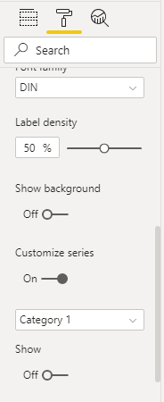
What I would suggest is going to the Data labels field in the Format tab and use Customize series.
Here, just toggle the Show so that the labels will not show for that paricular column or measure.
Then, the end user can simply hover over the line to see the important value they are looking for.
- Mark as New
- Bookmark
- Subscribe
- Mute
- Subscribe to RSS Feed
- Permalink
- Report Inappropriate Content
You can format the Y axis in the Format for that particular visualization. This is set to Auto by default.
Because it is a percentage, try putting 1.5 as you End bound to get the 150% upper bound you are looking for.
- Mark as New
- Bookmark
- Subscribe
- Mute
- Subscribe to RSS Feed
- Permalink
- Report Inappropriate Content
Hi @Maradh ,
What is the column that is that is shown on the chart in GREEN. Can you share some sample data?
Thanks,
Pragati
Helpful resources

Power BI Dataviz World Championships
The Power BI Data Visualization World Championships is back! It's time to submit your entry.

Power BI Monthly Update - January 2026
Check out the January 2026 Power BI update to learn about new features.

| User | Count |
|---|---|
| 61 | |
| 49 | |
| 30 | |
| 25 | |
| 23 |
| User | Count |
|---|---|
| 129 | |
| 104 | |
| 56 | |
| 39 | |
| 31 |


