- Power BI forums
- Get Help with Power BI
- Desktop
- Service
- Report Server
- Power Query
- Mobile Apps
- Developer
- DAX Commands and Tips
- Custom Visuals Development Discussion
- Health and Life Sciences
- Power BI Spanish forums
- Translated Spanish Desktop
- Training and Consulting
- Instructor Led Training
- Dashboard in a Day for Women, by Women
- Galleries
- Data Stories Gallery
- Themes Gallery
- Contests Gallery
- QuickViz Gallery
- Quick Measures Gallery
- Visual Calculations Gallery
- Notebook Gallery
- Translytical Task Flow Gallery
- TMDL Gallery
- R Script Showcase
- Webinars and Video Gallery
- Ideas
- Custom Visuals Ideas (read-only)
- Issues
- Issues
- Events
- Upcoming Events
Learn from the best! Meet the four finalists headed to the FINALS of the Power BI Dataviz World Championships! Register now
- Power BI forums
- Forums
- Get Help with Power BI
- Desktop
- Re: Conditional Formatting
- Subscribe to RSS Feed
- Mark Topic as New
- Mark Topic as Read
- Float this Topic for Current User
- Bookmark
- Subscribe
- Printer Friendly Page
- Mark as New
- Bookmark
- Subscribe
- Mute
- Subscribe to RSS Feed
- Permalink
- Report Inappropriate Content
Conditional Formatting
Hi,
Wondering if someone can help.
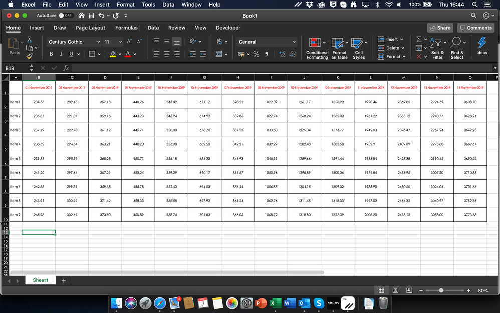
I have a Matrix as below (example using Excel for simpli:
My question:
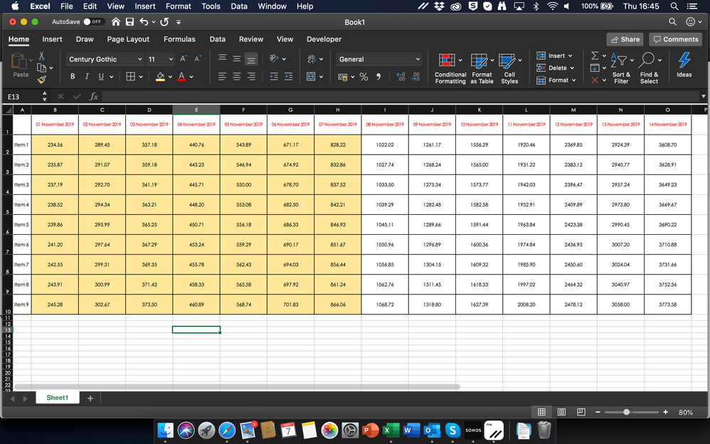
Is it possible to conditionally format the columns, to show the columns that relate to dates before todays date? So with the table above, it would look like this for today 7th November:
Thanks for your help
Solved! Go to Solution.
- Mark as New
- Bookmark
- Subscribe
- Mute
- Subscribe to RSS Feed
- Permalink
- Report Inappropriate Content
Hey @timknox ,
this is not that simple as you changed the interaction of the Matrix visual to none, to show all the AP's as column headers.
For this I created an unrelated table that contains the AP and the Serial columns from the Sheet2 table using this DAX:
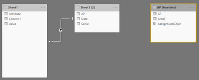
AP Unrelated = SELECTCOLUMNS('Sheet1 (2)' , "AP" , 'Sheet1 (2)'[AP] , "Serial" , 'Sheet1 (2)'[Serial])The data model will look like this:
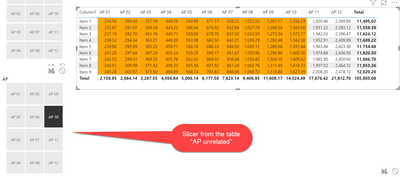
I created a slicer in the report that shows the APs from the new table.
I also created a measure that adjusts the background color, this measure looks like this:
backgroundColor =
var selectedAPSerial = IF(HASONEVALUE('AP Unrelated'[AP]) , MAX('AP Unrelated'[Serial]) , BLANK())
var allAPs = SELECTCOLUMNS(FILTER(ALL('AP Unrelated'), 'AP Unrelated'[Serial] <= selectedAPSerial) , "AP" , [AP])

return
//CONCATENATEX(allAPs , [AP] , " | ")
IF(FIRSTNONBLANK('Sheet1 (2)'[AP] , 0) in allAPs , "orange" , BLANK())
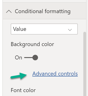
I assigned the measure above to the conditional formatting option of the Matrix visual background color
And configured the dialog like so:
This then makes my report look like this:
Hopefully this is what you are looking for.
Regards,
Tom
Did I answer your question? Mark my post as a solution, this will help others!
Proud to be a Super User!
I accept Kudos 😉
Hamburg, Germany
- Mark as New
- Bookmark
- Subscribe
- Mute
- Subscribe to RSS Feed
- Permalink
- Report Inappropriate Content
Hey,
yes that's possible, please create a pbix that contains sample data and reflects your Power BI data model, upload the pbix file to onedrive or dropbox and share the link.
Regards,
Tom
Did I answer your question? Mark my post as a solution, this will help others!
Proud to be a Super User!
I accept Kudos 😉
Hamburg, Germany
- Mark as New
- Bookmark
- Subscribe
- Mute
- Subscribe to RSS Feed
- Permalink
- Report Inappropriate Content
hi Tom,
Here is a sample file i have put together......
https://www.dropbox.com/s/mimwl05yfoncoqv/sample.pbix?dl=0
So basically, when you select a specific AP in the slicer (for example AP 06) the column AP 06 and the one to the left should be coloured.....
Does that make sense?
Kind regards
Tim
- Mark as New
- Bookmark
- Subscribe
- Mute
- Subscribe to RSS Feed
- Permalink
- Report Inappropriate Content
Hey @timknox ,
this is not that simple as you changed the interaction of the Matrix visual to none, to show all the AP's as column headers.
For this I created an unrelated table that contains the AP and the Serial columns from the Sheet2 table using this DAX:
AP Unrelated = SELECTCOLUMNS('Sheet1 (2)' , "AP" , 'Sheet1 (2)'[AP] , "Serial" , 'Sheet1 (2)'[Serial])The data model will look like this:
I created a slicer in the report that shows the APs from the new table.
I also created a measure that adjusts the background color, this measure looks like this:
backgroundColor =
var selectedAPSerial = IF(HASONEVALUE('AP Unrelated'[AP]) , MAX('AP Unrelated'[Serial]) , BLANK())
var allAPs = SELECTCOLUMNS(FILTER(ALL('AP Unrelated'), 'AP Unrelated'[Serial] <= selectedAPSerial) , "AP" , [AP])

return
//CONCATENATEX(allAPs , [AP] , " | ")
IF(FIRSTNONBLANK('Sheet1 (2)'[AP] , 0) in allAPs , "orange" , BLANK())
I assigned the measure above to the conditional formatting option of the Matrix visual background color
And configured the dialog like so:
This then makes my report look like this:
Hopefully this is what you are looking for.
Regards,
Tom
Did I answer your question? Mark my post as a solution, this will help others!
Proud to be a Super User!
I accept Kudos 😉
Hamburg, Germany
Helpful resources

Power BI DataViz World Championships - June 2026
A new Power BI DataViz World Championship is coming this June! Don't miss out on submitting your entry.

Join our Fabric User Panel
Share feedback directly with Fabric product managers, participate in targeted research studies and influence the Fabric roadmap.

| User | Count |
|---|---|
| 45 | |
| 35 | |
| 30 | |
| 15 | |
| 15 |
| User | Count |
|---|---|
| 58 | |
| 55 | |
| 38 | |
| 21 | |
| 21 |
