FabCon is coming to Atlanta
Join us at FabCon Atlanta from March 16 - 20, 2026, for the ultimate Fabric, Power BI, AI and SQL community-led event. Save $200 with code FABCOMM.
Register now!- Power BI forums
- Get Help with Power BI
- Desktop
- Service
- Report Server
- Power Query
- Mobile Apps
- Developer
- DAX Commands and Tips
- Custom Visuals Development Discussion
- Health and Life Sciences
- Power BI Spanish forums
- Translated Spanish Desktop
- Training and Consulting
- Instructor Led Training
- Dashboard in a Day for Women, by Women
- Galleries
- Data Stories Gallery
- Themes Gallery
- Contests Gallery
- QuickViz Gallery
- Quick Measures Gallery
- Visual Calculations Gallery
- Notebook Gallery
- Translytical Task Flow Gallery
- TMDL Gallery
- R Script Showcase
- Webinars and Video Gallery
- Ideas
- Custom Visuals Ideas (read-only)
- Issues
- Issues
- Events
- Upcoming Events
The Power BI Data Visualization World Championships is back! Get ahead of the game and start preparing now! Learn more
- Power BI forums
- Forums
- Get Help with Power BI
- Desktop
- Conditional Formatting one column based on another
- Subscribe to RSS Feed
- Mark Topic as New
- Mark Topic as Read
- Float this Topic for Current User
- Bookmark
- Subscribe
- Printer Friendly Page
- Mark as New
- Bookmark
- Subscribe
- Mute
- Subscribe to RSS Feed
- Permalink
- Report Inappropriate Content
Conditional Formatting one column based on another
I have two CSV files that look like this:
Data
Unit,CategoryA,CategoryB,CategoryC
U1,99,90,82
U2,92,100,56
U3,96,50,66
U4,85,33,99
U5,21,94,100
Cutoffs
Unit,Cutoff
U1,95
U2,90
U3,55
U4,85
U5,90
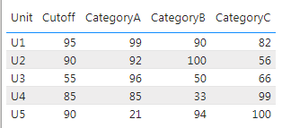
I load them to a table and combine and display them like this, using the Unit column to combine the two:
Now I would like to conditionally format columns Category A through C, based on the Cutoff column. For example, for Unit1, if any category value >= 95, set that cell background to green, and if category value < 95, set it to red. So, my formatted data should look like this:
The available Conditional Formatting options don't seem to help me do this. Is that the case, or is there a work around that will alow me do this?
Solved! Go to Solution.
- Mark as New
- Bookmark
- Subscribe
- Mute
- Subscribe to RSS Feed
- Permalink
- Report Inappropriate Content
Hi @Anonymous
If you cannot do this, you need to use visual Table and then write 3 measures (separate for each category) that will return the color code.
CC Category A =
IF(SELECTEDVALUE('Table (3)'[Category A]) >= SELECTEDVALUE('Table (3)'[CutOff]), "#0f0","#f00")

CC Category B =
IF(SELECTEDVALUE('Table (3)'[Category B]) >= SELECTEDVALUE('Table (3)'[CutOff]), "#0f0","#f00")

CC Category C =
IF(SELECTEDVALUE('Table (3)'[Category C]) >= SELECTEDVALUE('Table (3)'[CutOff]), "#0f0","#f00")
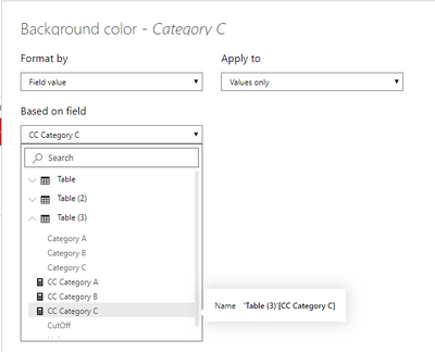
Then for each column separately (Cat A, B, C) set the background color from conditional formatting section. Select the Field Value from the list, and then select the appropriate measure.
_______________
If I helped, please accept the solution and give kudos! 😀
- Mark as New
- Bookmark
- Subscribe
- Mute
- Subscribe to RSS Feed
- Permalink
- Report Inappropriate Content
Hi @Anonymous
You should follow these steps.
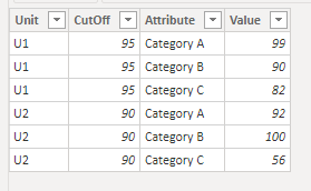
1. Unpivot Category - put categories in one column and values in the other.
2. Create a measure that checks whether a given category value is greater than or less than CutOff. This measure will return a color code (red or green).
ConditionalColoring =
IF(SELECTEDVALUE('Table'[Value]) >= SELECTEDVALUE('Table'[CutOff]), "#0f0","#f00")
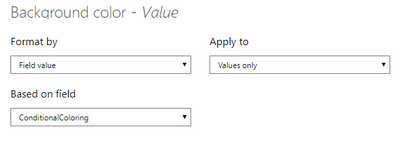
3. In the conditional formatting settings, select Field Value and then select the measure you created.
4. The Result:
I prepared the file with the solution. Please use this link to find it: https://gofile.io/d/Z3szIL
_______________
If I helped, please accept the solution and give kudos! 😀
- Mark as New
- Bookmark
- Subscribe
- Mute
- Subscribe to RSS Feed
- Permalink
- Report Inappropriate Content
@lkalawski thanks for the quick reply.
While this does seem to get the end result I want, it changes my data structure, which is something I don't want to do. I prefer to not unpivot category as I use it for other things. So I'm guessing there's no way to do this without changing how my data is organized?
- Mark as New
- Bookmark
- Subscribe
- Mute
- Subscribe to RSS Feed
- Permalink
- Report Inappropriate Content
Hi @Anonymous
If you cannot do this, you need to use visual Table and then write 3 measures (separate for each category) that will return the color code.
CC Category A =
IF(SELECTEDVALUE('Table (3)'[Category A]) >= SELECTEDVALUE('Table (3)'[CutOff]), "#0f0","#f00")

CC Category B =
IF(SELECTEDVALUE('Table (3)'[Category B]) >= SELECTEDVALUE('Table (3)'[CutOff]), "#0f0","#f00")

CC Category C =
IF(SELECTEDVALUE('Table (3)'[Category C]) >= SELECTEDVALUE('Table (3)'[CutOff]), "#0f0","#f00")
Then for each column separately (Cat A, B, C) set the background color from conditional formatting section. Select the Field Value from the list, and then select the appropriate measure.
_______________
If I helped, please accept the solution and give kudos! 😀
- Mark as New
- Bookmark
- Subscribe
- Mute
- Subscribe to RSS Feed
- Permalink
- Report Inappropriate Content
@lkalawski OK, that worked, thanks!
Although that's a ridiculous amount of work for something supposedly simple. Microsoft really need to add simple features like this.
Helpful resources

Power BI Dataviz World Championships
The Power BI Data Visualization World Championships is back! Get ahead of the game and start preparing now!

| User | Count |
|---|---|
| 143 | |
| 123 | |
| 102 | |
| 79 | |
| 54 |


