Get Fabric certified for FREE!
Don't miss your chance to take the Fabric Data Engineer (DP-600) exam for FREE! Find out how by attending the DP-600 session on April 23rd (pacific time), live or on-demand.
Learn more- Power BI forums
- Get Help with Power BI
- Desktop
- Service
- Report Server
- Power Query
- Mobile Apps
- Developer
- DAX Commands and Tips
- Custom Visuals Development Discussion
- Health and Life Sciences
- Power BI Spanish forums
- Translated Spanish Desktop
- Training and Consulting
- Instructor Led Training
- Dashboard in a Day for Women, by Women
- Galleries
- Data Stories Gallery
- Themes Gallery
- Contests Gallery
- QuickViz Gallery
- Quick Measures Gallery
- Visual Calculations Gallery
- Notebook Gallery
- Translytical Task Flow Gallery
- TMDL Gallery
- R Script Showcase
- Webinars and Video Gallery
- Ideas
- Custom Visuals Ideas (read-only)
- Issues
- Issues
- Events
- Upcoming Events
Next up in the FabCon + SQLCon recap series: The roadmap for Microsoft SQL and Maximizing Developer experiences in Fabric. All sessions are available on-demand after the live show. Register now
- Power BI forums
- Forums
- Get Help with Power BI
- Desktop
- Conditional Formatting Data Labels
- Subscribe to RSS Feed
- Mark Topic as New
- Mark Topic as Read
- Float this Topic for Current User
- Bookmark
- Subscribe
- Printer Friendly Page
- Mark as New
- Bookmark
- Subscribe
- Mute
- Subscribe to RSS Feed
- Permalink
- Report Inappropriate Content
Conditional Formatting Data Labels
HI All,
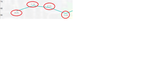
I have a line graph which has some values shown as data labels, i would like to conditionally format these labels. Can anyone help?
Solved! Go to Solution.
- Mark as New
- Bookmark
- Subscribe
- Mute
- Subscribe to RSS Feed
- Permalink
- Report Inappropriate Content
Hi @Anonymous ,
You cannot condittional formatting data labels however you can make a work around:
Create 3 measures:
Total Values = SUM(Table[Column])
Total Values Above = IF([Total Values] < 100; BLANK(); [Total Values] )
Total Values Below= IF([Total Values] < 100; [Total Values] ;BLANK())
Now add your measure to the line chart and make the following setup:
Turn of the lines on the Values above and below
Turn off data labels on the Total Values measure
Make different formatting for labels for lines above and below
Adjust the measure to what you need if you want to have additional levels you need to create additional measures.
Check PBIX file attach.
Regards
Miguel Félix
Did I answer your question? Mark my post as a solution!
Proud to be a Super User!
Check out my blog: Power BI em Português- Mark as New
- Bookmark
- Subscribe
- Mute
- Subscribe to RSS Feed
- Permalink
- Report Inappropriate Content
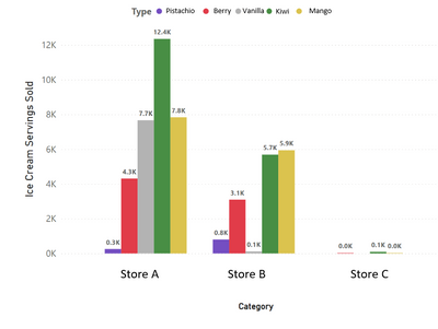
I sympathize with this issue. Here's an example. Data labels for certain values can show up as 0.0K, but having all data labels in raw units just looks crowded (ie. 4.2K > 4,200 and 144 > 0.1K). There should be conditional formatting for units as there is for color.
I submitted an idea ticket: https://ideas.powerbi.com/ideas/idea/?ideaid=10ba158d-4e13-ed11-b5cf-281878bd0909
- Mark as New
- Bookmark
- Subscribe
- Mute
- Subscribe to RSS Feed
- Permalink
- Report Inappropriate Content
Hi @Anonymous ,
Have your problem be solved? Please consider accept the answer as a solution if it worked.
Best Regards,
Jay
Community Support Team _ Jay Wang
If this post helps, then please consider Accept it as the solution to help the other members find it more quickly.
- Mark as New
- Bookmark
- Subscribe
- Mute
- Subscribe to RSS Feed
- Permalink
- Report Inappropriate Content
Hi @Anonymous ,
You cannot condittional formatting data labels however you can make a work around:
Create 3 measures:
Total Values = SUM(Table[Column])
Total Values Above = IF([Total Values] < 100; BLANK(); [Total Values] )
Total Values Below= IF([Total Values] < 100; [Total Values] ;BLANK())
Now add your measure to the line chart and make the following setup:
Turn of the lines on the Values above and below
Turn off data labels on the Total Values measure
Make different formatting for labels for lines above and below
Adjust the measure to what you need if you want to have additional levels you need to create additional measures.
Check PBIX file attach.
Regards
Miguel Félix
Did I answer your question? Mark my post as a solution!
Proud to be a Super User!
Check out my blog: Power BI em PortuguêsHelpful resources

New to Fabric Survey
If you have recently started exploring Fabric, we'd love to hear how it's going. Your feedback can help with product improvements.

Power BI DataViz World Championships - June 2026
A new Power BI DataViz World Championship is coming this June! Don't miss out on submitting your entry.

Join our Fabric User Panel
Share feedback directly with Fabric product managers, participate in targeted research studies and influence the Fabric roadmap.

| User | Count |
|---|---|
| 44 | |
| 43 | |
| 38 | |
| 19 | |
| 15 |
| User | Count |
|---|---|
| 68 | |
| 64 | |
| 31 | |
| 29 | |
| 24 |


