Get certified for free when you join Fabric Data Days 2026 and dive into Fabric, Power BI, SQL, AI, and other essential data skills.
Join nowJuly 7 - July 17 | Round 2 of the Power BI Dataviz World Championships. Don't miss your chance! Learn more
HI All,
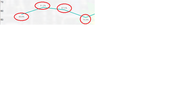
I have a line graph which has some values shown as data labels, i would like to conditionally format these labels. Can anyone help?
Solved! Go to Solution.
Hi @Anonymous ,
You cannot condittional formatting data labels however you can make a work around:
Create 3 measures:
Total Values = SUM(Table[Column])
Total Values Above = IF([Total Values] < 100; BLANK(); [Total Values] )
Total Values Below= IF([Total Values] < 100; [Total Values] ;BLANK())
Now add your measure to the line chart and make the following setup:
Turn of the lines on the Values above and below
Turn off data labels on the Total Values measure
Make different formatting for labels for lines above and below
Adjust the measure to what you need if you want to have additional levels you need to create additional measures.
Check PBIX file attach.
Regards
Miguel Félix
Proud to be a Super User!
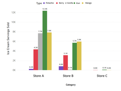
Check out my blog: Power BI em PortuguêsI sympathize with this issue. Here's an example. Data labels for certain values can show up as 0.0K, but having all data labels in raw units just looks crowded (ie. 4.2K > 4,200 and 144 > 0.1K). There should be conditional formatting for units as there is for color.
I submitted an idea ticket: https://ideas.powerbi.com/ideas/idea/?ideaid=10ba158d-4e13-ed11-b5cf-281878bd0909
Hi @Anonymous ,
Have your problem be solved? Please consider accept the answer as a solution if it worked.
Best Regards,
Jay
Community Support Team _ Jay Wang
If this post helps, then please consider Accept it as the solution to help the other members find it more quickly.
Hi @Anonymous ,
You cannot condittional formatting data labels however you can make a work around:
Create 3 measures:
Total Values = SUM(Table[Column])
Total Values Above = IF([Total Values] < 100; BLANK(); [Total Values] )
Total Values Below= IF([Total Values] < 100; [Total Values] ;BLANK())
Now add your measure to the line chart and make the following setup:
Turn of the lines on the Values above and below
Turn off data labels on the Total Values measure
Make different formatting for labels for lines above and below
Adjust the measure to what you need if you want to have additional levels you need to create additional measures.
Check PBIX file attach.
Regards
Miguel Félix
Proud to be a Super User!
Check out my blog: Power BI em PortuguêsJoin us in Barcelona for FabCon and SQLCon, the Fabric, Power BI, SQL, and AI community event. Save €200 with code FABCMTY200.
Join Fabric Data Days 2026: 60 days of free live/on-demand sessions, challenges, study groups, and certification opportunities.
| User | Count |
|---|---|
| 63 | |
| 41 | |
| 39 | |
| 39 | |
| 38 |