FabCon is coming to Atlanta
Join us at FabCon Atlanta from March 16 - 20, 2026, for the ultimate Fabric, Power BI, AI and SQL community-led event. Save $200 with code FABCOMM.
Register now!- Power BI forums
- Get Help with Power BI
- Desktop
- Service
- Report Server
- Power Query
- Mobile Apps
- Developer
- DAX Commands and Tips
- Custom Visuals Development Discussion
- Health and Life Sciences
- Power BI Spanish forums
- Translated Spanish Desktop
- Training and Consulting
- Instructor Led Training
- Dashboard in a Day for Women, by Women
- Galleries
- Data Stories Gallery
- Themes Gallery
- Contests Gallery
- QuickViz Gallery
- Quick Measures Gallery
- Visual Calculations Gallery
- Notebook Gallery
- Translytical Task Flow Gallery
- TMDL Gallery
- R Script Showcase
- Webinars and Video Gallery
- Ideas
- Custom Visuals Ideas (read-only)
- Issues
- Issues
- Events
- Upcoming Events
Get Fabric Certified for FREE during Fabric Data Days. Don't miss your chance! Request now
- Power BI forums
- Forums
- Get Help with Power BI
- Desktop
- Conditional Formatting Based on a Table
- Subscribe to RSS Feed
- Mark Topic as New
- Mark Topic as Read
- Float this Topic for Current User
- Bookmark
- Subscribe
- Printer Friendly Page
- Mark as New
- Bookmark
- Subscribe
- Mute
- Subscribe to RSS Feed
- Permalink
- Report Inappropriate Content
Conditional Formatting Based on a Table
I want to dislplay a Card and have the background show red if an occupancy level drops below a certain level. The twist is that the locations have different thresholds of when they should be red. Here are the table examples and what I would like for an outcome:
| Location | Min Occupancy |
| North | .90 |
| South | .75 |
| East | .65 |
West | .50 |
I would have a slicer for the Location and then a card that would show the current Occupancy rate. The Card would also show a background color of Red if it drops below the Min. Occupancy. For an example
North would show a card with Red if the Occupancy was at .88 but none of the other locations would be red, they would be green if they were at .88. West would be green at .55 but East would be red. How do I setup up the card to use the different thresholds for the different locations to determin the background color?
Solved! Go to Solution.
- Mark as New
- Bookmark
- Subscribe
- Mute
- Subscribe to RSS Feed
- Permalink
- Report Inappropriate Content
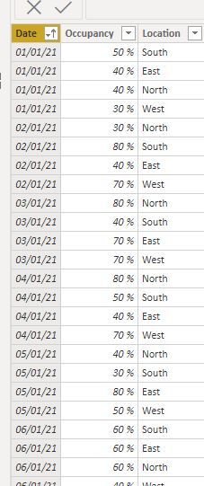
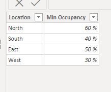
With these sample tables:
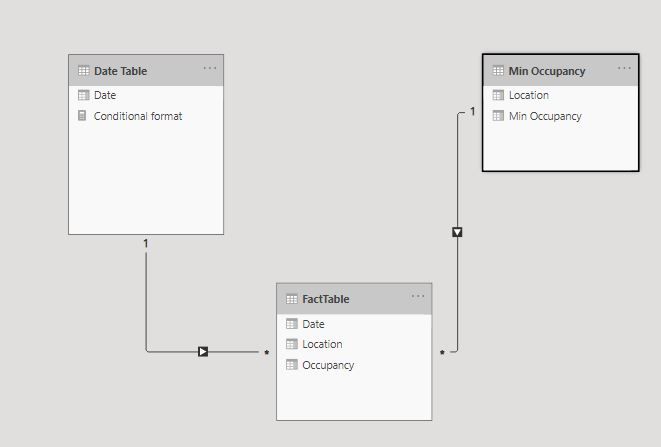
and this model:
I've created the following measures:
Occupancy = SUM(FactTable[Occupancy])Average Min Occ = AVERAGE('Min Occupancy'[Min Occupancy])
and to format the cards:
Conditional format = IF([Occupancy] < [Average Min Occ], 1, 0)
Use this [Conditional format] measure to format the different elements of the card. For example:
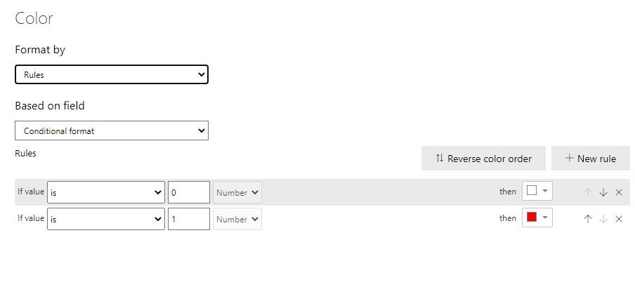
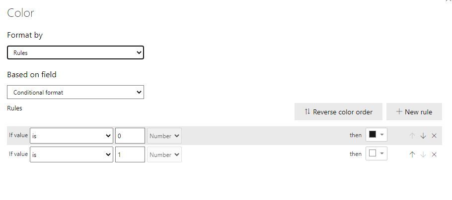
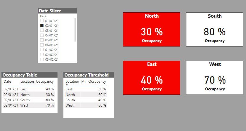
and you get this
Did I answer your question? Mark my post as a solution!
In doing so, you are also helping me. Thank you!
Proud to be a Super User!
Paul on Linkedin.
- Mark as New
- Bookmark
- Subscribe
- Mute
- Subscribe to RSS Feed
- Permalink
- Report Inappropriate Content
With these sample tables:
and this model:
I've created the following measures:
Occupancy = SUM(FactTable[Occupancy])Average Min Occ = AVERAGE('Min Occupancy'[Min Occupancy])
and to format the cards:
Conditional format = IF([Occupancy] < [Average Min Occ], 1, 0)
Use this [Conditional format] measure to format the different elements of the card. For example:


and you get this
Did I answer your question? Mark my post as a solution!
In doing so, you are also helping me. Thank you!
Proud to be a Super User!
Paul on Linkedin.
- Mark as New
- Bookmark
- Subscribe
- Mute
- Subscribe to RSS Feed
- Permalink
- Report Inappropriate Content
Does this allow us to choose a location as a slicer rather than the date?
- Mark as New
- Bookmark
- Subscribe
- Mute
- Subscribe to RSS Feed
- Permalink
- Report Inappropriate Content
Sure...
I've attached the sample PBIX file for your reference
Did I answer your question? Mark my post as a solution!
In doing so, you are also helping me. Thank you!
Proud to be a Super User!
Paul on Linkedin.
- Mark as New
- Bookmark
- Subscribe
- Mute
- Subscribe to RSS Feed
- Permalink
- Report Inappropriate Content
Also keep in mind I want to use a slicer to change the location and the card to display the correct backgound color, either Green or Red. I will be doing other cards like this that will include Green Yellow Red depending on the % of a number.
Helpful resources

Power BI Monthly Update - November 2025
Check out the November 2025 Power BI update to learn about new features.

Fabric Data Days
Advance your Data & AI career with 50 days of live learning, contests, hands-on challenges, study groups & certifications and more!

