This is best Fabric, Power BI, SQL and AI community event. How do we know? The last event sold out! Save €200 with code FABCMTY200.
Register nowA new Data Days event is coming soon! This time we’re going bigger than ever. Fabric, Power BI, SQL, AI and more. Don't miss out.
I want to dislplay a Card and have the background show red if an occupancy level drops below a certain level. The twist is that the locations have different thresholds of when they should be red. Here are the table examples and what I would like for an outcome:
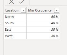
| Location | Min Occupancy |
| North | .90 |
| South | .75 |
| East | .65 |
West | .50 |
I would have a slicer for the Location and then a card that would show the current Occupancy rate. The Card would also show a background color of Red if it drops below the Min. Occupancy. For an example
North would show a card with Red if the Occupancy was at .88 but none of the other locations would be red, they would be green if they were at .88. West would be green at .55 but East would be red. How do I setup up the card to use the different thresholds for the different locations to determin the background color?
Solved! Go to Solution.
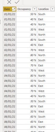
With these sample tables:
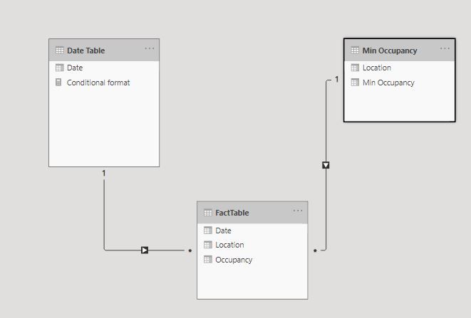
and this model:
I've created the following measures:
Occupancy = SUM(FactTable[Occupancy])Average Min Occ = AVERAGE('Min Occupancy'[Min Occupancy])
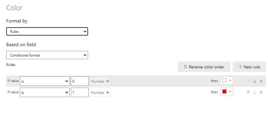
and to format the cards:
Conditional format = IF([Occupancy] < [Average Min Occ], 1, 0)
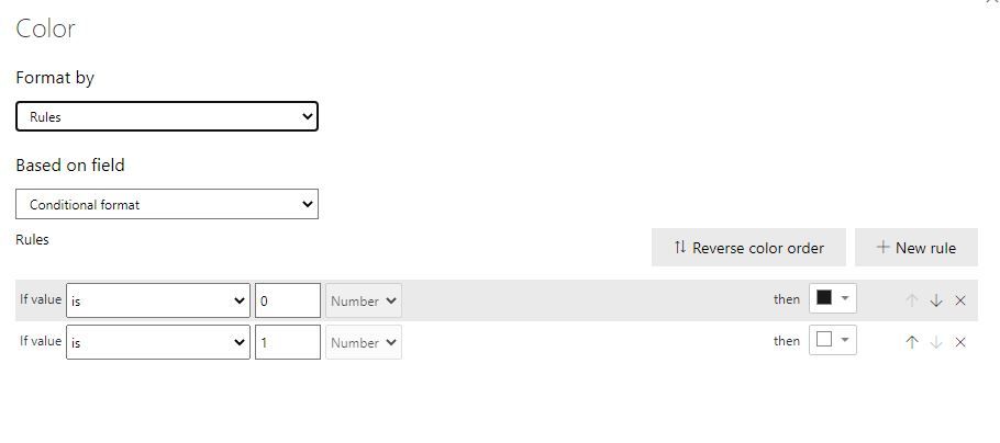
Use this [Conditional format] measure to format the different elements of the card. For example:
Backround
Label
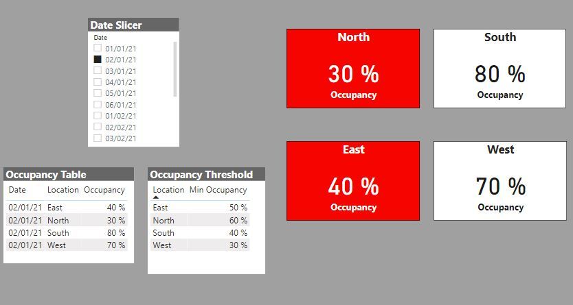
and you get this
Proud to be a Super User!
Paul on Linkedin.
With these sample tables:
and this model:
I've created the following measures:
Occupancy = SUM(FactTable[Occupancy])Average Min Occ = AVERAGE('Min Occupancy'[Min Occupancy])
and to format the cards:
Conditional format = IF([Occupancy] < [Average Min Occ], 1, 0)
Use this [Conditional format] measure to format the different elements of the card. For example:
Backround
Label
and you get this
Proud to be a Super User!
Paul on Linkedin.
Does this allow us to choose a location as a slicer rather than the date?
Sure...
I've attached the sample PBIX file for your reference
Proud to be a Super User!
Paul on Linkedin.
Also keep in mind I want to use a slicer to change the location and the card to display the correct backgound color, either Green or Red. I will be doing other cards like this that will include Green Yellow Red depending on the % of a number.
Check out the May 2026 Power BI update to learn about new features.
Sign up to receive a private message when registration opens and key events begin.
If you have recently started exploring Fabric, we'd love to hear how it's going. Your feedback can help with product improvements.
| User | Count |
|---|---|
| 32 | |
| 25 | |
| 23 | |
| 22 | |
| 13 |
| User | Count |
|---|---|
| 61 | |
| 47 | |
| 27 | |
| 24 | |
| 19 |