Get Fabric certified for FREE!
Don't miss your chance to take the Fabric Data Engineer (DP-700) exam on us!
Learn more- Power BI forums
- Get Help with Power BI
- Desktop
- Service
- Report Server
- Power Query
- Mobile Apps
- Developer
- DAX Commands and Tips
- Custom Visuals Development Discussion
- Health and Life Sciences
- Power BI Spanish forums
- Translated Spanish Desktop
- Training and Consulting
- Instructor Led Training
- Dashboard in a Day for Women, by Women
- Galleries
- Data Stories Gallery
- Themes Gallery
- Contests Gallery
- QuickViz Gallery
- Quick Measures Gallery
- Visual Calculations Gallery
- Notebook Gallery
- Translytical Task Flow Gallery
- TMDL Gallery
- R Script Showcase
- Webinars and Video Gallery
- Ideas
- Custom Visuals Ideas (read-only)
- Issues
- Issues
- Events
- Upcoming Events
Next up in the FabCon + SQLCon recap series: The roadmap for Microsoft SQL and Maximizing Developer experiences in Fabric. All sessions are available on-demand after the live show. Register now
- Power BI forums
- Forums
- Get Help with Power BI
- Desktop
- Comparison
- Subscribe to RSS Feed
- Mark Topic as New
- Mark Topic as Read
- Float this Topic for Current User
- Bookmark
- Subscribe
- Printer Friendly Page
- Mark as New
- Bookmark
- Subscribe
- Mute
- Subscribe to RSS Feed
- Permalink
- Report Inappropriate Content
Comparison
Hi All,
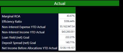
I am trying to show a comparison between Actuals vs Plan. I am using a Matrix table and for some reason only the Actuals shows up. In my source data (Excel) I have both a column for Actual and Plan and I would like to display them side by side. Is a Matrix table the right solution ? How can I get the Plan section to display next to the Actuals ?
Solved! Go to Solution.
- Mark as New
- Bookmark
- Subscribe
- Mute
- Subscribe to RSS Feed
- Permalink
- Report Inappropriate Content
Hi @Anonymous ,
What is the structure of your source data?
If Actual and Plan columns are in one table, create a table visual or matrix visual like @az38 said.
If they are in two tables, create correct relationship between the two tables. Then create a table visual or matrix visual like @az38 said.
Best Regards,
Icey
If this post helps, then please consider Accept it as the solution to help the other members find it more quickly.
- Mark as New
- Bookmark
- Subscribe
- Mute
- Subscribe to RSS Feed
- Permalink
- Report Inappropriate Content
@Anonymous
You may have to create a table like this
union(
summarize (Table,"Name","Marginal ROA","Actual",[Marginal ROA Actual],"Target",[Marginal ROA Actual]),
summarize (Table,"Name","Effciency Ratio","Actual",[Effciency Ratio Actual],"Target",[Effciency Ratio Actual])
)
Or Convert measure to dimension values
- Mark as New
- Bookmark
- Subscribe
- Mute
- Subscribe to RSS Feed
- Permalink
- Report Inappropriate Content
Hi @Anonymous
add both of fields, Actual and Plan to Values in Visual Pane
Helpful resources

New to Fabric Survey
If you have recently started exploring Fabric, we'd love to hear how it's going. Your feedback can help with product improvements.

Power BI DataViz World Championships - June 2026
A new Power BI DataViz World Championship is coming this June! Don't miss out on submitting your entry.

Join our Fabric User Panel
Share feedback directly with Fabric product managers, participate in targeted research studies and influence the Fabric roadmap.

| User | Count |
|---|---|
| 56 | |
| 47 | |
| 44 | |
| 20 | |
| 20 |
| User | Count |
|---|---|
| 73 | |
| 72 | |
| 34 | |
| 33 | |
| 31 |

