- Power BI forums
- Get Help with Power BI
- Desktop
- Service
- Report Server
- Power Query
- Mobile Apps
- Developer
- DAX Commands and Tips
- Custom Visuals Development Discussion
- Health and Life Sciences
- Power BI Spanish forums
- Translated Spanish Desktop
- Training and Consulting
- Instructor Led Training
- Dashboard in a Day for Women, by Women
- Galleries
- Data Stories Gallery
- Themes Gallery
- Contests Gallery
- QuickViz Gallery
- Quick Measures Gallery
- Visual Calculations Gallery
- Notebook Gallery
- Translytical Task Flow Gallery
- TMDL Gallery
- R Script Showcase
- Webinars and Video Gallery
- Ideas
- Custom Visuals Ideas (read-only)
- Issues
- Issues
- Events
- Upcoming Events
Learn from the best! Meet the four finalists headed to the FINALS of the Power BI Dataviz World Championships! Register now
- Power BI forums
- Forums
- Get Help with Power BI
- Desktop
- Re: Comparing weekly increase/ decrease of custome...
- Subscribe to RSS Feed
- Mark Topic as New
- Mark Topic as Read
- Float this Topic for Current User
- Bookmark
- Subscribe
- Printer Friendly Page
- Mark as New
- Bookmark
- Subscribe
- Mute
- Subscribe to RSS Feed
- Permalink
- Report Inappropriate Content
Comparing weekly increase/ decrease of customers
Hi All,
The chart below contains a measure with the distinct count of Customers & the Legend is Product:
Current Customer Uptake =
CALCULATE(
DISTINCTCOUNT(DATA[Customer),
LASTDATE(DATA[LAST_DAY_OF_WEEK]))
Each product has a unique go live date and is used to calculate the X asis "Weeks from go live" within a custom column.
Problem:
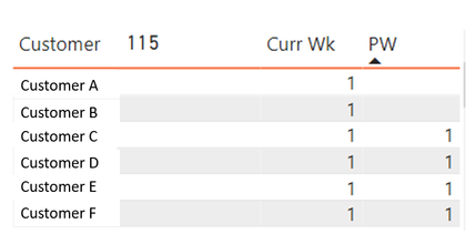
I would like to select a particular data point in this chart and see the increase/ decrease of customers within a table format, see image below. However, when a particular data point is selected the previous weeks data disappears.
What is the best way to calculate/visualise this? Suggestions welome 🙂
- Mark as New
- Bookmark
- Subscribe
- Mute
- Subscribe to RSS Feed
- Permalink
- Report Inappropriate Content
Refer to my file which uses rank to find Last week
https://www.dropbox.com/s/d9898a48e76wmvl/sales_analytics_weekWise.pbix?dl=0
Helpful resources

Power BI DataViz World Championships - June 2026
A new Power BI DataViz World Championship is coming this June! Don't miss out on submitting your entry.

Join our Fabric User Panel
Share feedback directly with Fabric product managers, participate in targeted research studies and influence the Fabric roadmap.

| User | Count |
|---|---|
| 48 | |
| 31 | |
| 30 | |
| 16 | |
| 16 |
| User | Count |
|---|---|
| 60 | |
| 59 | |
| 39 | |
| 24 | |
| 24 |


