FabCon is coming to Atlanta
Join us at FabCon Atlanta from March 16 - 20, 2026, for the ultimate Fabric, Power BI, AI and SQL community-led event. Save $200 with code FABCOMM.
Register now!- Power BI forums
- Get Help with Power BI
- Desktop
- Service
- Report Server
- Power Query
- Mobile Apps
- Developer
- DAX Commands and Tips
- Custom Visuals Development Discussion
- Health and Life Sciences
- Power BI Spanish forums
- Translated Spanish Desktop
- Training and Consulting
- Instructor Led Training
- Dashboard in a Day for Women, by Women
- Galleries
- Data Stories Gallery
- Themes Gallery
- Contests Gallery
- Quick Measures Gallery
- Visual Calculations Gallery
- Notebook Gallery
- Translytical Task Flow Gallery
- TMDL Gallery
- R Script Showcase
- Webinars and Video Gallery
- Ideas
- Custom Visuals Ideas (read-only)
- Issues
- Issues
- Events
- Upcoming Events
Calling all Data Engineers! Fabric Data Engineer (Exam DP-700) live sessions are back! Starting October 16th. Sign up.
- Power BI forums
- Forums
- Get Help with Power BI
- Desktop
- Re: Combining Multiple Measures into 1 Line Chart
- Subscribe to RSS Feed
- Mark Topic as New
- Mark Topic as Read
- Float this Topic for Current User
- Bookmark
- Subscribe
- Printer Friendly Page
- Mark as New
- Bookmark
- Subscribe
- Mute
- Subscribe to RSS Feed
- Permalink
- Report Inappropriate Content
Combining Multiple Measures into 1 Line Chart
Hi,
I have some measures that I made to read data from a SharePoint List and I want to compare them to metadata that I have from a SharePoint Document Library. Basically, I want to do some file tracking based on a plan.
I am almost there but struggling at the finish line.
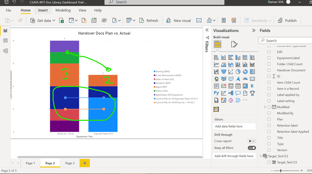
I want to have a stacked bar chart showing the actual documents and a target line which is the planned list of documents expected. I have created some measures to get the data points that I need for the line chart, but it looks like below. I drew in Green what I want this to look like. The 3 and 2 value are being driven by 2 quick measures that I made to filter the plan data from my sharepoint list.
So my SharePoint List would expect 2 documents, but I have 8 documents there (above target) gives a sense that we are storing the key auditable documents that we need to vs. going to check all the folders and constantly bug the team.
Any help would be appreciated !
- Mark as New
- Bookmark
- Subscribe
- Mute
- Subscribe to RSS Feed
- Permalink
- Report Inappropriate Content
@raman_vee Perhaps just use a Stacked column visual and add your lines as Constant lines using the Analytics pane. You can tie the constant lines to a measure.
Follow on LinkedIn
@ me in replies or I'll lose your thread!!!
Instead of a Kudo, please vote for this idea
Become an expert!: Enterprise DNA
External Tools: MSHGQM
YouTube Channel!: Microsoft Hates Greg
Latest book!: DAX For Humans
DAX is easy, CALCULATE makes DAX hard...
- Mark as New
- Bookmark
- Subscribe
- Mute
- Subscribe to RSS Feed
- Permalink
- Report Inappropriate Content
Hi,
Thanks for the quick response. I tried that but does not get me where I need to be. Also I want these the automatically update as the data changes.
Ideally, these measures would populate into a column on a table somewhere and then I could add that as the line information on the combination chart. Also not sure if that's the best way either.
Helpful resources

FabCon Global Hackathon
Join the Fabric FabCon Global Hackathon—running virtually through Nov 3. Open to all skill levels. $10,000 in prizes!

Power BI Monthly Update - October 2025
Check out the October 2025 Power BI update to learn about new features.


