- Power BI forums
- Get Help with Power BI
- Desktop
- Service
- Report Server
- Power Query
- Mobile Apps
- Developer
- DAX Commands and Tips
- Custom Visuals Development Discussion
- Health and Life Sciences
- Power BI Spanish forums
- Translated Spanish Desktop
- Training and Consulting
- Instructor Led Training
- Dashboard in a Day for Women, by Women
- Galleries
- Data Stories Gallery
- Themes Gallery
- Contests Gallery
- QuickViz Gallery
- Quick Measures Gallery
- Visual Calculations Gallery
- Notebook Gallery
- Translytical Task Flow Gallery
- TMDL Gallery
- R Script Showcase
- Webinars and Video Gallery
- Ideas
- Custom Visuals Ideas (read-only)
- Issues
- Issues
- Events
- Upcoming Events
Learn from the best! Meet the four finalists headed to the FINALS of the Power BI Dataviz World Championships! Register now
- Power BI forums
- Forums
- Get Help with Power BI
- Desktop
- Re: Column Chart Multiple Columns
- Subscribe to RSS Feed
- Mark Topic as New
- Mark Topic as Read
- Float this Topic for Current User
- Bookmark
- Subscribe
- Printer Friendly Page
- Mark as New
- Bookmark
- Subscribe
- Mute
- Subscribe to RSS Feed
- Permalink
- Report Inappropriate Content
Column Chart Multiple Columns
Hi,
Sorry, quite new with Power BI and sometimes the simplest things in Excel aren't simple in here (to me anyway)!
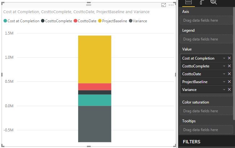
I wish to create a column chart with 5 separate pieces of data from a dataset.
So, I have Fields named: - Budget, Cost at completion, cost to complete, cost to date, Variance.
I wish the column chart to show these as 5 separate columns with a gap in-between. Whenever I try, I am either getting them stacked on top of one another (using the stacked version, obviously), or right next to each other (using the clustered), without the headings/titles below.
I realise it is probably something I am missing, but what?
Many thanks,
Rich
Solved! Go to Solution.
- Mark as New
- Bookmark
- Subscribe
- Mute
- Subscribe to RSS Feed
- Permalink
- Report Inappropriate Content
- Mark as New
- Bookmark
- Subscribe
- Mute
- Subscribe to RSS Feed
- Permalink
- Report Inappropriate Content
- Mark as New
- Bookmark
- Subscribe
- Mute
- Subscribe to RSS Feed
- Permalink
- Report Inappropriate Content
Hi Affan,
Appreciate the support.
As you will see, it is stacking my columns (this is the stacked chart though), whereas I want the 5 columns to be individually named and categorised.
Thanks, Rich
- Mark as New
- Bookmark
- Subscribe
- Mute
- Subscribe to RSS Feed
- Permalink
- Report Inappropriate Content
What do you have at the X-Axis?
- Mark as New
- Bookmark
- Subscribe
- Mute
- Subscribe to RSS Feed
- Permalink
- Report Inappropriate Content
The x axis needs to be the 5 fields, whilst the y is the £value.
As you see from the screenshot, you don't get the option to choose an axis.
- Mark as New
- Bookmark
- Subscribe
- Mute
- Subscribe to RSS Feed
- Permalink
- Report Inappropriate Content
Hi @RichJW,
Based on my test, I am afraid you could not achiveve this feature currently, I suggest you submit an idea in ideas forum:
https://ideas.powerbi.com/forums/265200-power-bi-ideas
Regards,
Daniel He
If this post helps, then please consider Accept it as the solution to help the other members find it more quickly.
- Mark as New
- Bookmark
- Subscribe
- Mute
- Subscribe to RSS Feed
- Permalink
- Report Inappropriate Content
Ah, okay. Many thanks Daniel.
I'll submit this.
Cheers,
Rich
- Mark as New
- Bookmark
- Subscribe
- Mute
- Subscribe to RSS Feed
- Permalink
- Report Inappropriate Content
Hi @RichJW I have a similar issue, you could try a funnel plot as that accepts plotting multiple values.
Personally I'd prefer this to be available on a column/stacked bar chart rather than seeing the bars centralised in a funnel plot though.. Do you have the link for the idea post you submitted?
Helpful resources

Power BI DataViz World Championships - June 2026
A new Power BI DataViz World Championship is coming this June! Don't miss out on submitting your entry.

Join our Fabric User Panel
Share feedback directly with Fabric product managers, participate in targeted research studies and influence the Fabric roadmap.

| User | Count |
|---|---|
| 45 | |
| 35 | |
| 30 | |
| 15 | |
| 15 |
| User | Count |
|---|---|
| 58 | |
| 56 | |
| 38 | |
| 21 | |
| 21 |

