Join us at FabCon Vienna from September 15-18, 2025
The ultimate Fabric, Power BI, SQL, and AI community-led learning event. Save €200 with code FABCOMM.
Get registered- Power BI forums
- Get Help with Power BI
- Desktop
- Service
- Report Server
- Power Query
- Mobile Apps
- Developer
- DAX Commands and Tips
- Custom Visuals Development Discussion
- Health and Life Sciences
- Power BI Spanish forums
- Translated Spanish Desktop
- Training and Consulting
- Instructor Led Training
- Dashboard in a Day for Women, by Women
- Galleries
- Data Stories Gallery
- Themes Gallery
- Contests Gallery
- Quick Measures Gallery
- Notebook Gallery
- Translytical Task Flow Gallery
- TMDL Gallery
- R Script Showcase
- Webinars and Video Gallery
- Ideas
- Custom Visuals Ideas (read-only)
- Issues
- Issues
- Events
- Upcoming Events
Enhance your career with this limited time 50% discount on Fabric and Power BI exams. Ends August 31st. Request your voucher.
- Power BI forums
- Forums
- Get Help with Power BI
- Desktop
- Two charts created of same table not slicing each ...
- Subscribe to RSS Feed
- Mark Topic as New
- Mark Topic as Read
- Float this Topic for Current User
- Bookmark
- Subscribe
- Printer Friendly Page
- Mark as New
- Bookmark
- Subscribe
- Mute
- Subscribe to RSS Feed
- Permalink
- Report Inappropriate Content
Two charts created of same table not slicing each other plus question about creating custom axis
Hi All,
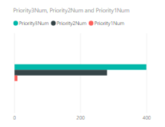
My intention is to divide certain set of values - 'VALUES' in different categories/priorities value-wise for my entities - 'TESTS' and display in another bar chart, such that both charts can slice each other.
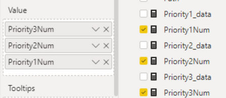
Approach --> I created three measures that would calculate the number of TESTS with specific value range and added them to a clustered bar chart (details below)
Issues :
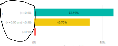
(1) How to get the Axis displaying tha categories, like (<0.90) , (>=0.90 and <0.98) and (>0.98) for VISUAL B[Reference:visualC]
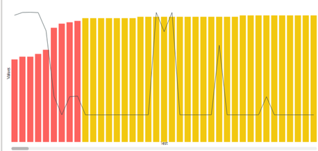
(2) My Visual B - showing percentage of items cateogry-wise doesnt slice Visual A - which is the set of values being categoriesed , when I click on it ? (I have edited their interactions to do so and all the vlaues are from same table)
Visuals :
- Mark as New
- Bookmark
- Subscribe
- Mute
- Subscribe to RSS Feed
- Permalink
- Report Inappropriate Content
Hi,
Sorry for my anwser. I think now I got it. Try this:
First, create a column in the table test:
PriorityGroup = SWITCH(TRUE(),TESTS[Value]<.9, "Group < 0.9",TESTS[Value]<0.98,"Group > 0.90 and < 0.98","Group >= 0.98")
Then , create this two measures:
TotalTests = CALCULATE(COUNT(TESTS[IDTest]),ALL(TESTS))

PriorityGroupTotal% = DIVIDE(COUNT(TESTS[PriorityGroup]),[TotalTests])
So,
You can create your clustered chart using the measure PriorityGroup as the Axis and PriorityGroupTotal% as the Value:
- Mark as New
- Bookmark
- Subscribe
- Mute
- Subscribe to RSS Feed
- Permalink
- Report Inappropriate Content
@mauriciosotero, Thanks for the help! This seems to be working, however Tests can have multiple entries in the table , thus even PriorityGroup for a paritcular tests will have multiple duplicate instances.
How can I ensure that I count only the values for a particular Test single time ? When calcualting below measure:
PriorityGroupTotal% = DIVIDE(COUNT(OverallAndPerCP[Priority]),[TotalTest])
- Mark as New
- Bookmark
- Subscribe
- Mute
- Subscribe to RSS Feed
- Permalink
- Report Inappropriate Content
Hi, welcome!
Can you share a sample of the table Tests? Because I can't understand why Tests can have multiple entries and a test has more than one PriorityGroup.
Thanks
- Mark as New
- Bookmark
- Subscribe
- Mute
- Subscribe to RSS Feed
- Permalink
- Report Inappropriate Content
@mauriciosotero, That is because other than "TESTS[Value]" , there is another column "TESTS[Value2]" which has unique numbers for each row, but TESTS[Value]could be duplicated for some rows of unique TESTS[Value2].
I tried below DAX but it doesn't seem to be working,
PriValues = DIVIDE (
CALCULATE( DISTINCTCOUNT( TESTS[IDTest])),
CALCULATE ( DISTINCTCOUNT( TESTS[IDTest]), ALL ( Table[Tests]))
)
But when I plot it on bar graph, with PriorityGroupTotal% on X-axis, it always slices the data, even though I use ALL.
- Mark as New
- Bookmark
- Subscribe
- Mute
- Subscribe to RSS Feed
- Permalink
- Report Inappropriate Content
Hi @rumittal ,
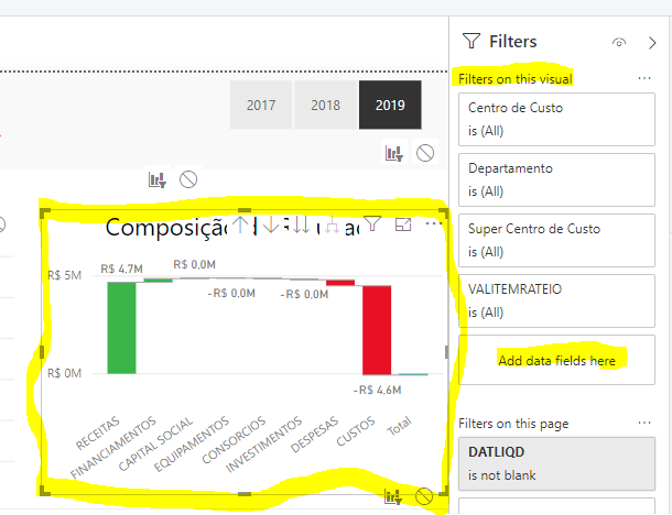
You can apply different filters criteria to the charts. For this, you can use the Visual Filters properties clicking in the charts and add the fields you want to use:
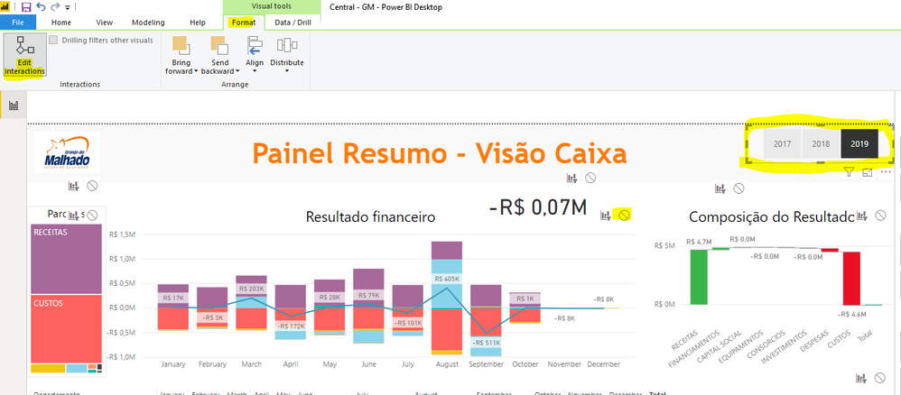
Then, you have to edit the interations beetween the slicer and the chart to configuring the indepent aproach:
If this helps, pls give me a kudo and mark as the solution. Thanks
- Mark as New
- Bookmark
- Subscribe
- Mute
- Subscribe to RSS Feed
- Permalink
- Report Inappropriate Content
@mauriciosotero, I am sorry but I couldnt understand how below suggestions could address my issues. please illustrate further, below are my issues (Visuals can be found in original message).
For issue 1 , I have already created measures to get the categories/priorities percentage , and added them to vertical bar chart , I need suggestion on how can I add Category strings like "(<=0.90)" to Y-axis , like shown in visual C.
For issue 2, I have already edited itneraction between my bar chart (visual B) and item's chart (Visual A) , but still when I click on any bar from Visual B, say (<=0.90) , visual A does not filter out to show only scenarios having consistency < 0.90.

