Get Fabric certified for FREE!
Don't miss your chance to take the Fabric Data Engineer (DP-700) exam on us!
Learn more- Power BI forums
- Get Help with Power BI
- Desktop
- Service
- Report Server
- Power Query
- Mobile Apps
- Developer
- DAX Commands and Tips
- Custom Visuals Development Discussion
- Health and Life Sciences
- Power BI Spanish forums
- Translated Spanish Desktop
- Training and Consulting
- Instructor Led Training
- Dashboard in a Day for Women, by Women
- Galleries
- Data Stories Gallery
- Themes Gallery
- Contests Gallery
- QuickViz Gallery
- Quick Measures Gallery
- Visual Calculations Gallery
- Notebook Gallery
- Translytical Task Flow Gallery
- TMDL Gallery
- R Script Showcase
- Webinars and Video Gallery
- Ideas
- Custom Visuals Ideas (read-only)
- Issues
- Issues
- Events
- Upcoming Events
The FabCon + SQLCon recap series starts April 14th at 8am Pacific. If you’re tracking where AI is going inside Fabric, this first session is a can't miss. Register now
- Power BI forums
- Forums
- Get Help with Power BI
- Desktop
- Color My World
- Subscribe to RSS Feed
- Mark Topic as New
- Mark Topic as Read
- Float this Topic for Current User
- Bookmark
- Subscribe
- Printer Friendly Page
- Mark as New
- Bookmark
- Subscribe
- Mute
- Subscribe to RSS Feed
- Permalink
- Report Inappropriate Content
Color My World
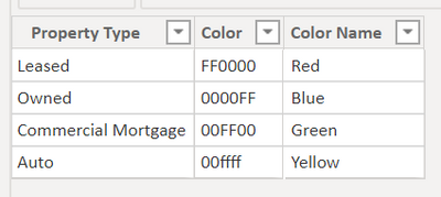
I have made this table to color the dots on the map I have created.
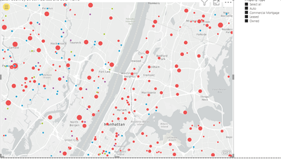
However, the colors that are shown on the maps are not the same ones that are specified in the hex codes:
| Property Type | Color code | Color I am Exoectubg | Color on Map |
| Leased | FF0000 | Red | Green |
| Owned | 0000FF | Blue | Purple |
| Commercial Morgtage | 00FF00 | Green | Blue |
| Auto | 00FFFF | Cyan | Red |
Please help me fix this problem.
- Mark as New
- Bookmark
- Subscribe
- Mute
- Subscribe to RSS Feed
- Permalink
- Report Inappropriate Content
Hi !
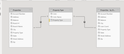
Please share the Data Model diagram, seem you are using another table which has fact information & that is mapped to status table.
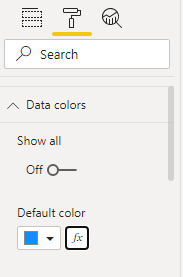
In Power BI - Map chart, go to format, expand Data colors -> press (fx) and use format by [field vaue] to provide data fill colors.

Regards,
Hasham
- Mark as New
- Bookmark
- Subscribe
- Mute
- Subscribe to RSS Feed
- Permalink
- Report Inappropriate Content
Here you go. I don't see a problem with the data model, though...
- Mark as New
- Bookmark
- Subscribe
- Mute
- Subscribe to RSS Feed
- Permalink
- Report Inappropriate Content
Hi !
Thanks, the model diagram will help us understand how you are plotting the map chart.
You can create a measure lie below;
Property Color = SWITCH( TRUE(),
                MAX(Property Type[Property Type]) = "Leased", 1,
                MAX(Property Type[Property Type]) = "Owned", 2,
                MAX(Property Type[Property Type]) = "Commercial Mortgage", 3,
                MAX(Property Type[Property Type]) = "Auto", 4,
                5
)
Now, in the Data Color option, choose format by Rules as shown below;
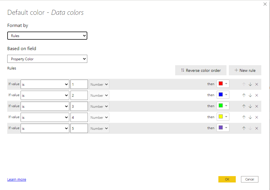
Hope this will work for you.
Regards,
Hasham
- Mark as New
- Bookmark
- Subscribe
- Mute
- Subscribe to RSS Feed
- Permalink
- Report Inappropriate Content
@Anonymous , are you able to show dots for each Property Type.
If so either with the measure of column ((hex code need to with #)
Example measure you create one and use that in conditional formatting with the field value option. But that option will not be there with a legend
Brand Color = Switch( true(),
max('Item'[brand]) = "Brand 1" , "red",
max('Item'[brand]) = "Brand 2" , "blue",
max('Item'[brand]) = "Brand 3" , "green",
max('Item'[brand]) = "Brand 4" , "gray",
max('Item'[brand]) = "Brand 5" , "yellow",
max('Item'[brand]) = "Brand 6" , "orange",
max('Item'[brand]) = "Brand 7" , "brown",
max('Item'[brand]) = "Brand 8" , "Cyan",
max('Item'[brand]) = "Brand 9" , "Tan",
max('Item'[brand]) = "Brand 10" , "Violet",
max('Item'[brand]) = "Brand 11" , "Gold",
"silver"
)Helpful resources

New to Fabric Survey
If you have recently started exploring Fabric, we'd love to hear how it's going. Your feedback can help with product improvements.

Power BI DataViz World Championships - June 2026
A new Power BI DataViz World Championship is coming this June! Don't miss out on submitting your entry.

Join our Fabric User Panel
Share feedback directly with Fabric product managers, participate in targeted research studies and influence the Fabric roadmap.

| User | Count |
|---|---|
| 52 | |
| 44 | |
| 44 | |
| 19 | |
| 19 |
| User | Count |
|---|---|
| 71 | |
| 70 | |
| 34 | |
| 33 | |
| 31 |
