FabCon is coming to Atlanta
Join us at FabCon Atlanta from March 16 - 20, 2026, for the ultimate Fabric, Power BI, AI and SQL community-led event. Save $200 with code FABCOMM.
Register now!- Power BI forums
- Get Help with Power BI
- Desktop
- Service
- Report Server
- Power Query
- Mobile Apps
- Developer
- DAX Commands and Tips
- Custom Visuals Development Discussion
- Health and Life Sciences
- Power BI Spanish forums
- Translated Spanish Desktop
- Training and Consulting
- Instructor Led Training
- Dashboard in a Day for Women, by Women
- Galleries
- Data Stories Gallery
- Themes Gallery
- Contests Gallery
- QuickViz Gallery
- Quick Measures Gallery
- Visual Calculations Gallery
- Notebook Gallery
- Translytical Task Flow Gallery
- TMDL Gallery
- R Script Showcase
- Webinars and Video Gallery
- Ideas
- Custom Visuals Ideas (read-only)
- Issues
- Issues
- Events
- Upcoming Events
Learn from the best! Meet the four finalists headed to the FINALS of the Power BI Dataviz World Championships! Register now
- Power BI forums
- Forums
- Get Help with Power BI
- Desktop
- Re: Clustered Column and Line Chart - Conditional ...
- Subscribe to RSS Feed
- Mark Topic as New
- Mark Topic as Read
- Float this Topic for Current User
- Bookmark
- Subscribe
- Printer Friendly Page
- Mark as New
- Bookmark
- Subscribe
- Mute
- Subscribe to RSS Feed
- Permalink
- Report Inappropriate Content
Clustered Column and Line Chart - Conditional formatting
Hello Community –
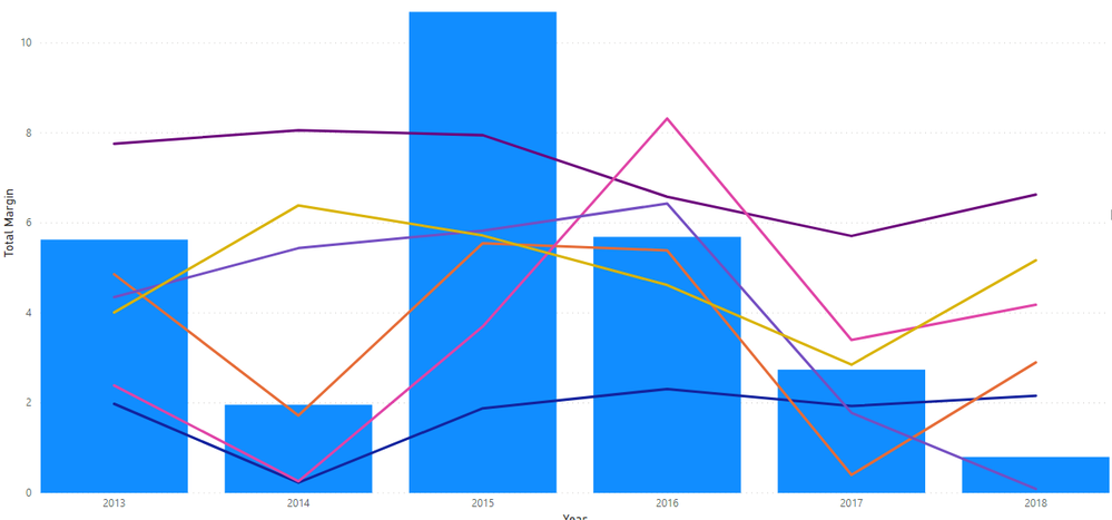
I am working on a line and clustered column chart. I have 7 tables – 1 table called ENTITY with various financial calculations; a comparative group (Metropolitan, Micropolitan, Rural) and year. The 6 linked tables contain benchmark financial data by year and have a corresponding comparative group (2 tables for Metropolitan, 2 tables for Micropolitan, 2 tables for Rural). I also have a slicer to select an entity. I have all 6 benchmarks as lines and one financial indicator from the Entity table as the column.
All 6 benchmark lines are making the visualization too cluttered and I would like to only show the related comparative group benchmark. I don’t want to add another slicer to filter by comparative group as the user may not know what comparative group corresponds to the entity. I have looked at the data colors on the format tab and don’t see a way to use a conditional format.
Any suggestions on how to solve?
Thanks!
Solved! Go to Solution.
- Mark as New
- Bookmark
- Subscribe
- Mute
- Subscribe to RSS Feed
- Permalink
- Report Inappropriate Content
Hi , @ldenney
Based on my research, Line chart (even in Clustered-Column-and-Line-Char) does not support conditional formatting in PowerBI yet currently.
I think you have no choice but to manually set different line colors and add another slicer to filter.
In addition ,you can come up with a new idea and add your comments there to make this feature coming sooner.
https://ideas.powerbi.com/forums/265200-power-bi-ideas
Best Regards,
Community Support Team _ Eason
If this post helps, then please consider Accept it as the solution to help the other members find it more quickly.
Helpful resources

Join our Fabric User Panel
Share feedback directly with Fabric product managers, participate in targeted research studies and influence the Fabric roadmap.

Power BI Monthly Update - February 2026
Check out the February 2026 Power BI update to learn about new features.

| User | Count |
|---|---|
| 50 | |
| 49 | |
| 35 | |
| 15 | |
| 14 |
| User | Count |
|---|---|
| 91 | |
| 75 | |
| 41 | |
| 26 | |
| 25 |


