cancel
Showing results for 
Search instead for 
Did you mean: 

July 7 - July 17 | Round 2 of the Power BI Dataviz World Championships. Don't miss your chance! Learn more

Reply
ldenney
Regular Visitor

Clustered Column and Line Chart - Conditional formatting

Hello Community –

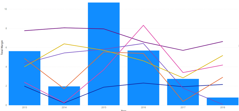
I am working on a line and clustered column chart. I have 7 tables – 1 table called ENTITY with various financial calculations; a comparative group (Metropolitan, Micropolitan, Rural) and year. The 6 linked tables contain benchmark financial data by year and have a corresponding comparative group (2 tables for Metropolitan, 2 tables for Micropolitan, 2 tables for Rural). I also have a slicer to select an entity. I have all 6 benchmarks as lines and one financial indicator from the Entity table as the column.

All 6 benchmark lines are making the visualization too cluttered and I would like to only show the related comparative group benchmark. I don’t want to add another slicer to filter by comparative group as the user may not know what comparative group corresponds to the entity. I have looked at the data colors on the format tab and don’t see a way to use a conditional format.

Any suggestions on how to solve?


Thanks!financial_graphic.png

1 ACCEPTED SOLUTION
v-easonf-msft
Community Support
Community Support

Hi , @ldenney 


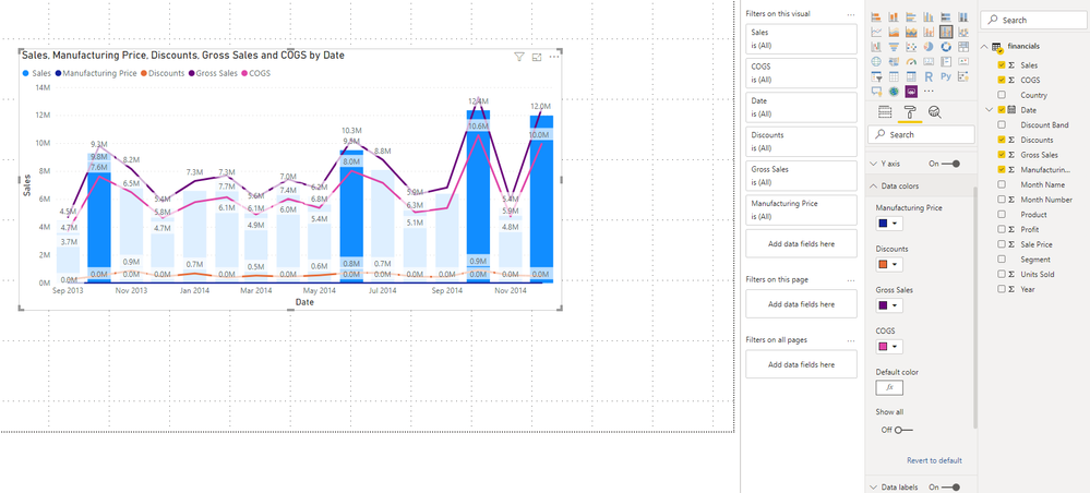
Based on my research, Line chart (even in  Clustered-Column-and-Line-Char) does not support conditional formatting in  PowerBI yet currently.

I  think you  have no choice but to manually set different line colors and add another slicer to filter.

z3.png


In addition ,you can come up with a new  idea and add your comments there to make this feature coming sooner.

https://ideas.powerbi.com/forums/265200-power-bi-ideas


Best Regards,
Community Support Team _ Eason
If this post helps, then please consider Accept it as the solution to help the other members find it more quickly.

View solution in original post

1 REPLY 1
v-easonf-msft
Community Support
Community Support

Hi , @ldenney 


Based on my research, Line chart (even in  Clustered-Column-and-Line-Char) does not support conditional formatting in  PowerBI yet currently.

I  think you  have no choice but to manually set different line colors and add another slicer to filter.

z3.png


In addition ,you can come up with a new  idea and add your comments there to make this feature coming sooner.

https://ideas.powerbi.com/forums/265200-power-bi-ideas


Best Regards,
Community Support Team _ Eason
If this post helps, then please consider Accept it as the solution to help the other members find it more quickly.

Helpful resources

Announcements
FabCon and SQLCon Barcelona 2026

FabCon & SQLCon – Barcelona 2026

Join us in Barcelona for FabCon and SQLCon, the Fabric, Power BI, SQL, and AI community event. Save €200 with code FABCMTY200.

60 days of Data Days Carousel

Data Days 2026

Join Data Days 2026: 60 days of free live/on-demand sessions, challenges, study groups, and certification opportunities.

Power BI DataViz World Championships carousel

Power BI DataViz World Championships - June 2026

A new Power BI DataViz World Championship is coming this June! Don't miss out on submitting your entry.

Top Solution Authors