- Power BI forums
- Get Help with Power BI
- Desktop
- Service
- Report Server
- Power Query
- Mobile Apps
- Developer
- DAX Commands and Tips
- Custom Visuals Development Discussion
- Health and Life Sciences
- Power BI Spanish forums
- Translated Spanish Desktop
- Training and Consulting
- Instructor Led Training
- Dashboard in a Day for Women, by Women
- Galleries
- Data Stories Gallery
- Themes Gallery
- Contests Gallery
- QuickViz Gallery
- Quick Measures Gallery
- Visual Calculations Gallery
- Notebook Gallery
- Translytical Task Flow Gallery
- TMDL Gallery
- R Script Showcase
- Webinars and Video Gallery
- Ideas
- Custom Visuals Ideas (read-only)
- Issues
- Issues
- Events
- Upcoming Events
Learn from the best! Meet the four finalists headed to the FINALS of the Power BI Dataviz World Championships! Register now
- Power BI forums
- Forums
- Get Help with Power BI
- Desktop
- Re: Clustered Column Chart using Multiple Columns.
- Subscribe to RSS Feed
- Mark Topic as New
- Mark Topic as Read
- Float this Topic for Current User
- Bookmark
- Subscribe
- Printer Friendly Page
- Mark as New
- Bookmark
- Subscribe
- Mute
- Subscribe to RSS Feed
- Permalink
- Report Inappropriate Content
Clustered Column Chart using Multiple Columns.
Hi All,
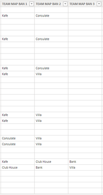
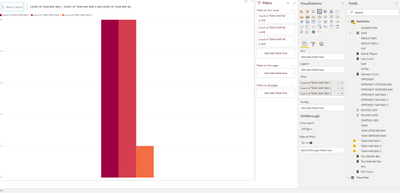
Having issues trying to figure this problem I have out. I have a big dataset ive imported from excel and within that dataset are the three columns below. I am struggling to list the Maps from all three columns as my axis. What I am after is a clustered column graph with each Map on the axis, and then the number of Bans that map recieved and whether it was the 1st ban, 2nd ban or third ban.
My Data:
Where Im Stuck:
Solved! Go to Solution.
- Mark as New
- Bookmark
- Subscribe
- Mute
- Subscribe to RSS Feed
- Permalink
- Report Inappropriate Content
Hey OceanMan,
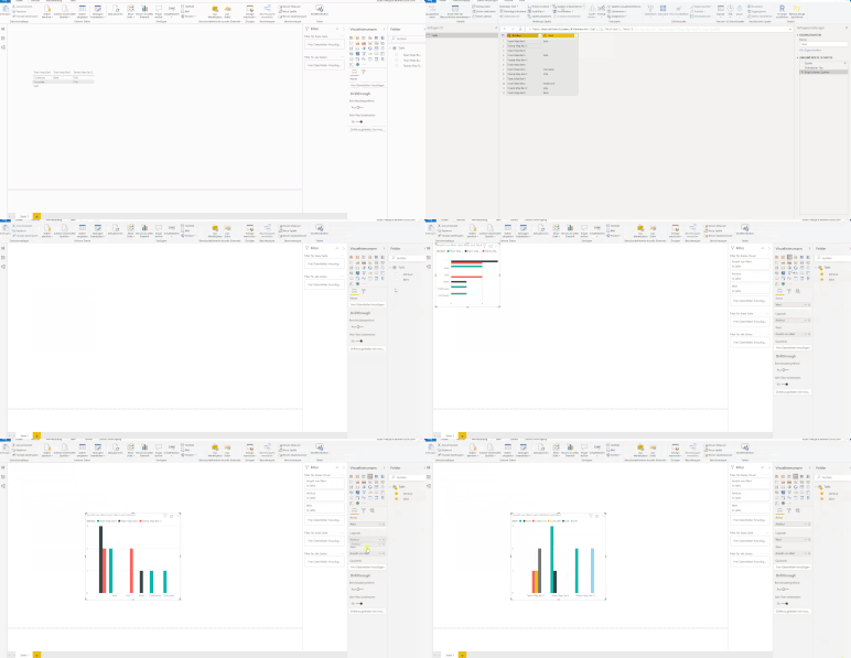
you need to unpivot the table in the PowerQuery Editor.
I did that for you in that example file
Here you have a Screen.Gif -> Sorry for the german version but you will get it 🙂
Please kudo & mark this post if I was able to help you
Have a nice day OceanMan!
BR,
Josef
- Mark as New
- Bookmark
- Subscribe
- Mute
- Subscribe to RSS Feed
- Permalink
- Report Inappropriate Content
You will need to unpivot the columns so you can use them as x axis on your chart
- Mark as New
- Bookmark
- Subscribe
- Mute
- Subscribe to RSS Feed
- Permalink
- Report Inappropriate Content
Hey OceanMan,
you need to unpivot the table in the PowerQuery Editor.
I did that for you in that example file
Here you have a Screen.Gif -> Sorry for the german version but you will get it 🙂
Please kudo & mark this post if I was able to help you
Have a nice day OceanMan!
BR,
Josef
Helpful resources
| User | Count |
|---|---|
| 52 | |
| 35 | |
| 22 | |
| 17 | |
| 17 |
| User | Count |
|---|---|
| 69 | |
| 57 | |
| 39 | |
| 21 | |
| 21 |


