- Power BI forums
- Get Help with Power BI
- Desktop
- Service
- Report Server
- Power Query
- Mobile Apps
- Developer
- DAX Commands and Tips
- Custom Visuals Development Discussion
- Health and Life Sciences
- Power BI Spanish forums
- Translated Spanish Desktop
- Training and Consulting
- Instructor Led Training
- Dashboard in a Day for Women, by Women
- Galleries
- Data Stories Gallery
- Themes Gallery
- Contests Gallery
- QuickViz Gallery
- Quick Measures Gallery
- Visual Calculations Gallery
- Notebook Gallery
- Translytical Task Flow Gallery
- TMDL Gallery
- R Script Showcase
- Webinars and Video Gallery
- Ideas
- Custom Visuals Ideas (read-only)
- Issues
- Issues
- Events
- Upcoming Events
Learn from the best! Meet the four finalists headed to the FINALS of the Power BI Dataviz World Championships! Register now
- Power BI forums
- Forums
- Get Help with Power BI
- Desktop
- Chart outcome visualization preference
- Subscribe to RSS Feed
- Mark Topic as New
- Mark Topic as Read
- Float this Topic for Current User
- Bookmark
- Subscribe
- Printer Friendly Page
- Mark as New
- Bookmark
- Subscribe
- Mute
- Subscribe to RSS Feed
- Permalink
- Report Inappropriate Content
Chart outcome visualization preference
Hi everyone,
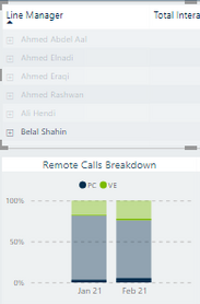
I have an employees table and another 100% stacked column chart which shows a certain KPI at the organization level (total)
When I select a name of one employee, the chart changes the outcome to reflect only data of the employee selected. However, the way it shows the new data (outcome) based on the selection of the other table, is by highlighted the new outcome over the original chart.
I need the outcome on the chart to be dedicated for the selected employee, department,...etc. (not by highlighting over the total)
Here's a screenshot for the table and the chart after selecting one name (note the dark blue and dark green colors)
Any idea how to change it?
Thanks!
Solved! Go to Solution.
- Mark as New
- Bookmark
- Subscribe
- Mute
- Subscribe to RSS Feed
- Permalink
- Report Inappropriate Content
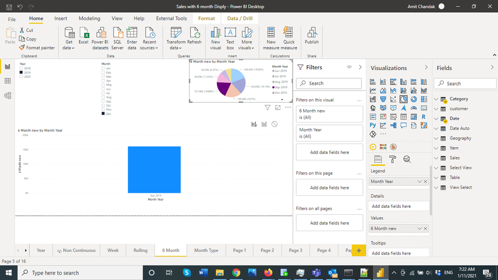
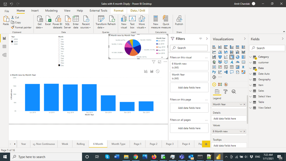
@OmarSaleh , Not sure I got it correctly. But do you want the interaction to filter, in place of fill. You want the first one :https://docs.microsoft.com/en-us/power-bi/create-reports/service-reports-visual-interactions
- Mark as New
- Bookmark
- Subscribe
- Mute
- Subscribe to RSS Feed
- Permalink
- Report Inappropriate Content
Thanks @amitchandak. Exactly that's what I meant, cross-filtering instead of cross-highlighting 🙂
Many thanks!
Helpful resources

Power BI DataViz World Championships - June 2026
A new Power BI DataViz World Championship is coming this June! Don't miss out on submitting your entry.

Join our Fabric User Panel
Share feedback directly with Fabric product managers, participate in targeted research studies and influence the Fabric roadmap.

| User | Count |
|---|---|
| 47 | |
| 35 | |
| 28 | |
| 17 | |
| 16 |
| User | Count |
|---|---|
| 59 | |
| 57 | |
| 40 | |
| 22 | |
| 20 |


