Get Fabric certified for FREE!
Don't miss your chance to take the Fabric Data Engineer (DP-600) exam for FREE! Find out how by watching the DP-600 session on-demand now through April 28th.
Learn more- Power BI forums
- Get Help with Power BI
- Desktop
- Service
- Report Server
- Power Query
- Mobile Apps
- Developer
- DAX Commands and Tips
- Custom Visuals Development Discussion
- Health and Life Sciences
- Power BI Spanish forums
- Translated Spanish Desktop
- Training and Consulting
- Instructor Led Training
- Dashboard in a Day for Women, by Women
- Galleries
- Data Stories Gallery
- Themes Gallery
- Contests Gallery
- QuickViz Gallery
- Quick Measures Gallery
- Visual Calculations Gallery
- Notebook Gallery
- Translytical Task Flow Gallery
- TMDL Gallery
- R Script Showcase
- Webinars and Video Gallery
- Ideas
- Custom Visuals Ideas (read-only)
- Issues
- Issues
- Events
- Upcoming Events
Join the FabCon + SQLCon recap series. Up next: Power BI, Real-Time Intelligence, IQ and AI, and Data Factory take center stage. All sessions are available on-demand after the live show. Register now
- Power BI forums
- Forums
- Get Help with Power BI
- Desktop
- Chart Help
- Subscribe to RSS Feed
- Mark Topic as New
- Mark Topic as Read
- Float this Topic for Current User
- Bookmark
- Subscribe
- Printer Friendly Page
- Mark as New
- Bookmark
- Subscribe
- Mute
- Subscribe to RSS Feed
- Permalink
- Report Inappropriate Content
Chart Help
Hi there ,
I have a data as below ;
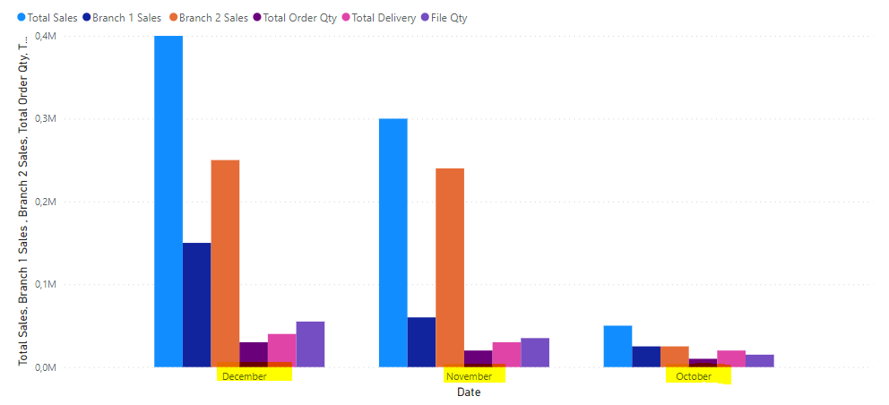
When i create a chart on power bi , datas are showed together based on months as below
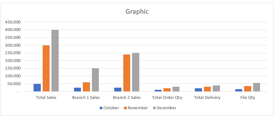
But i want to show datas as below based on their names groupped first then based on month , could you pls telll me how can i manage below seem on power bi ... thanks in advance
Solved! Go to Solution.
- Mark as New
- Bookmark
- Subscribe
- Mute
- Subscribe to RSS Feed
- Permalink
- Report Inappropriate Content
I was hoping Field Parameters could be used to quickly solve this but the result wasn't quite what you requested. Instead I put your Categories into a table and added a measure to extract the values from your table.
1. Category table (DAX), Seq should be used as sorting column:
Categories = DATATABLE(
    "Category", STRING,
    "Seq", INTEGER,
    {
        {"Total Sales", 1},
        {"Branch 1 Sales", 2},
        {"Branch 2 Sales", 3},
        {"Total Order Qty", 4},
        {"Total Delivery", 5},
        {"File Qty", 6}
    }
)
2. Measure (DAX):
Measure = SWITCH(SELECTEDVALUE(Categories[Category]),
    "Total Sales", SUM('Table'[Total Sales]),
    "Branch 1 Sales", SUM('Table'[Branch 1 Sales]),
    "Branch 2 Sales", SUM('Table'[Branch 2 Sales]),
    "Total Order Qty", SUM('Table'[Total Order Qty]),
    "Total Delivery", SUM('Table'[Total Delivery]),
    "File Qty", SUM('Table'[File Qty])
)
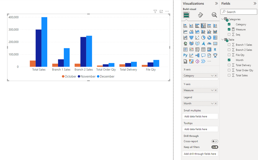
3. Use Clustered Column Chart visual with 'Categories'[Category] as x-axis, 'Categories'[Measure] as y-axis and 'Table'[Month] as legend.
- Mark as New
- Bookmark
- Subscribe
- Mute
- Subscribe to RSS Feed
- Permalink
- Report Inappropriate Content
In Power Query, if you select the first column (Date?) and choose Unpivot other columns, you will get 3 columns that can be pulled on to a column chart to get what you want
Helpful resources

Power BI Monthly Update - April 2026
Check out the April 2026 Power BI update to learn about new features.

New to Fabric Survey
If you have recently started exploring Fabric, we'd love to hear how it's going. Your feedback can help with product improvements.

Power BI DataViz World Championships - June 2026
A new Power BI DataViz World Championship is coming this June! Don't miss out on submitting your entry.

| User | Count |
|---|---|
| 45 | |
| 38 | |
| 34 | |
| 21 | |
| 17 |
| User | Count |
|---|---|
| 66 | |
| 64 | |
| 31 | |
| 26 | |
| 26 |


